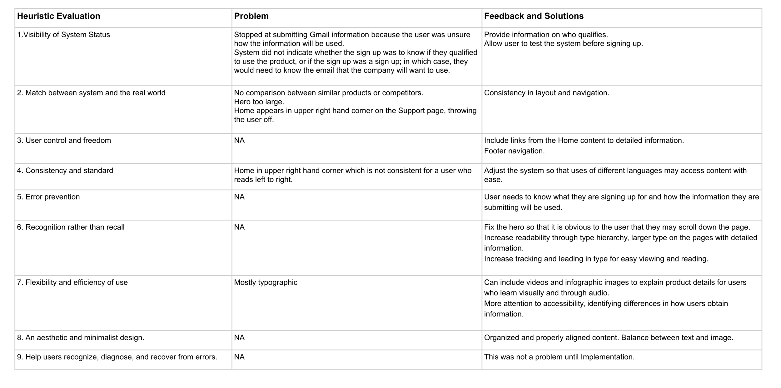
Project Shield
Scenario
The client has had their website (Project Shield https://projectshield.withgoogle.com/landing) up for some time but is not getting the conversion metrics that they had hoped for. There are two types of users that come to the website (Developers + Non-technical visitors). While the site is currently tailored for developers, research has shown that non-technical visitors are tasked with vetting out products like these and the team feels like the site may not be serving this user group in the most ideal way.
Business Requirements
The website should arm non-technical visitors with the ability to answer fundamental questions such as:
What is Project Shield?
What will this software do for me?
How can this improve protection on my site?
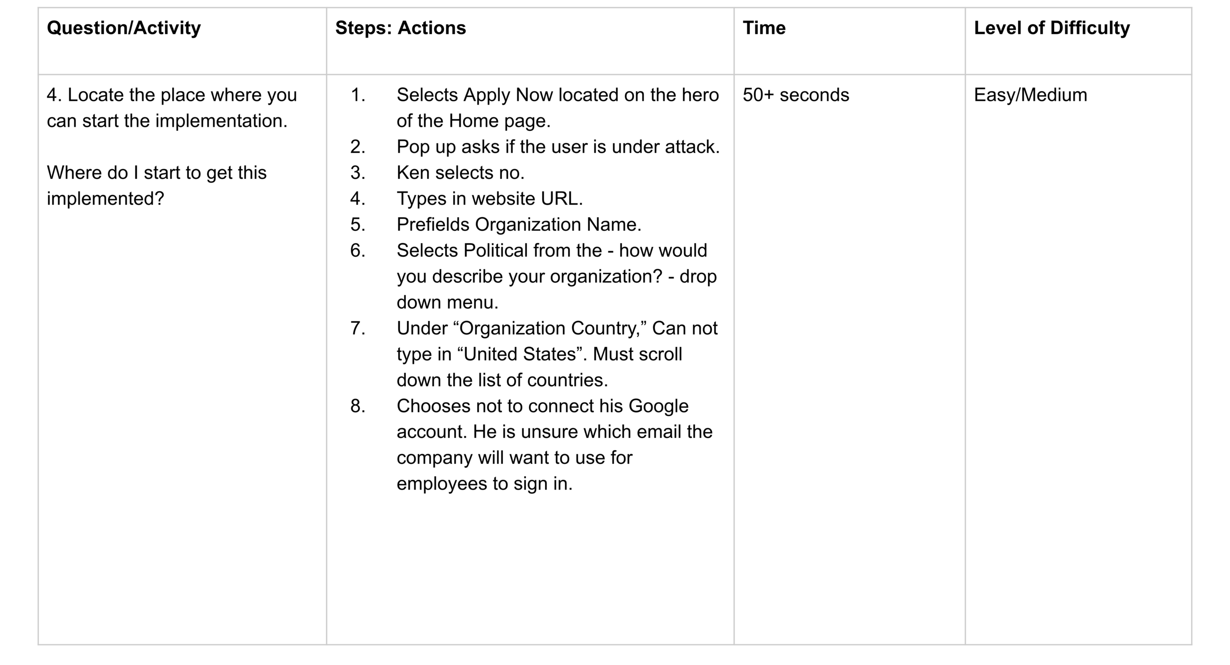
Where do I start to get this implemented?
Answer the following questions:
Does the information on the website meet the needs of the non-technical visitor?
Do they understand how it works?
What expectations do they have after they request access?
Moderator Script
Greeting/Introduction/Expectations (1-2 mins)
Demographics (2 mins)
Name?
Location?
Level of education?
Profession?
What economic class do you identify as belonging?
Do you have a disability that will affect the viewing and searching process?
Experience/Expertise (2 mins)
On a scale of 1-5, what is your level of tech knowledge?
How often do you use technology?
Which device(s) do you usually use?
Participant Activity (5-6mins)
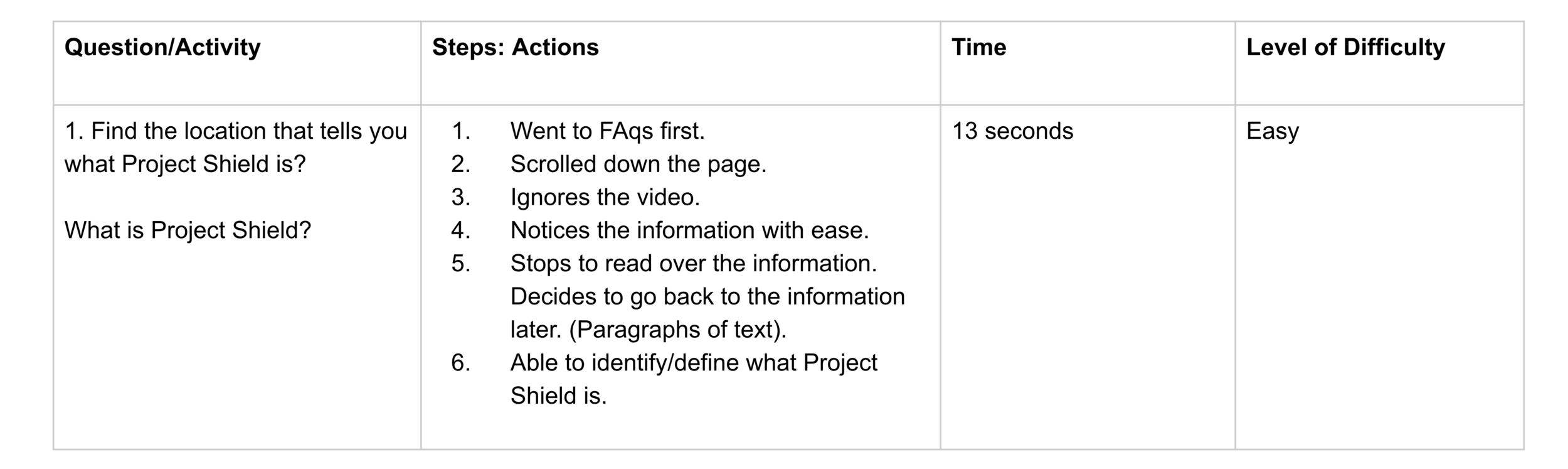
Find the location that tells you what Project Shield is.
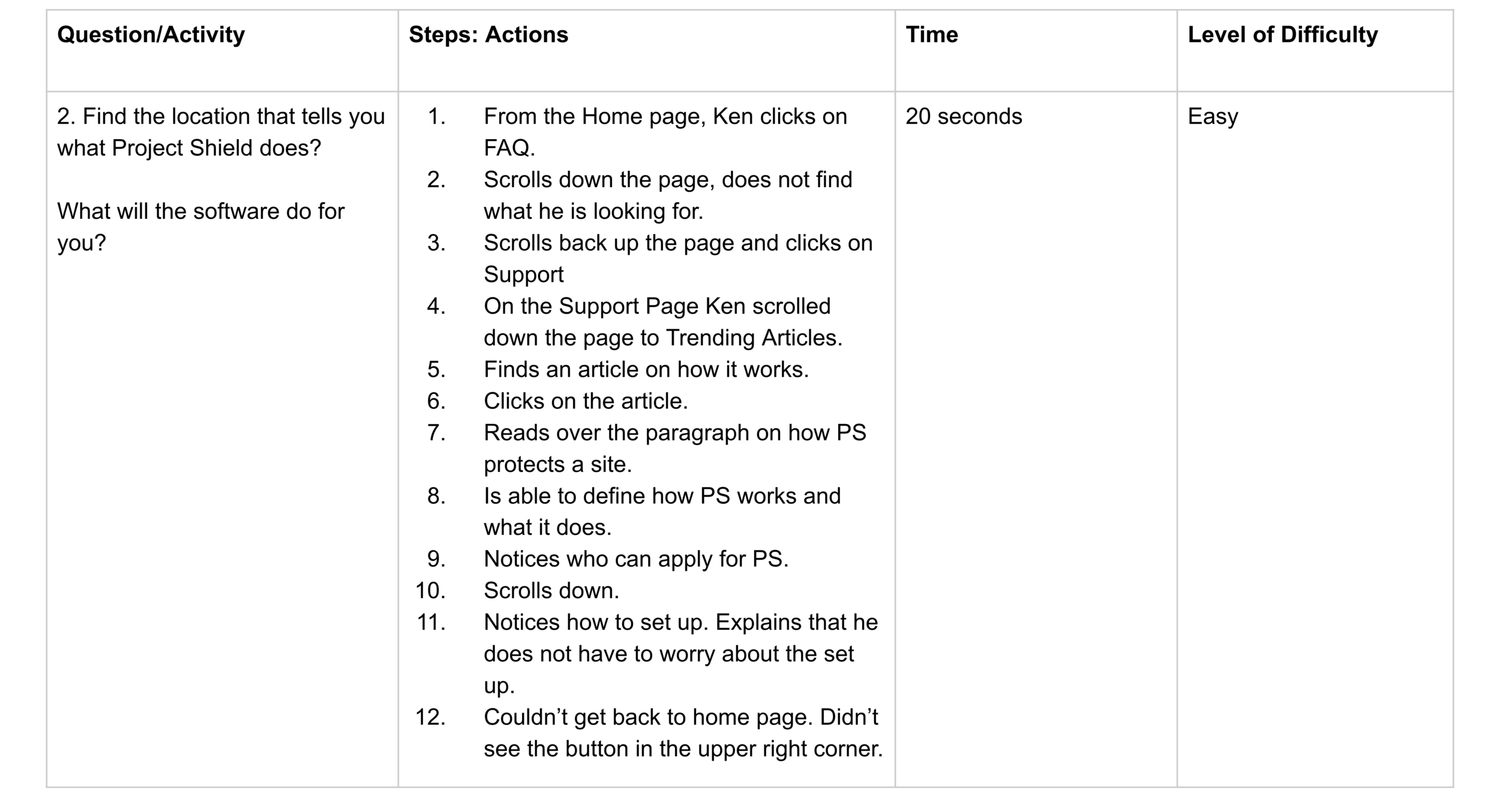
Find the location that tells you what Project Shield does.
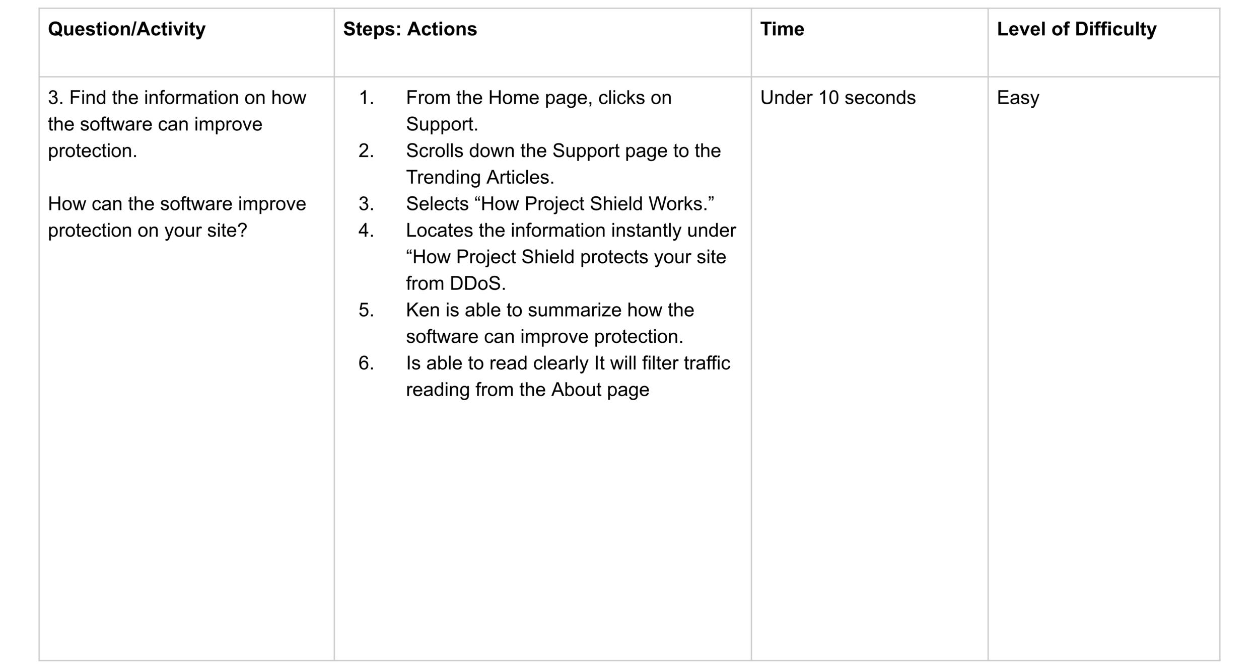
Find the information on how the software can improve protection.
Locate the place where you can start the implementation.
Followup (2 mins)
Have you used this product before?
Have you used a similar product?
What stood out to you when you first entered the site?
What was the easiest part of accessing the information you needed?
What was the hardest part about your process?
What could be done to improve your search experience?
User
Name: John Colman
Location: Charlotte, North Carolina
Education: Masters in Journalism
Profession: Political Journalism
Identifies as middle class.
No special ability that will affect site viewing and use.
Average tech literacy.
Uses technology daily.
Devices: laptops & tablets
Lower than average cyber security use/knowledge.
Non-technical individual
Is searching for a DDoS system for his company.
The company will make the final decision on which product to choose.
The user is testing the product to locate the information he needs to bring back to his team.
User Test & Interview
Follow-Up Questions
Q. Having gone through the site, do you feel you understand what the product does and how it works?
Yes. The support page provided enough information to let the user know how the software will help against a DDoS attack.
Q. When you went to apply for the service, did this make sense to you?
Not really, because I got stuck. I was surprised when it asked me for my Gmail account.
I’d like to know more about if I qualify. At the bottom of the Home page, there is a list of who is eligible to use the product, but I’d like to know more. I think I am eligible because of what I do, but I’d like to know about the steps for applying. This looks to be (a site) for someone who is applying; not a site for someone who is looking for more information on why/how to apply.
Q. I noticed that when you began your search, you went directly to the FAQ. What was the reason you chose this as your first step, rather than scroll down the page?
I did not know that you could scroll. I did not see anything that would indicate this. I did not see a scroll bar. The hero fit the whole screen. I thought (the edge of the hero) was the end of the screen. I thought it was a splash page and did not know I could scroll down.
Strengths
Easy to locate: What the product is. What the product does. How the product will help improve protection.
Offering the FAQs and Support pages.
Readability level high: Enough content/text on the Home page. Not too wordy. Little snippets of information. Simple.
FAQs and Support have the right topic. Not too much reading.
Good use of typography and typographic hierarchy.
Good contrast between background and type.
Layout and alignment are organized
FAQs page lists detailed information using type hierarchy, making it easy for the user to skim the content and locate the info they are seeking.
Weakness
Discovers a user can scroll down the home page by accident.
Signing up/Implementation was confusing and concerning when asking for Google information.
Did not provide useful information on who qualified for the product.
Hero too large. The user did not know you can scroll down the Home page to receive information.
Unable to type in country during sign up. Must scroll down the list to select the country name.
Change in site layout on the Support page. The Home button moved to the upper right corner which made it confusing for the user to go Home.
Opportunities
More information on who qualifies to use the product.
Information on competitor comparison.
What makes Project Shield unique and different from their competitors?
Tutorials. Listed table of comparison.
Include a 1-2 minute video summarizing the product.
Expand information from the home page.
Consistent layout of navigation.
Threats
User wanted to do further research into competitors.
They will leave the site and review competitor sites
Possibly will not go back to Project Shield.
Does not want to submit Gmail account without knowing if they qualify.
The user paused to find the Home button from the Support page.