BDRL Projects

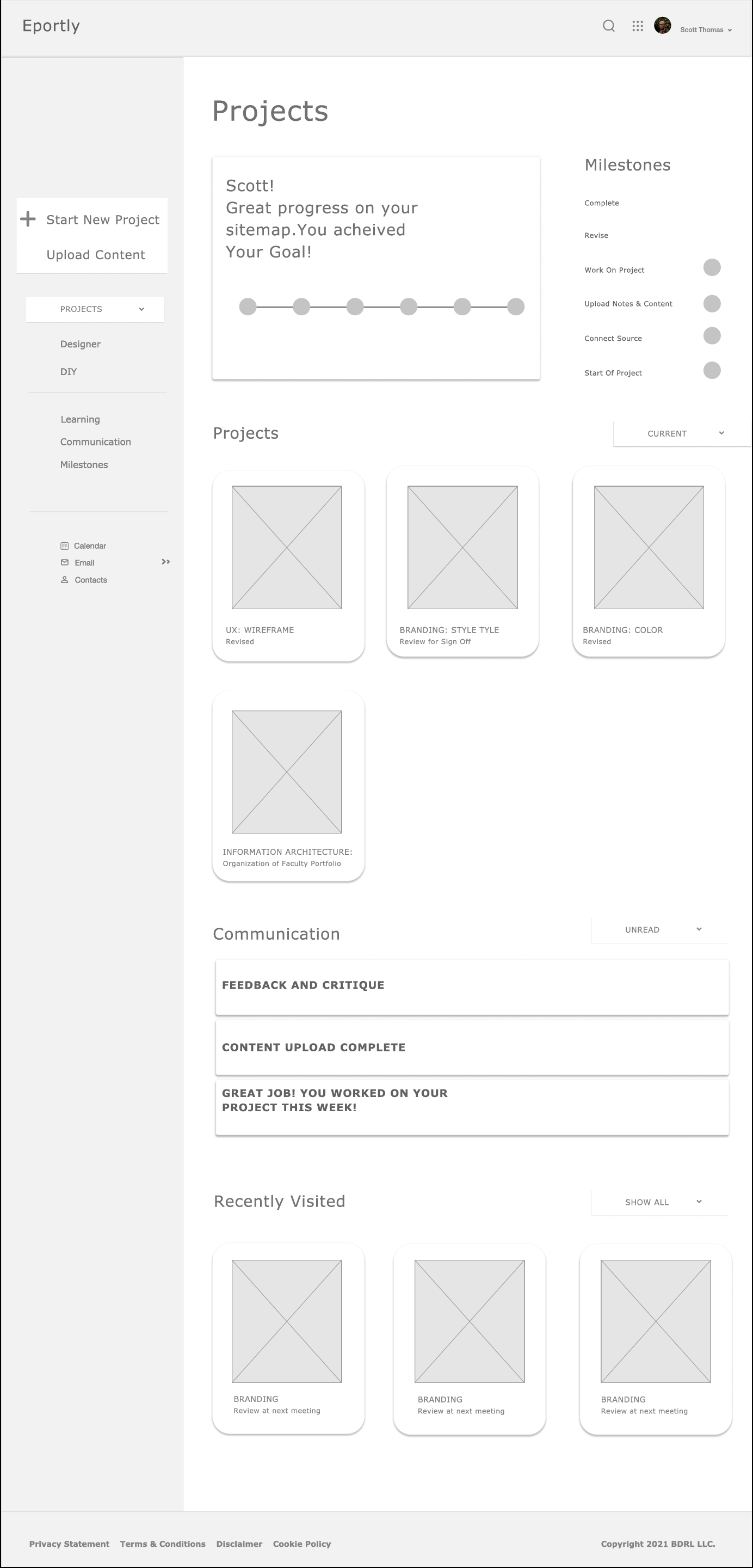
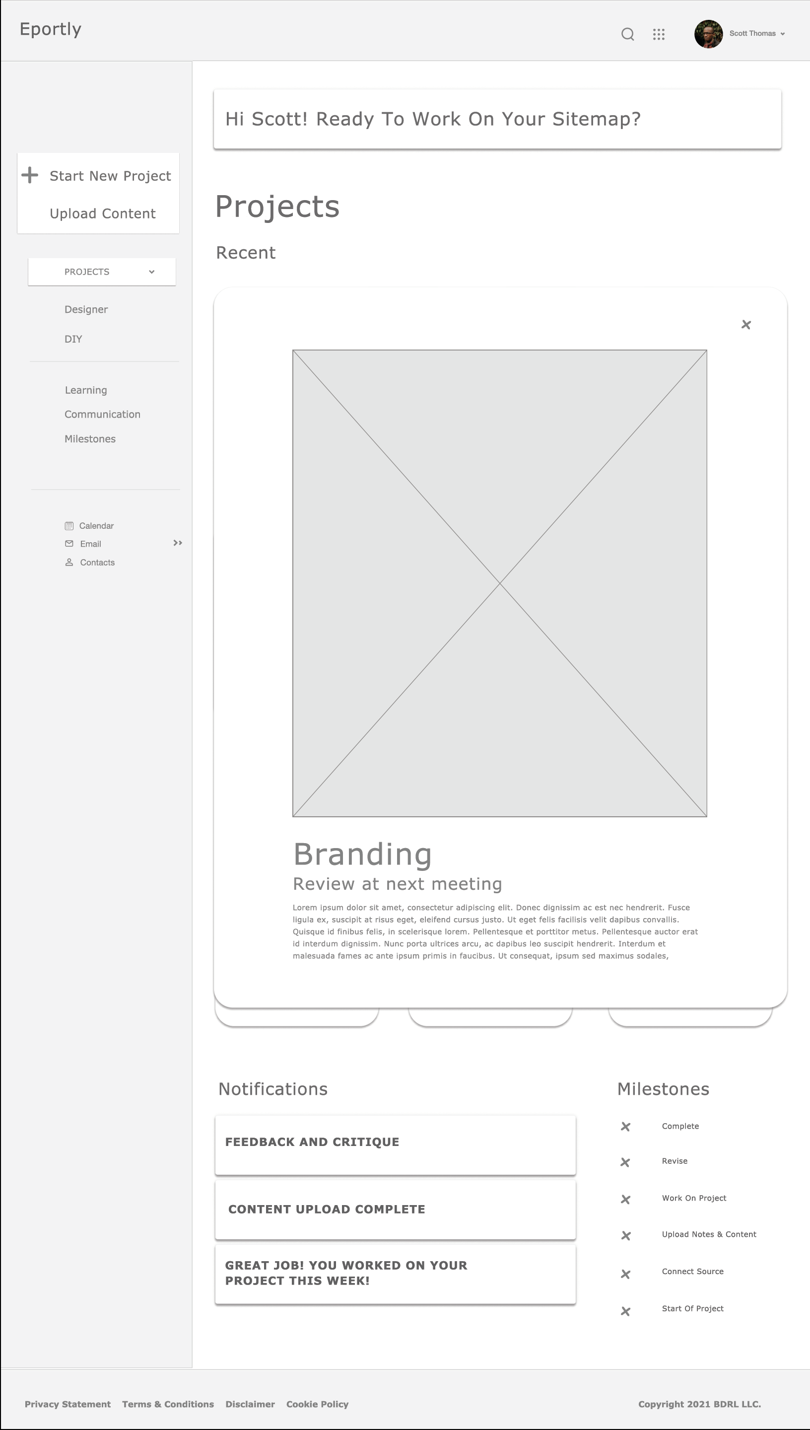
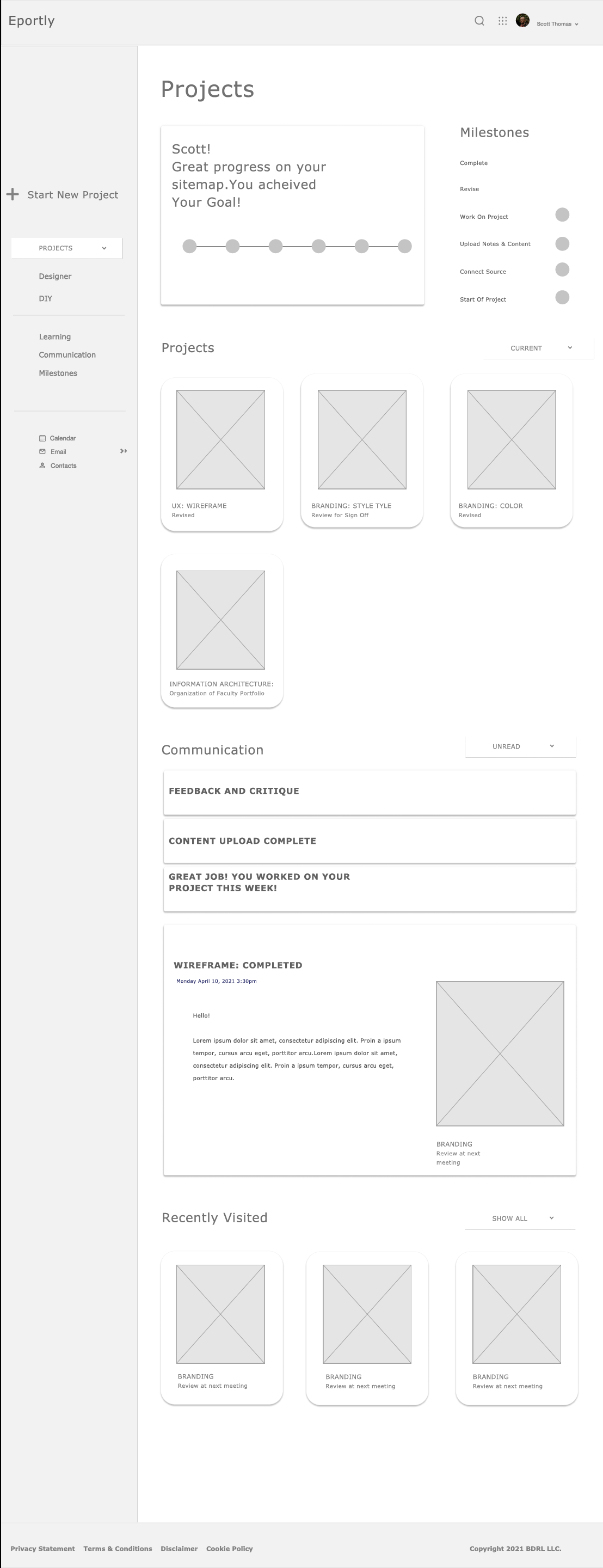
Eportly
Duration: WIP
Role: Product Design, UX Research, UX Design, UI
Overview:
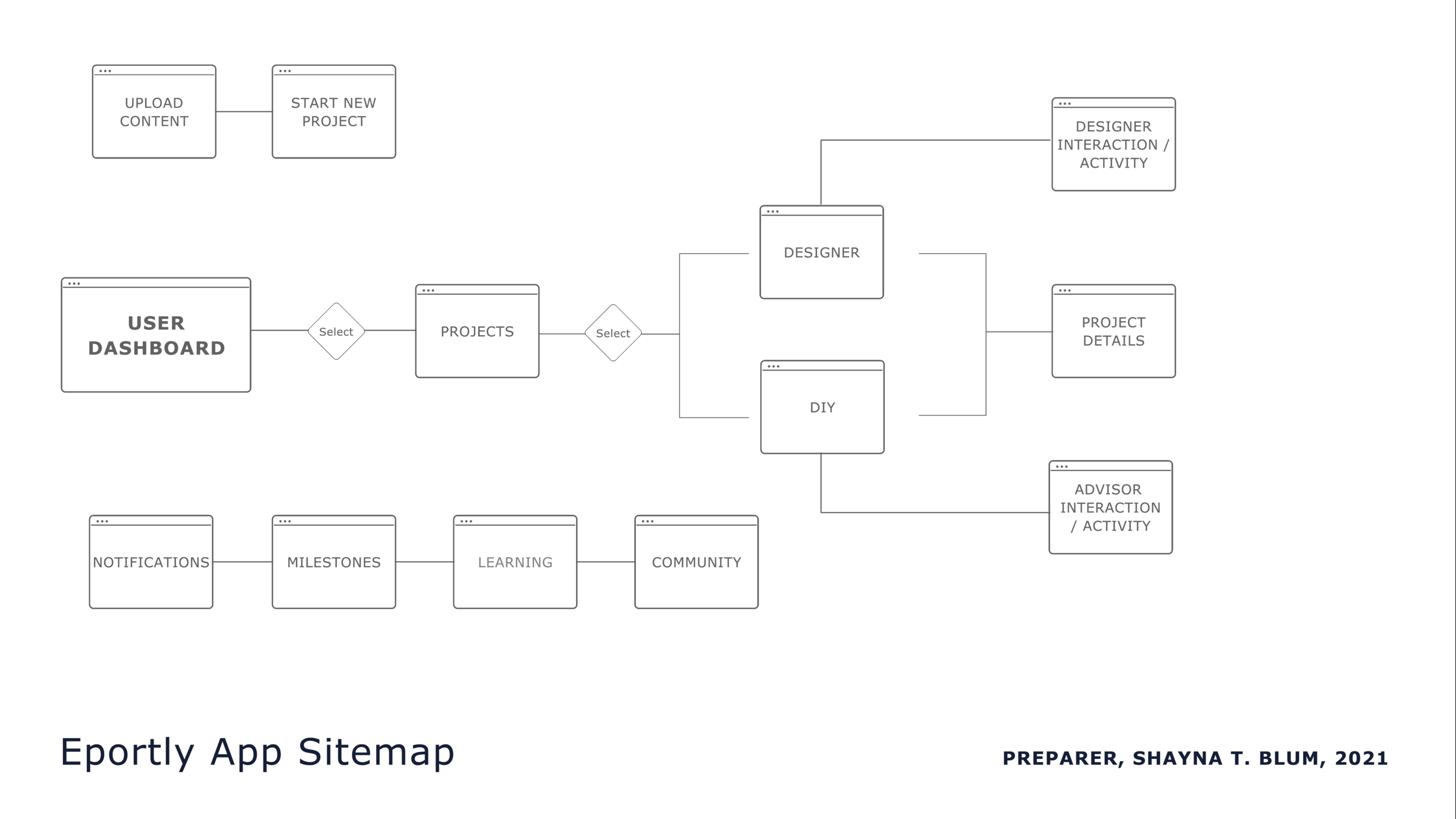
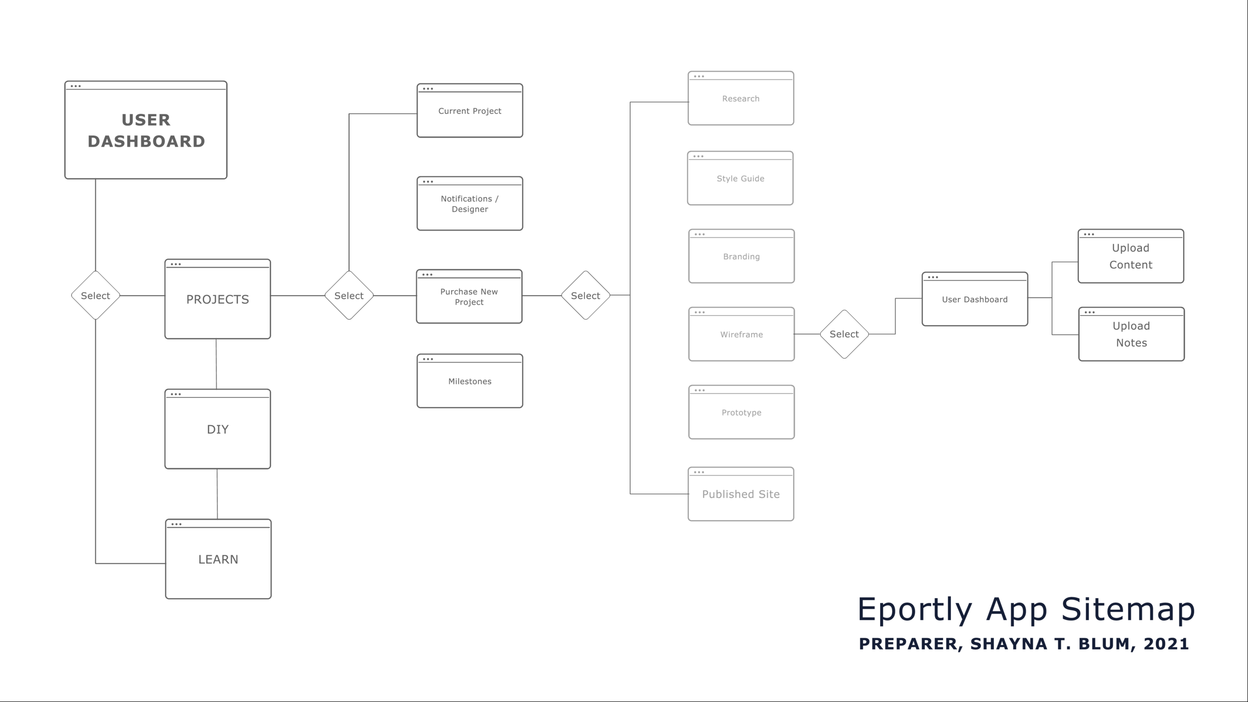
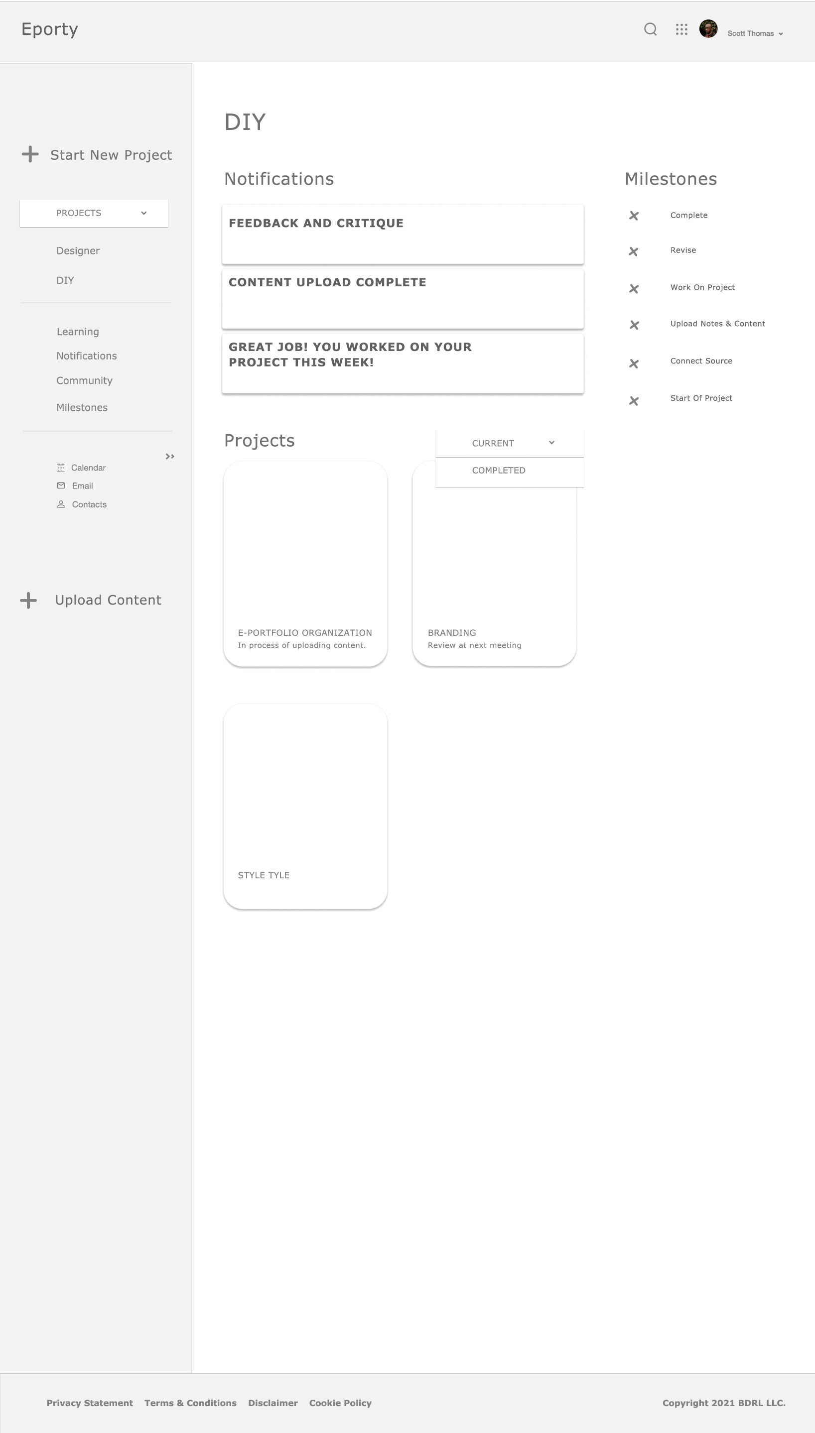
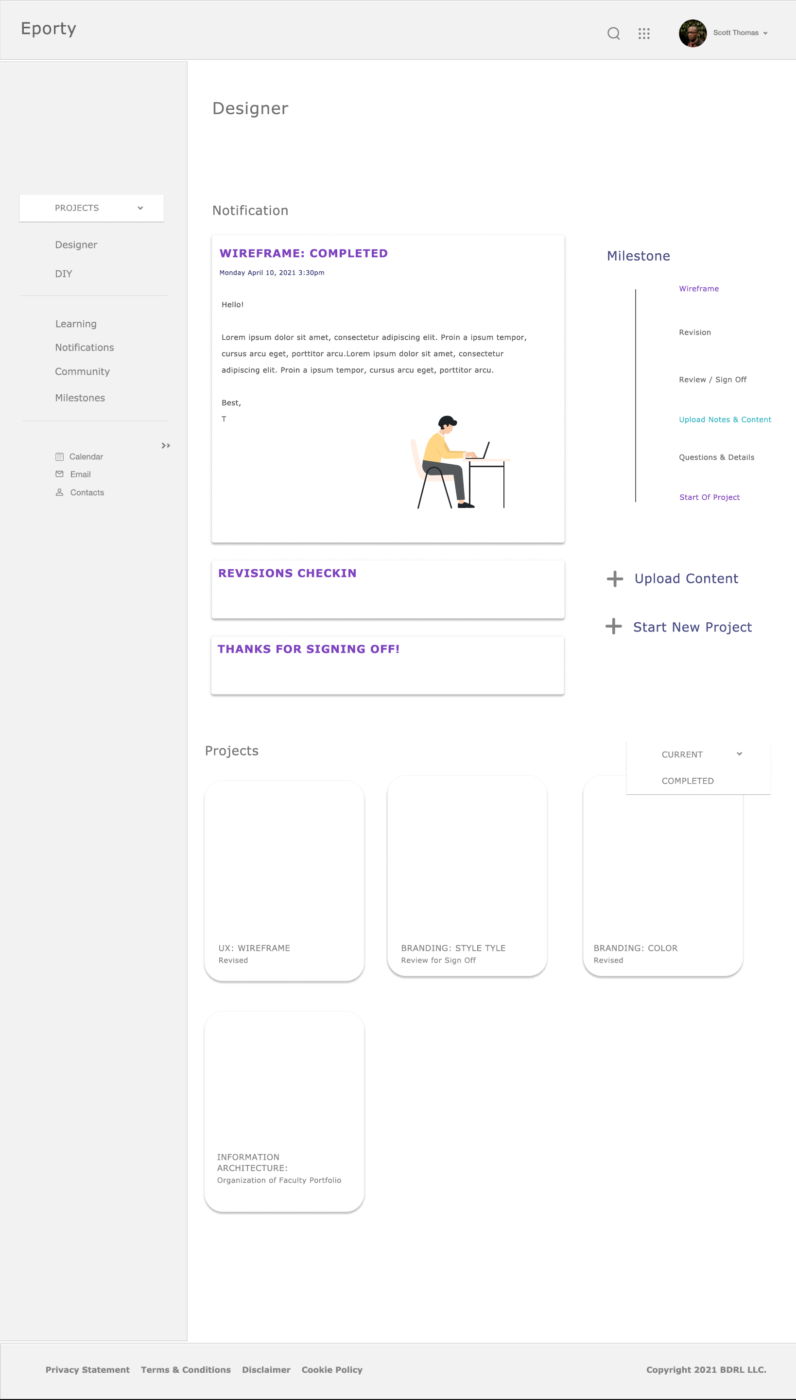
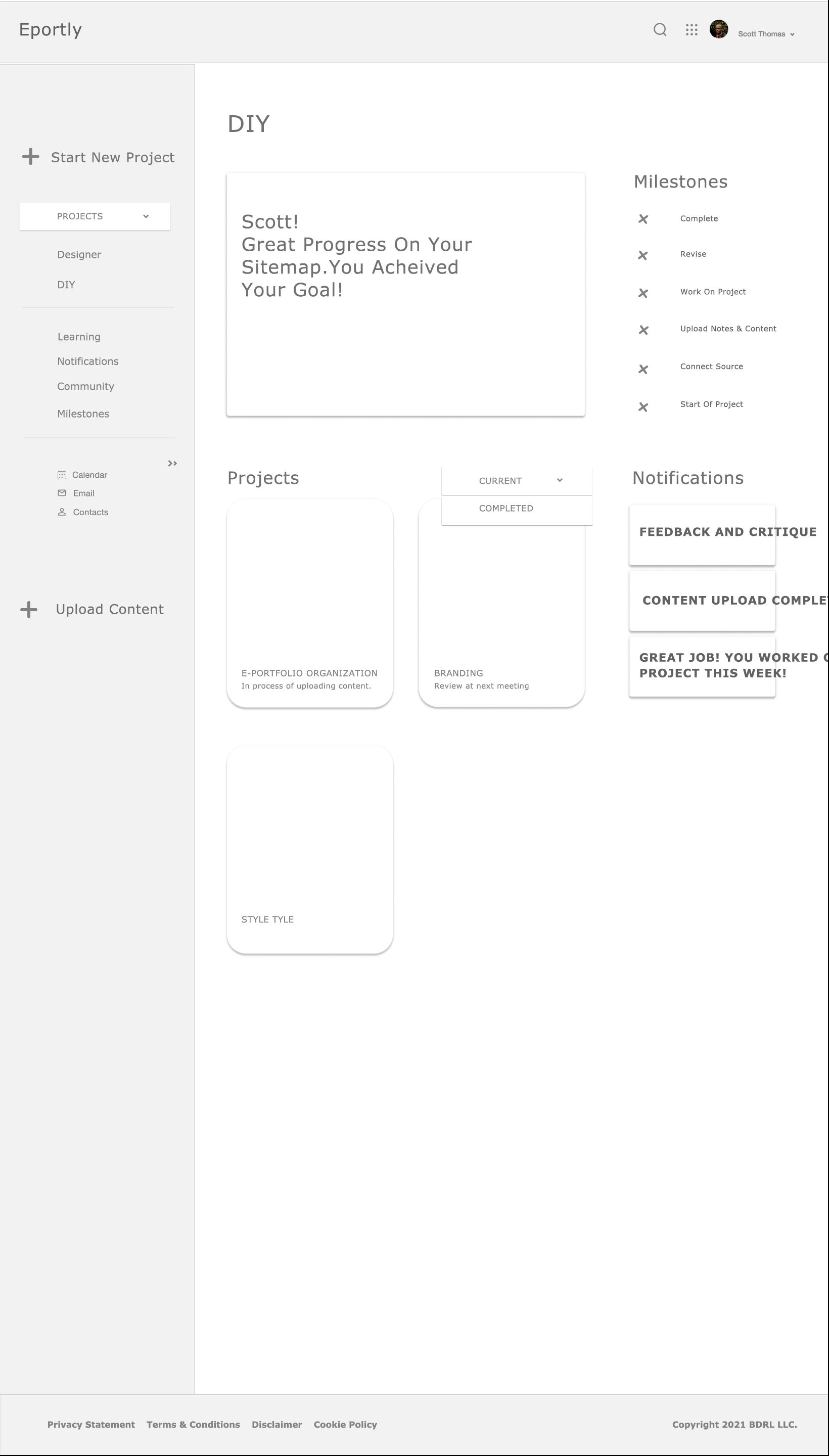
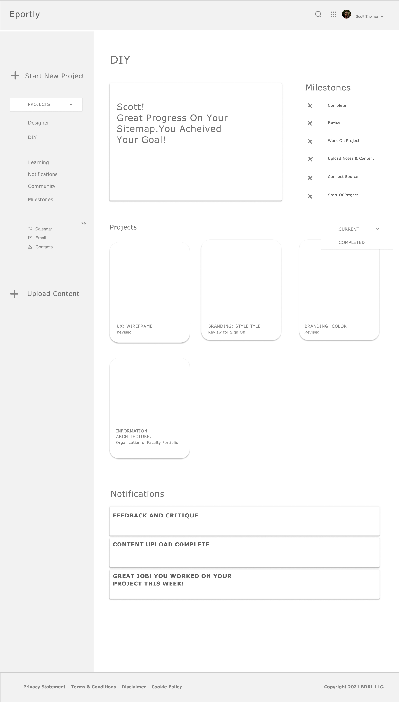
Eportly is a service application that helps faculty and students to organize and design their E-portfolio. It offers two service options:
Do it yourself. (DIY). The user designs their E-portfolio with the guidance and advising of a designer.
Do it for me. The user hires a designer to develop the E-portfolio for them.
Problem:
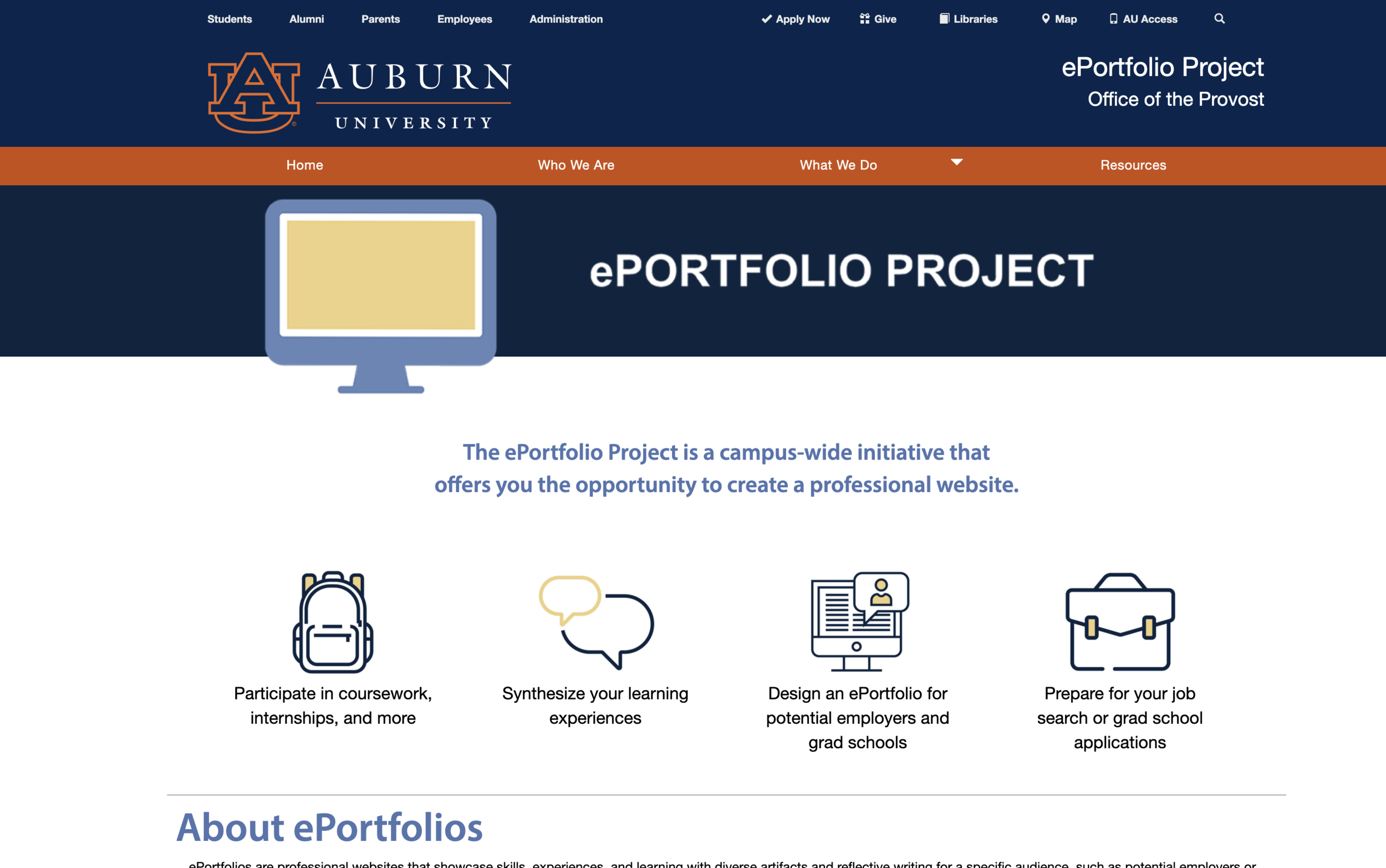
An E-portfolio (Education Portfolio) is a digital tool used by faculty and students to support academic achievements by highlighting work from a single course or overall experience. The collection of documents delivered in the Eportfolio allows educators and students to reflect on their teaching and learning process. Students are required to submit Eportfolios for graduate school and internships; and faculty are required to submit an E-portfolio for third-year review, tenure promotion, and position transfer/search. Despite the requirements of E-portfolios used in academia, and the importance of E-portfolios for professional growth, there is limited support for students and faculty to organize and create an E-portfolio.
Research
Research Methods
Faculty Training and Workshops
Eportfolio Faculty Workshop, Xavier University of Louisiana, 2018, 2020-2021
Eportfolio Faculty Training, Global Citizens for Campus, Communities, & Careers, Association of American Colleges & Universities, San Antonio, TX, 2019
Literary Review: News Articles, Google Scholar, JSTOR
Informal & Formal Discussions/Interviews
Course Assignment & Student Evaluations
Background Information: 5Ws
What is an E-portfolio?
An E-Portfolio is a collection of work (evidence) in an electronic format that showcases learning and teaching over time. It is a digital space for faculty and students to archive course materials and share their academic achievements with the local and global community. The Eportfolio can be created for individual courses or the gestalt of the individual’s academic experience.
Who needs an E-portfolio? Why?
Students: The E-portfolio allows students to archive and reflect on their learning process.
Faculty: The E-portfolio includes specific evidence of work and reflections for three major areas required in a Faculty E-portfolio:
Teaching and educational development.
Scholarship and the advancement of knowledge and its applications.
Service to the university and the community.
Why an Eportfolio?
Shows students’ achievements and academic growth.
Shows faculty teaching and educational development. Scholarship and the advancement of knowledge.
Shows service to the university and the community.
Students are required to submit Eportfolios for graduate school and internships.
Faculty are required to submit their Eportfolios for annual faculty updates, third-year review, finding a new position, and tenure promotion.
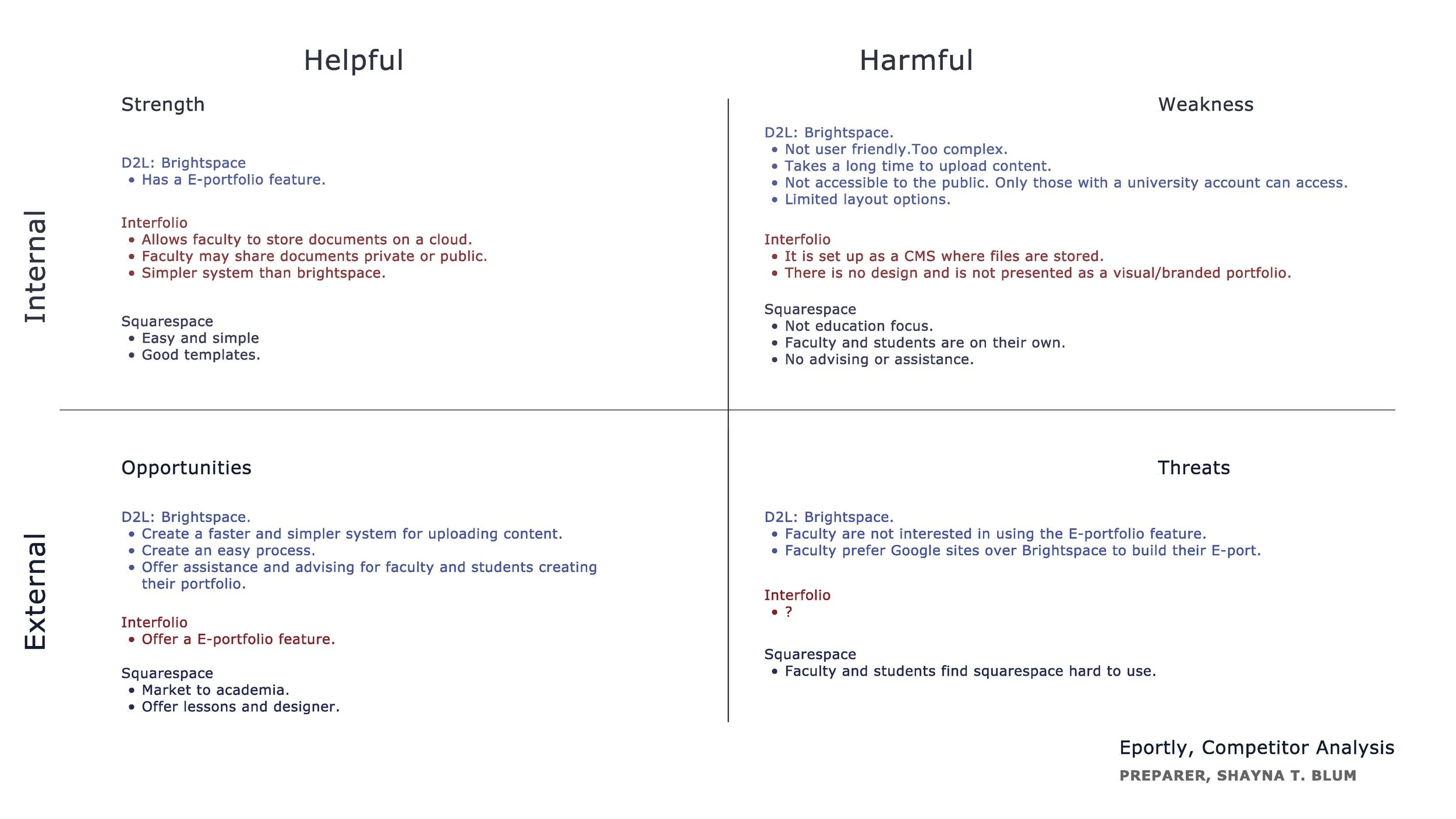
Competitors Analysis
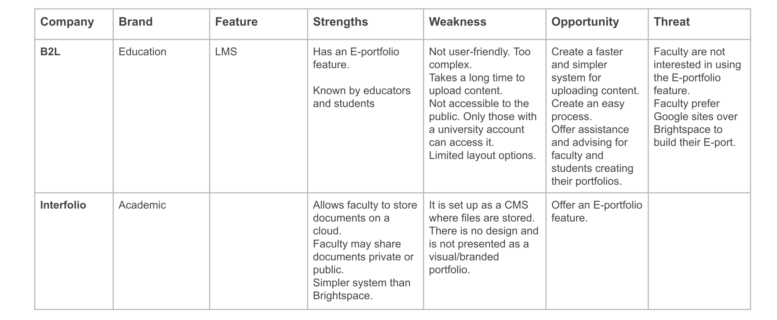
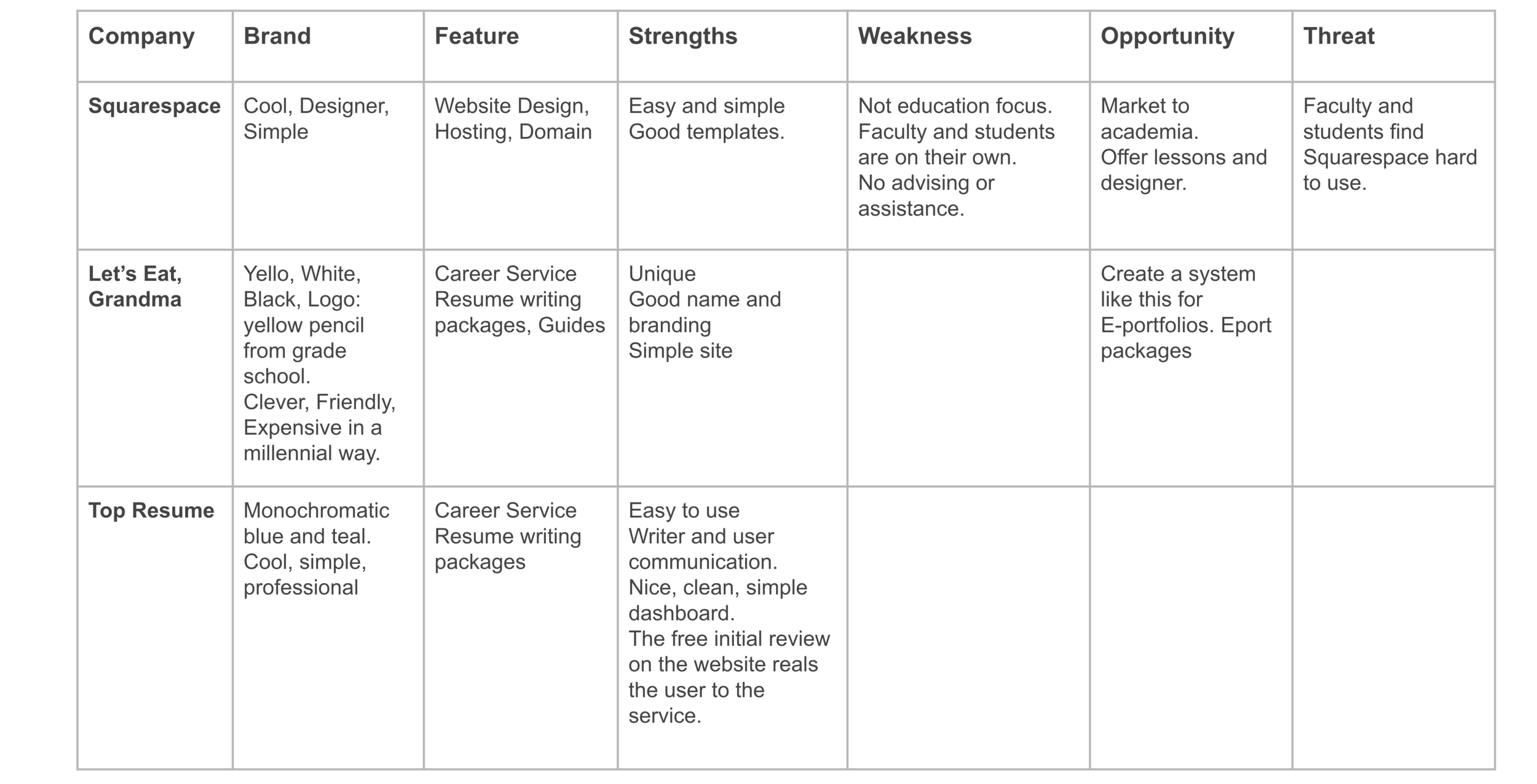
University Websites
Helpful
Often Heavy text.
Link to an LMS or outside resources.
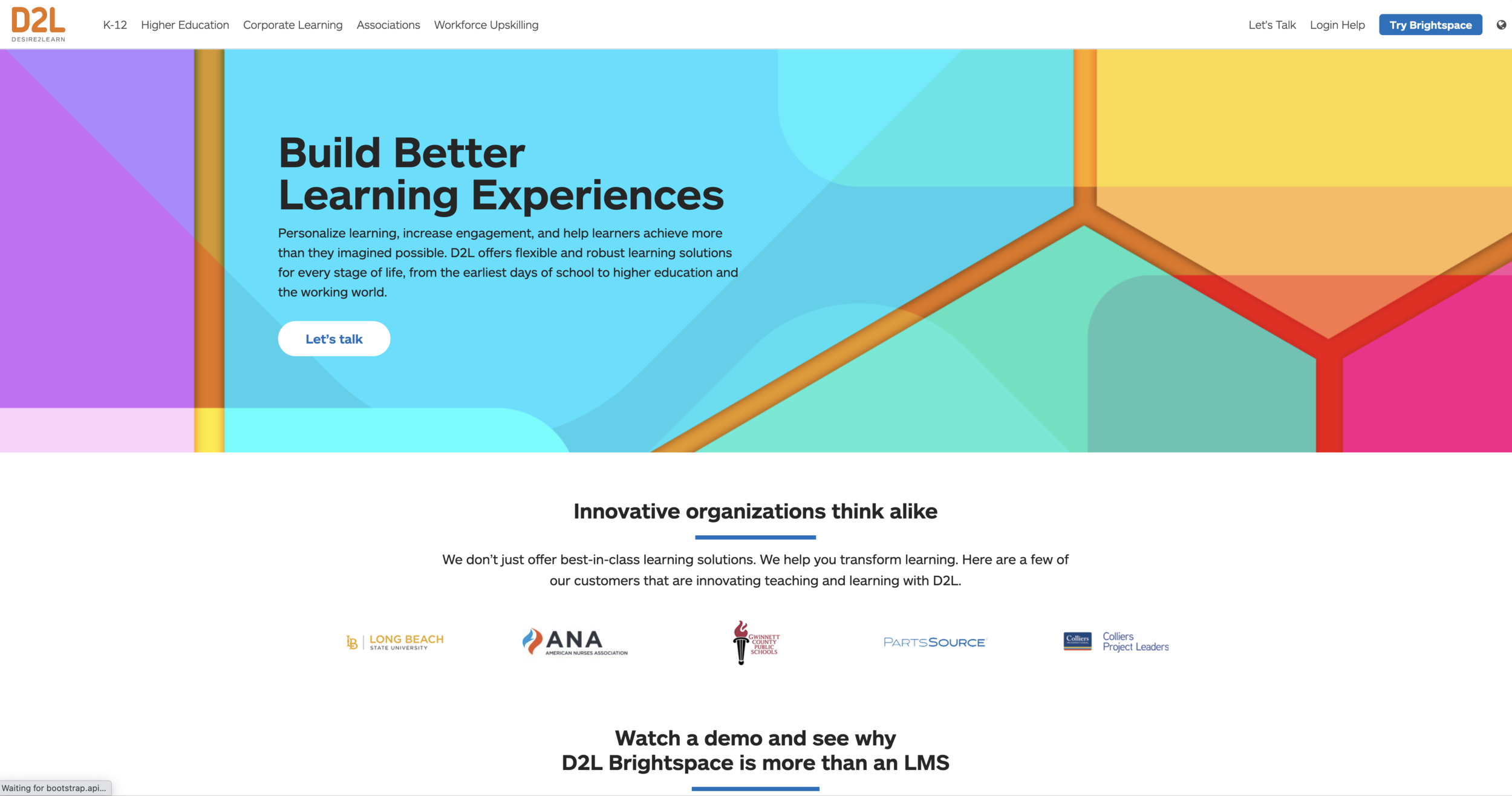
D2L, LMS
Has an E-portfolio feature
Takes a long time to upload content.
Not accessible to the public.
Limited layout options.
Faculty preferred Google sites over Brightspace to build their E-port.*
Let’s Eat, Grandma
Career Service
Does not offer eportfolio design services
Summary of Competitor Analysis
University Websites offer information and resources on how to create an e-portfolio.
Eportfolios can be created in specific LMS products such as Brightspace and Blackboard, however, the systems are slow to upload content, are limited in design, and can not be accessed by the public.
Reference to building the Eportfolios in Squarespace or Google assumes the user knows how to use the technology to design an Eportfolio.*
User Research: Faculty
Statistics
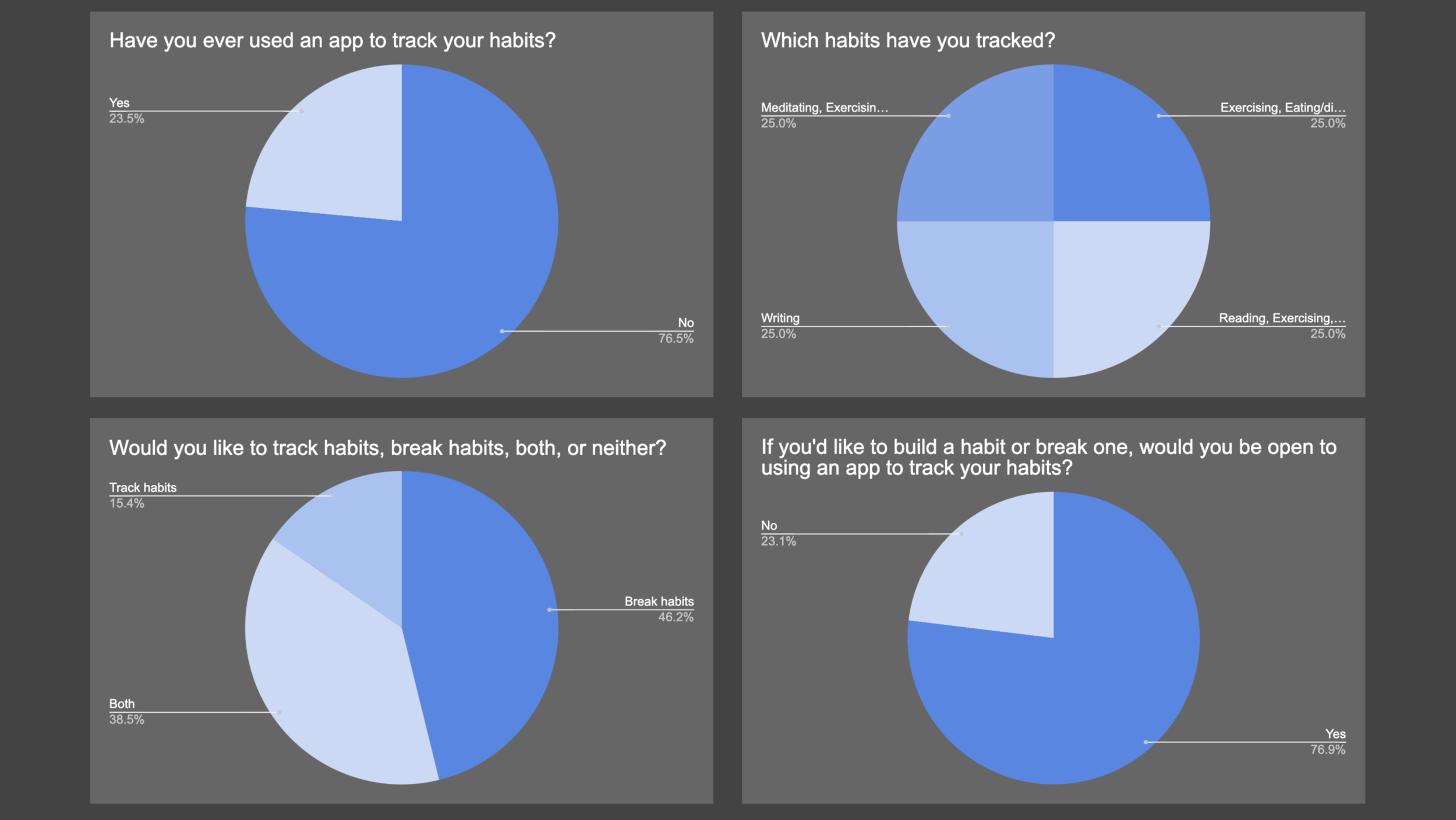
Survey and interviews with 30 faculty.
16% had created an Eportfolio for professional use.
16% had incorporated Eportfolios into a course.
56% were open to creating an Eportfolio for professional purposes or incorporating it into a course curriculum.
86% stated that lack of time was the main reason for not creating or learning how to create an Eportfolio.
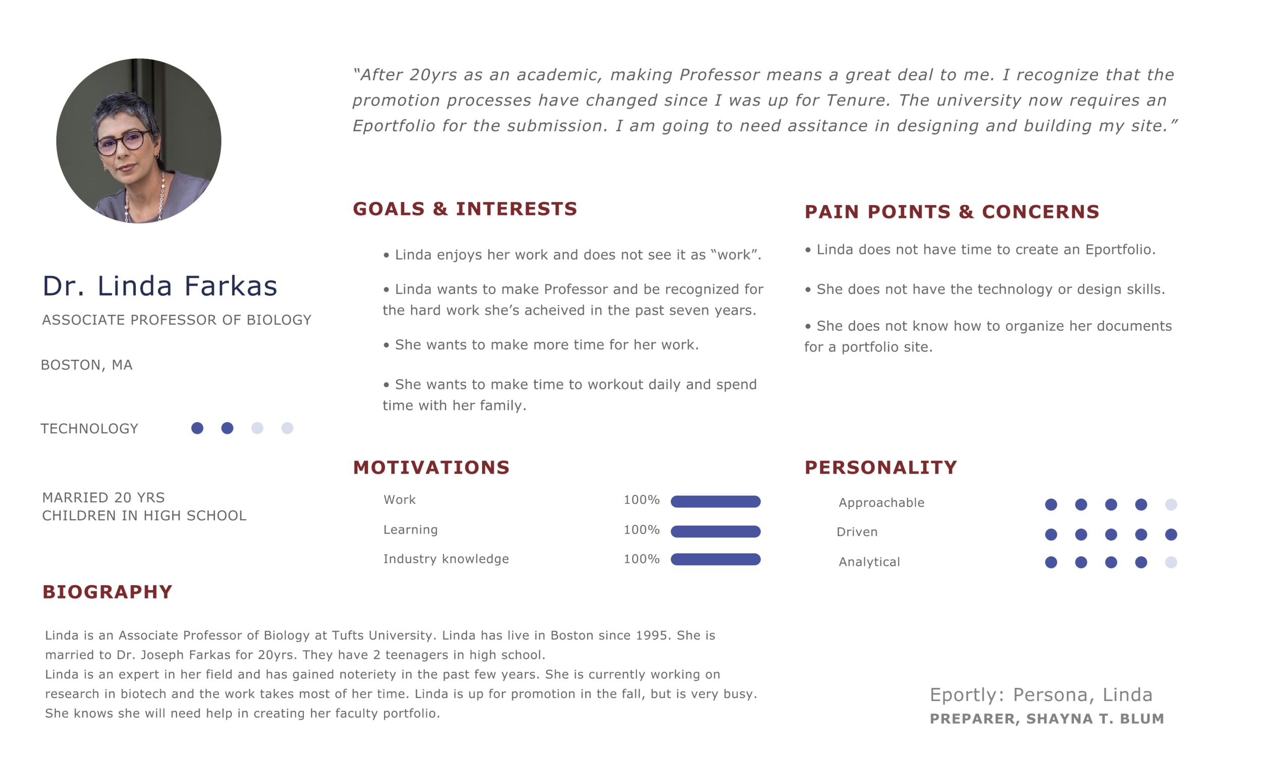
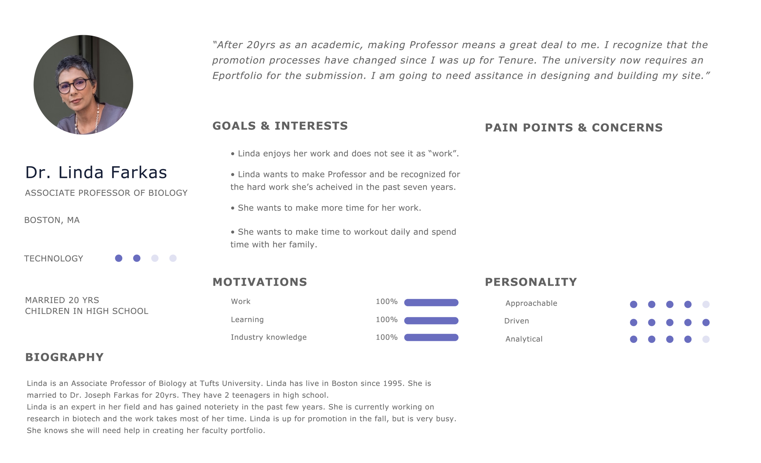
Faculty User Persona
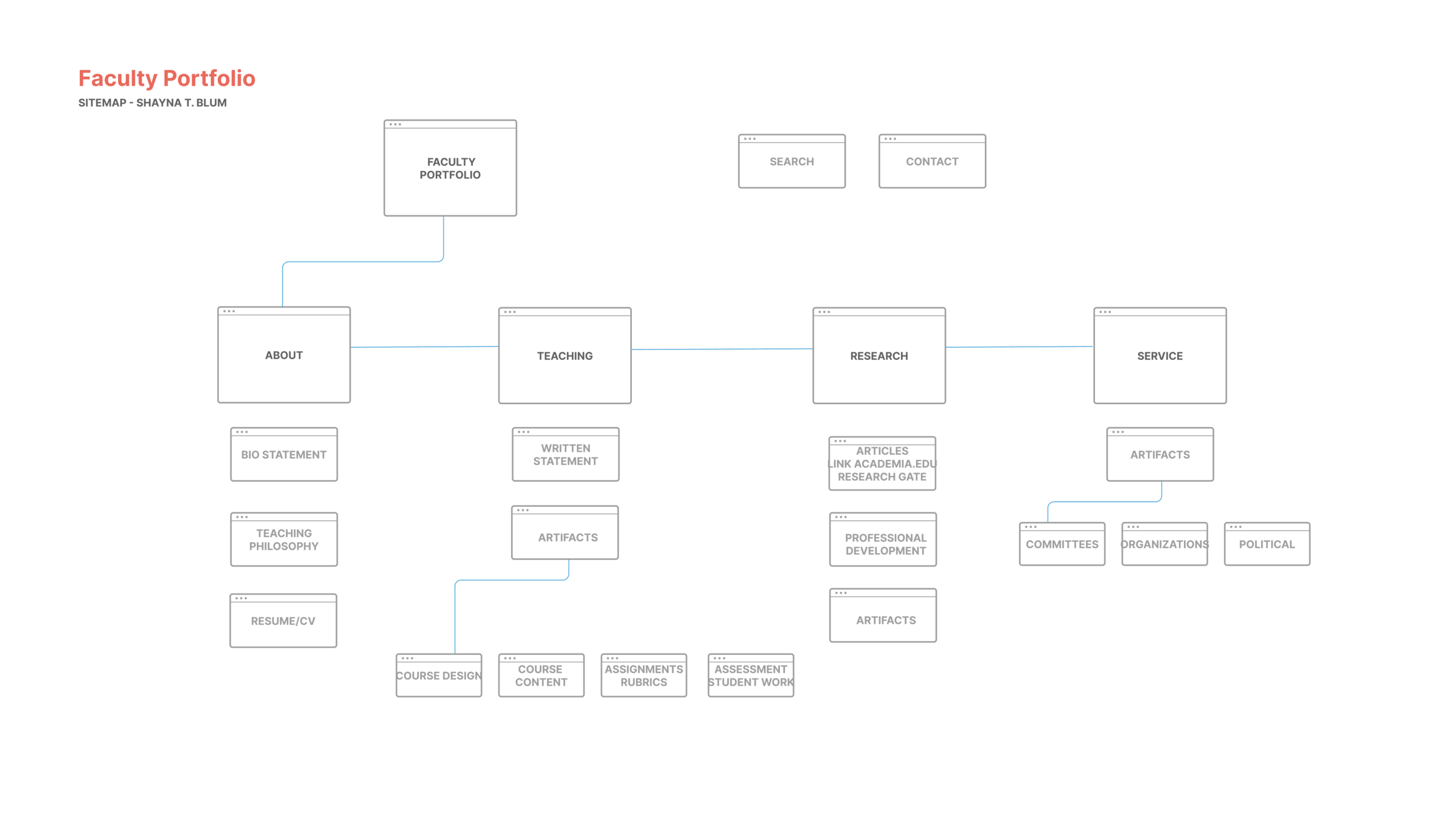
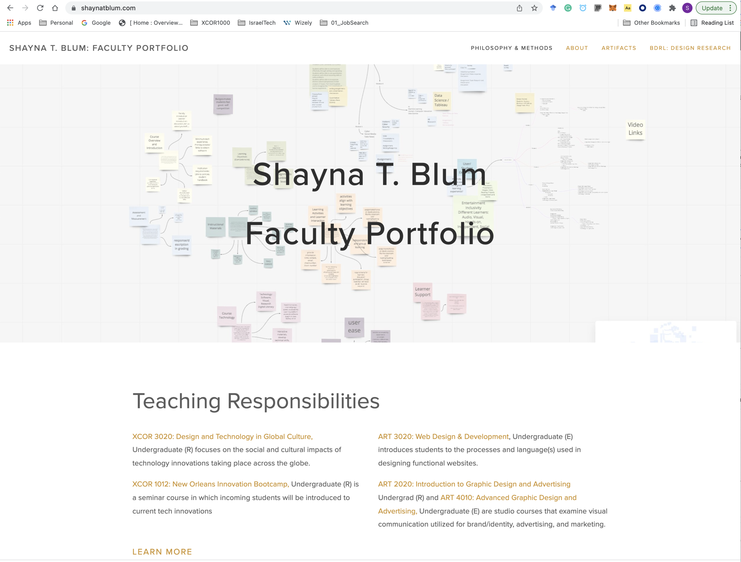
Faculty Eportfolio Sitemap
Faculty Eportfolio Examples
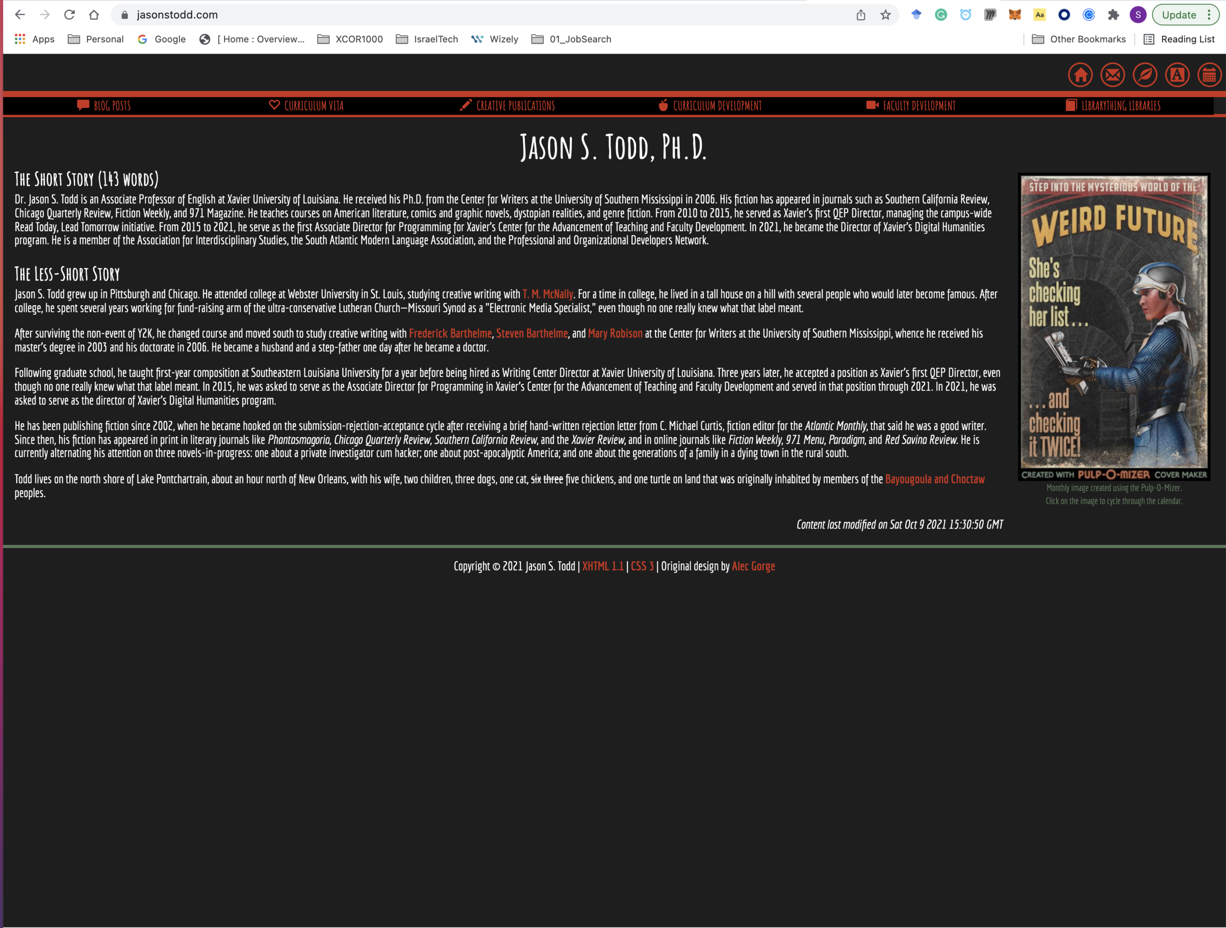
Dr. Jason S. Todd, Associate Director of Programming, Center for the Advancement of Teaching
WF Digital Sketch, Course Eportfolio: Graphic Design
WF Digital Sketch, Course Eportfolio: Web Design
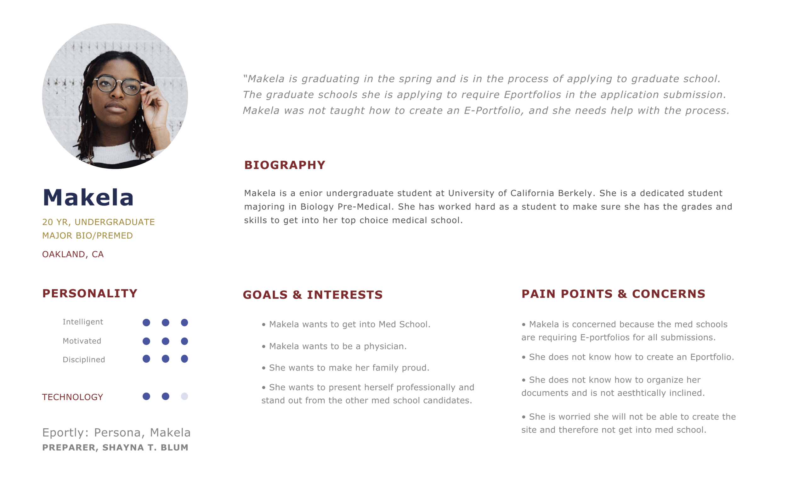
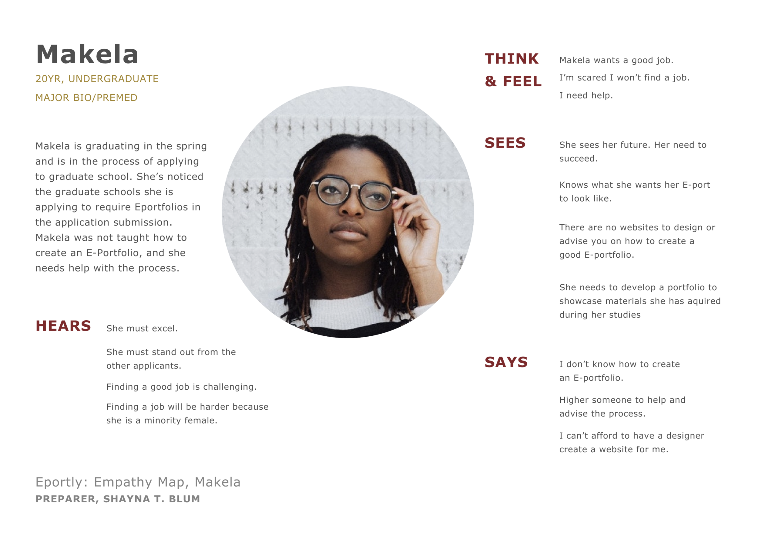
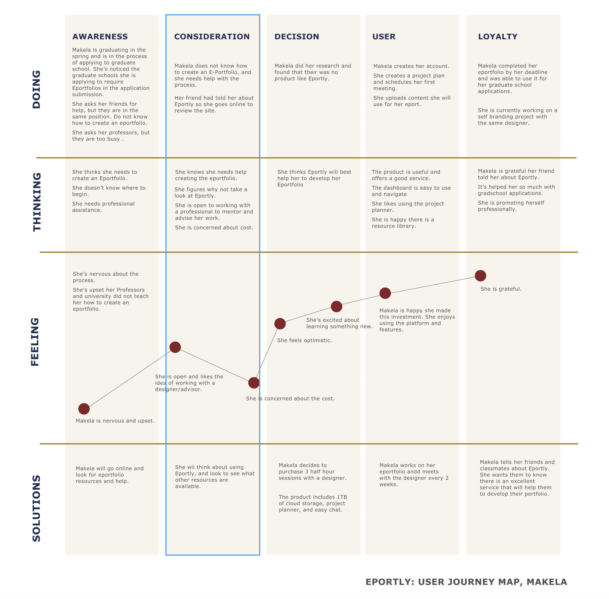
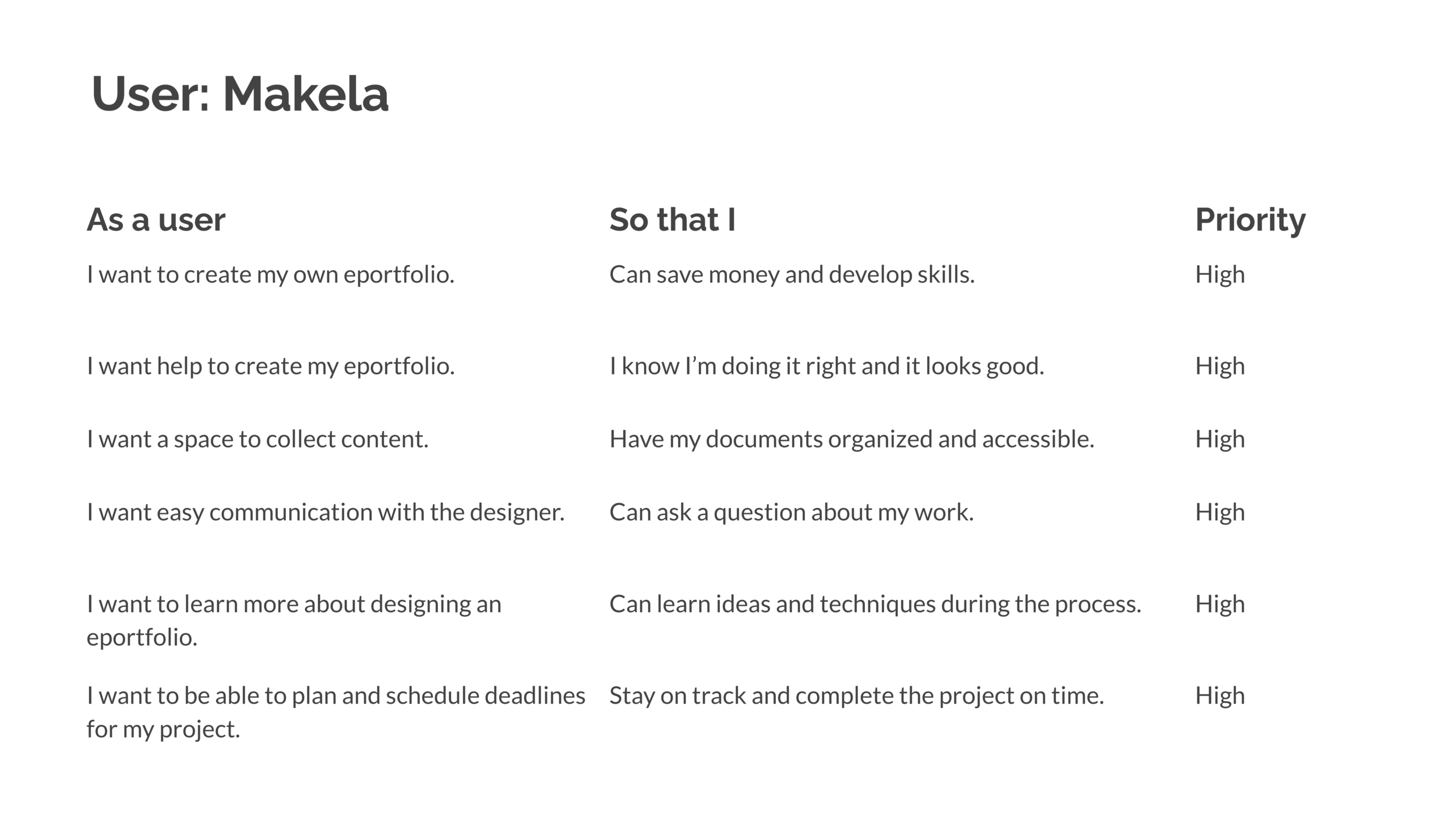
User: Student
Makela User Persona
Makela Empathy Map
Makela Journey Map
Makela User Story
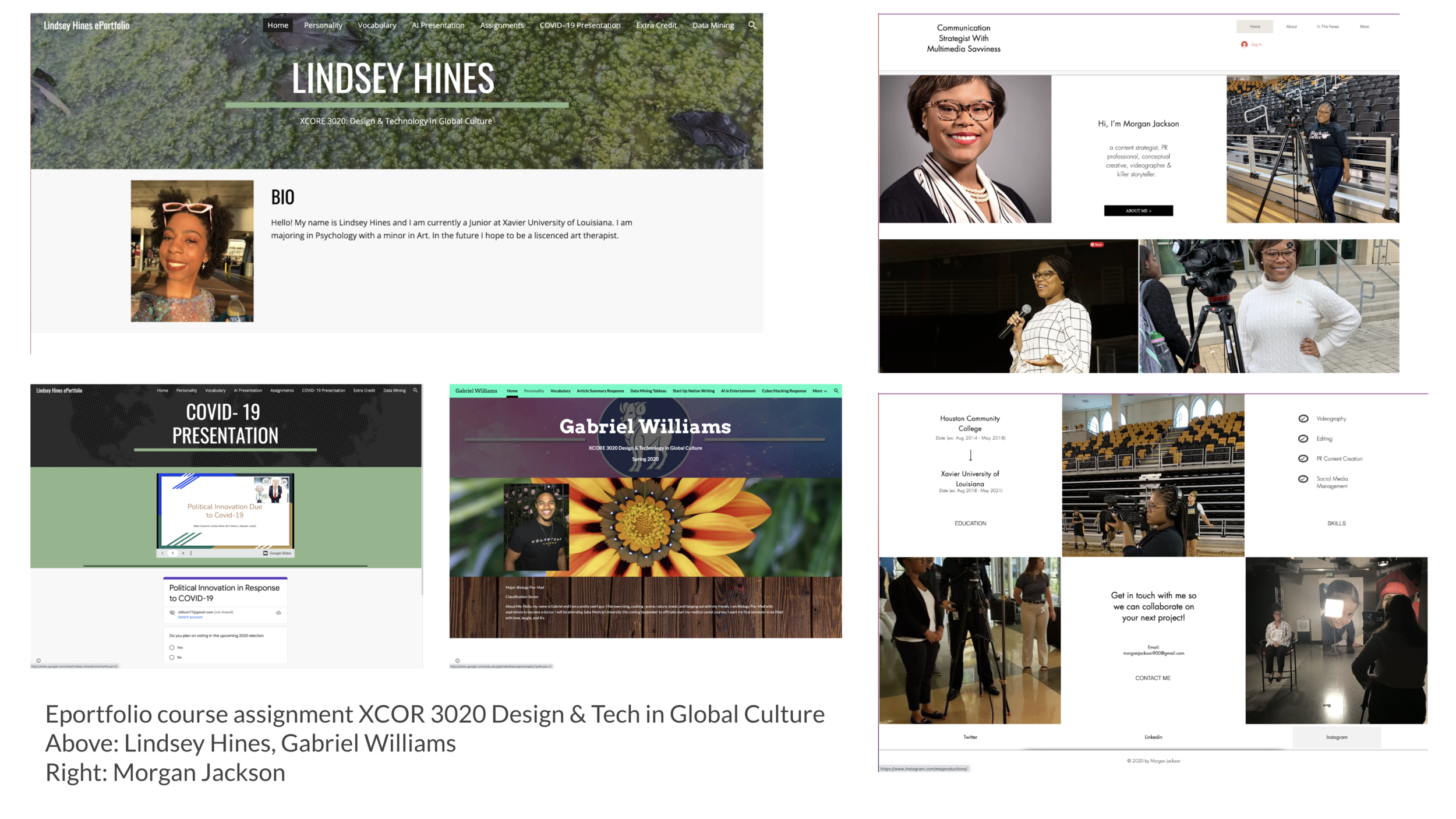
Student Eportfolio Examples
Design
Solution / Goals
Create an easy process in designing an Eportfolio.
Offer an E-portfolio feature.
Offer assistance and advising for faculty and students to create their portfolios.
Create a fast and simple system for uploading content.
Market to academia.
Create a system for E-portfolio design and lesson packages.
Service & Features
Do it yourself. (DIY). The user designs their E-portfolio with the guidance and advising of a designer.
Do it for me. The user hires a designer to develop the E-portfolio for them.
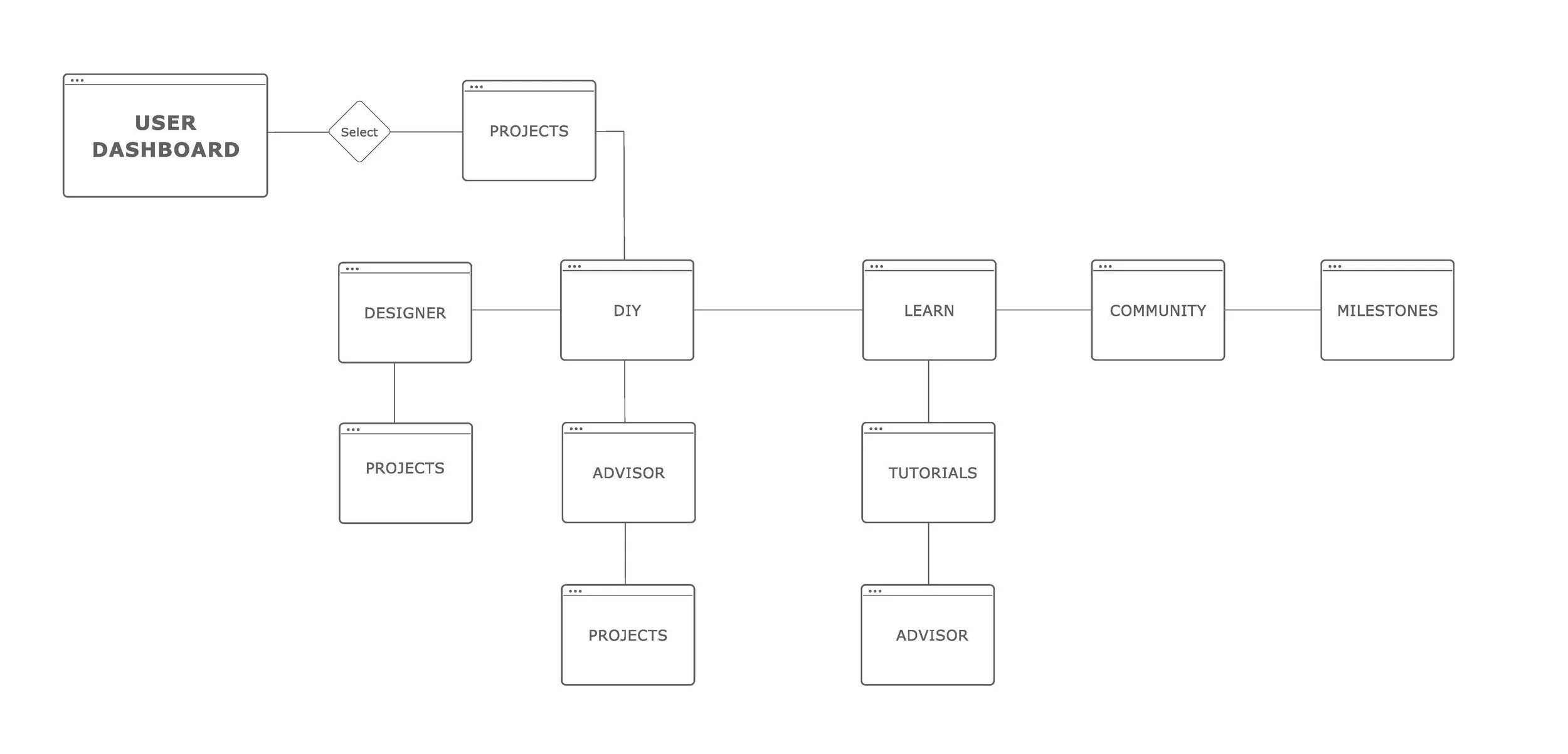
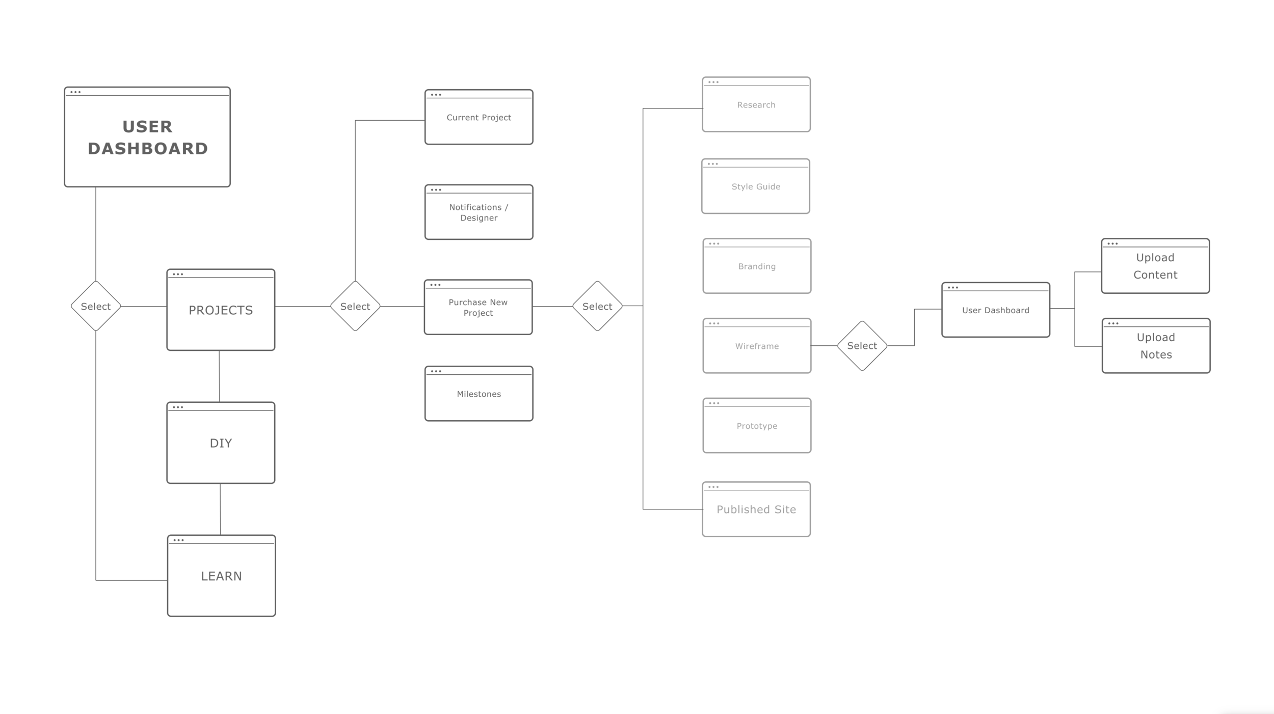
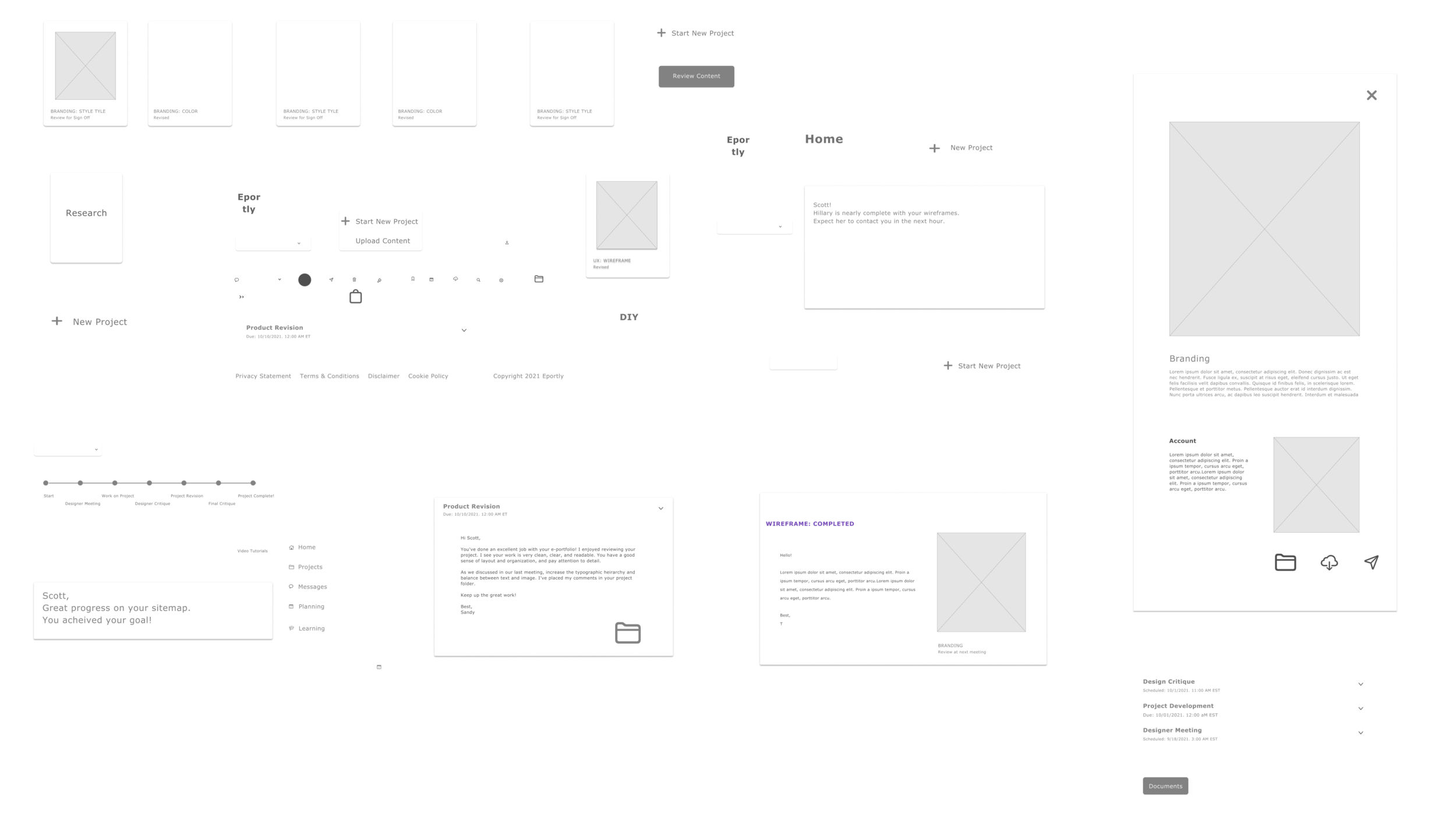
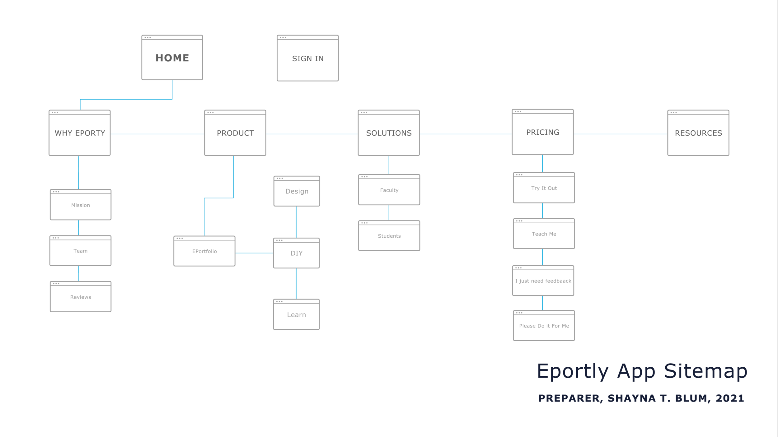
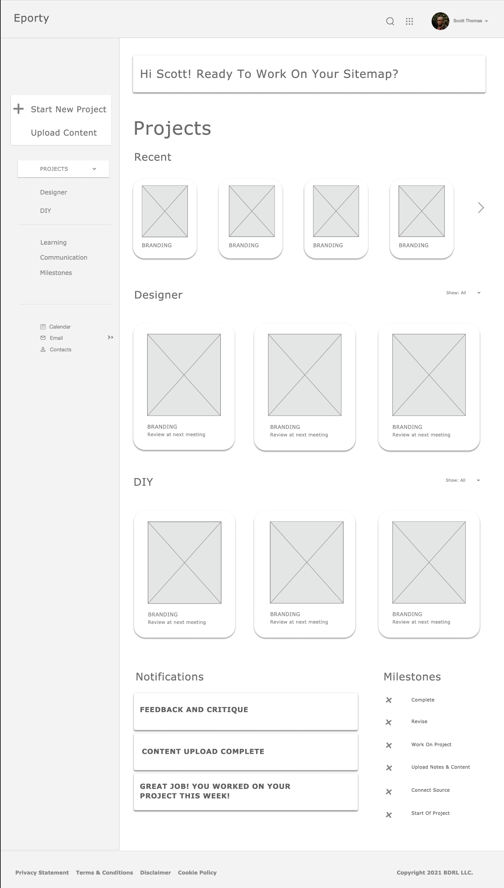
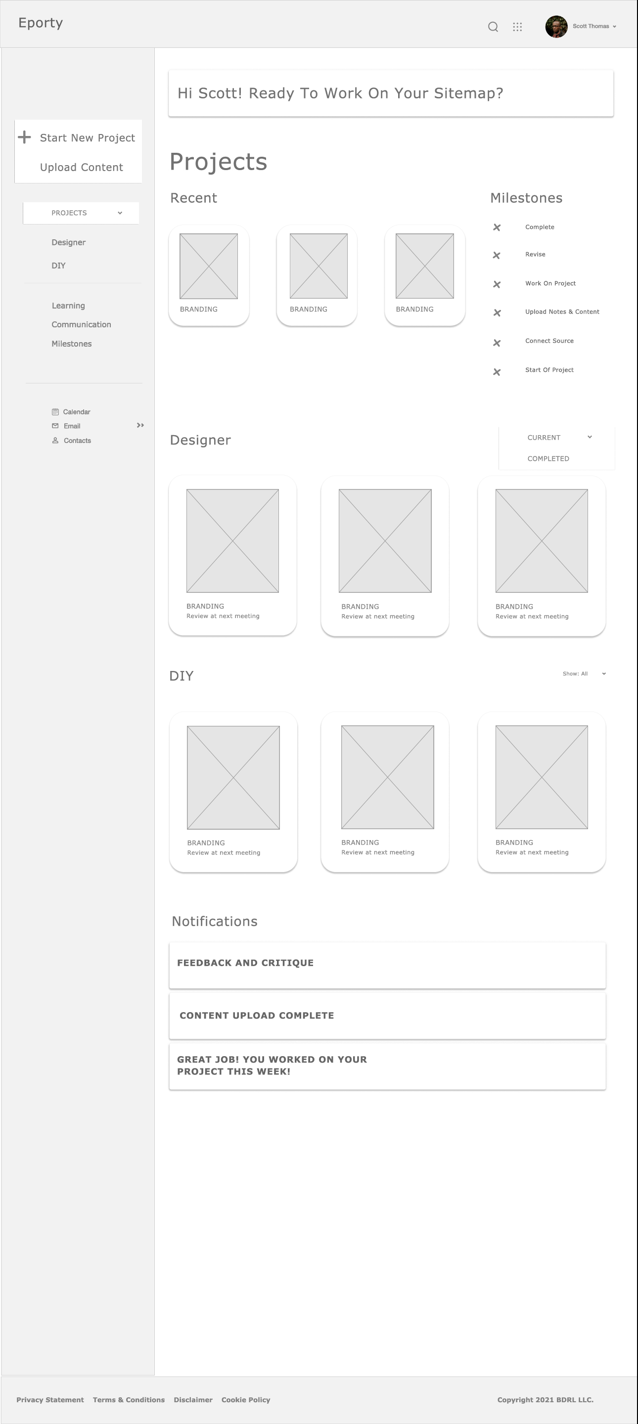
Eportly Application Site Map
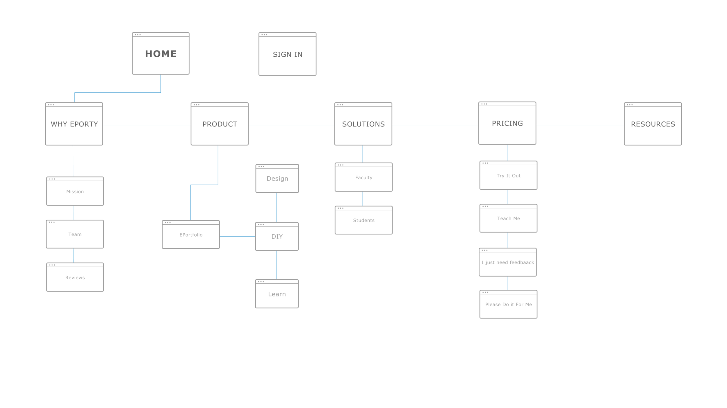
Eportly Website Site Map
User Flow: Project
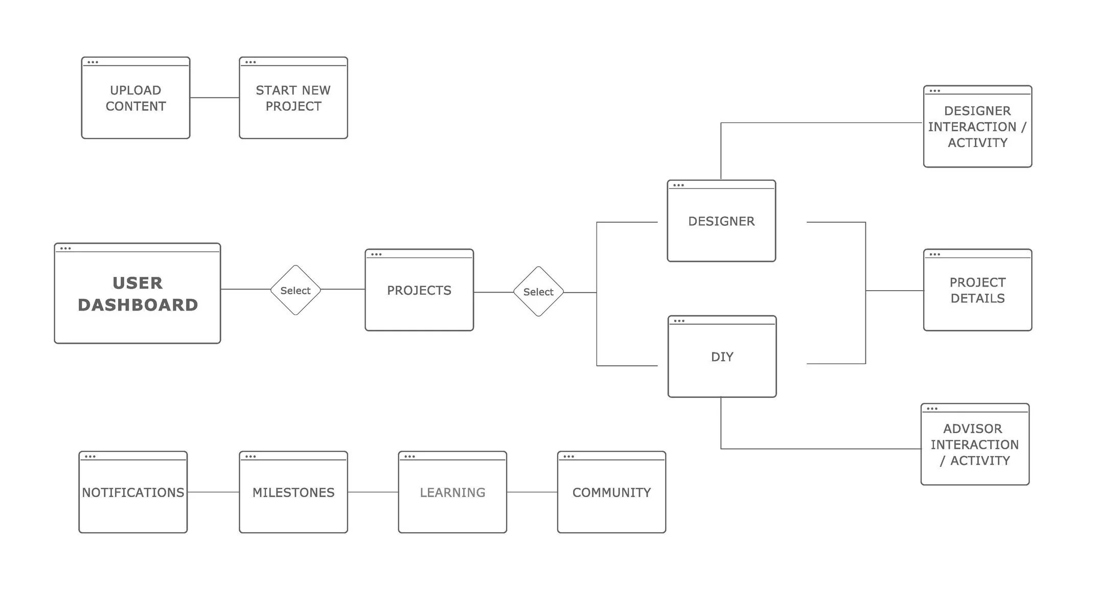
User Flow: New Project
Wireframes
Digital Sketches
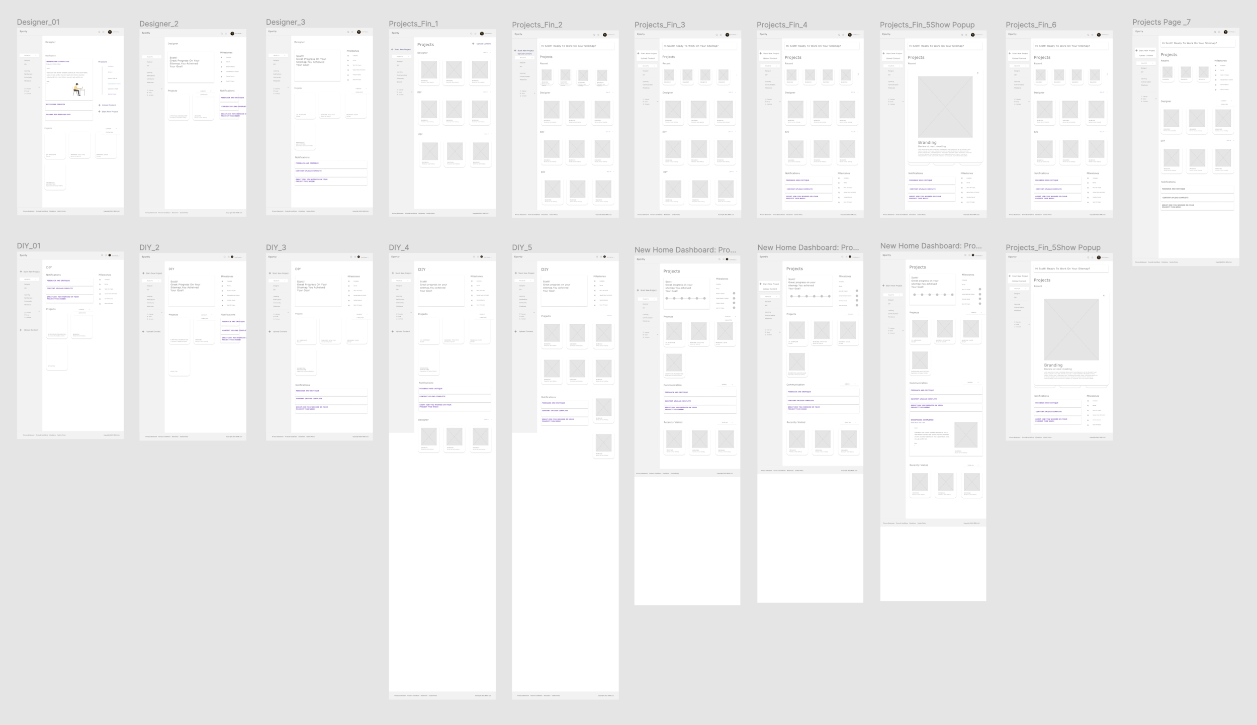
Wireframes Revise & Clean
Wireframe Components
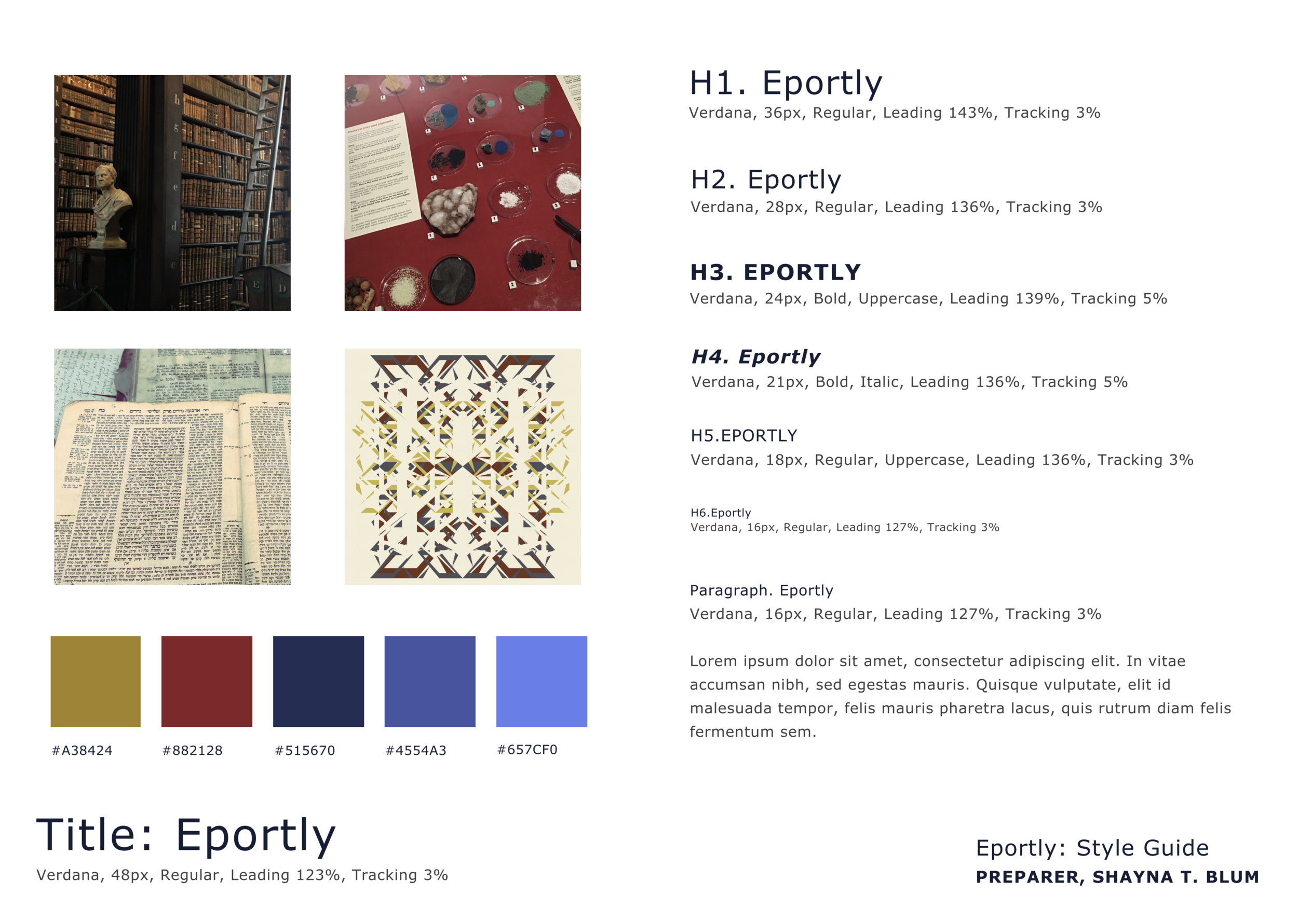
Branding
Mood Board

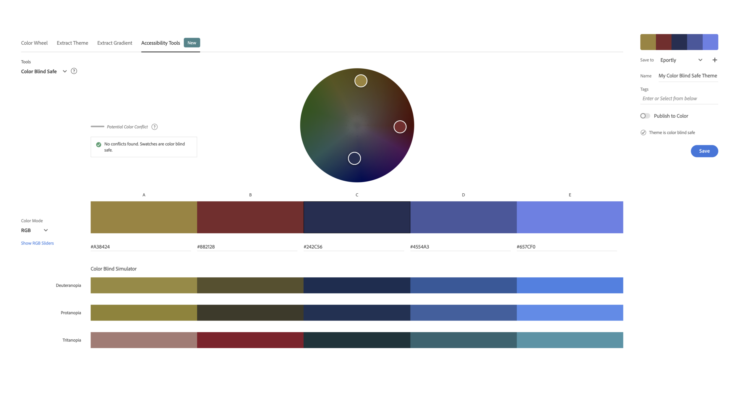
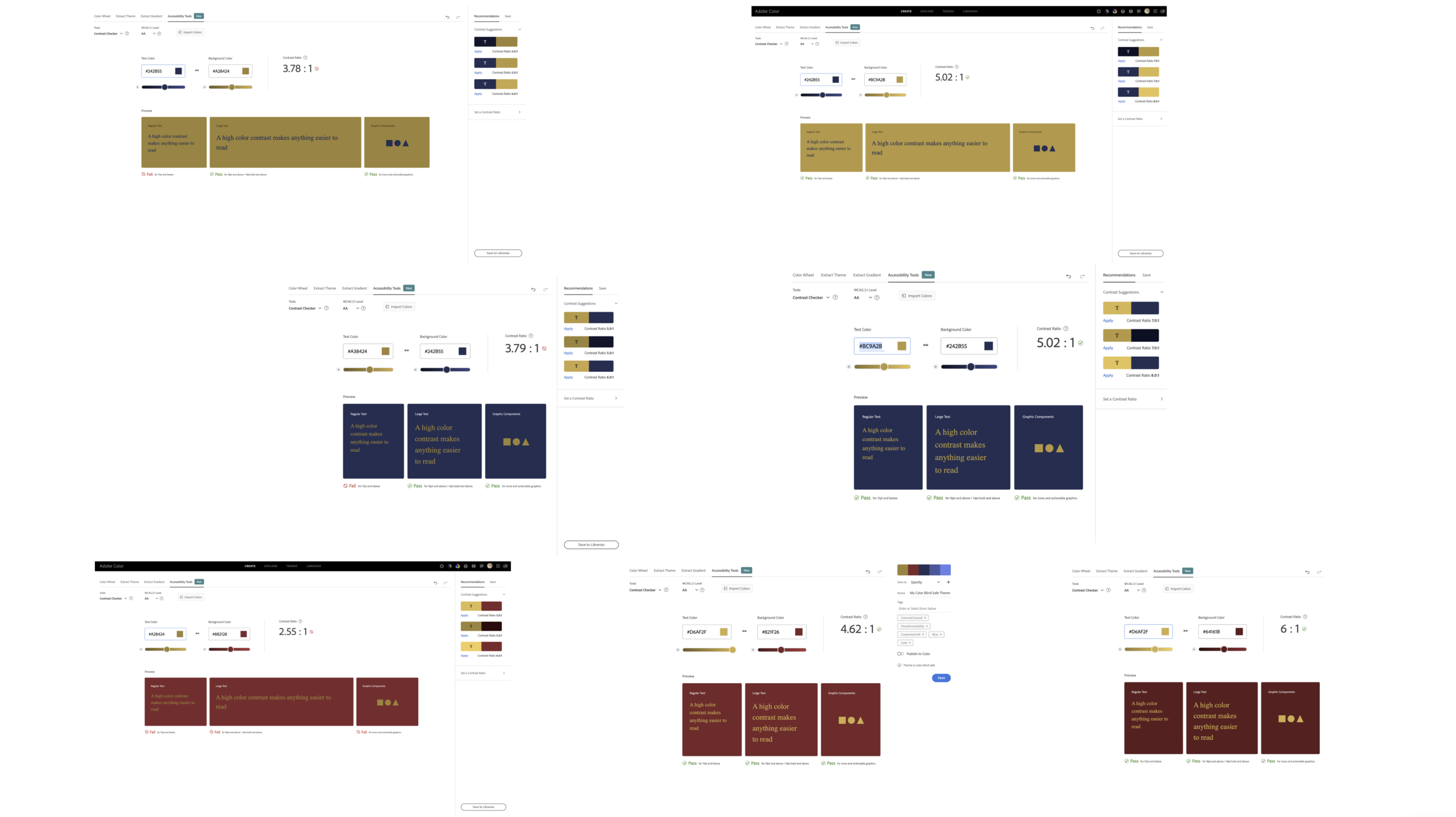
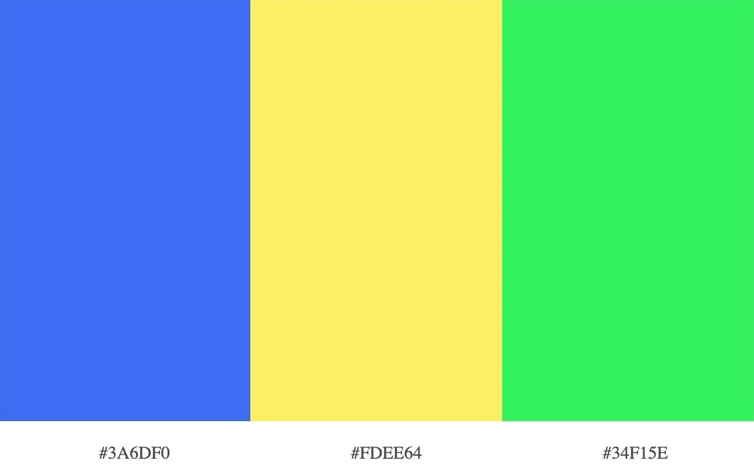
Color Selection & Accessibility
Style Guide
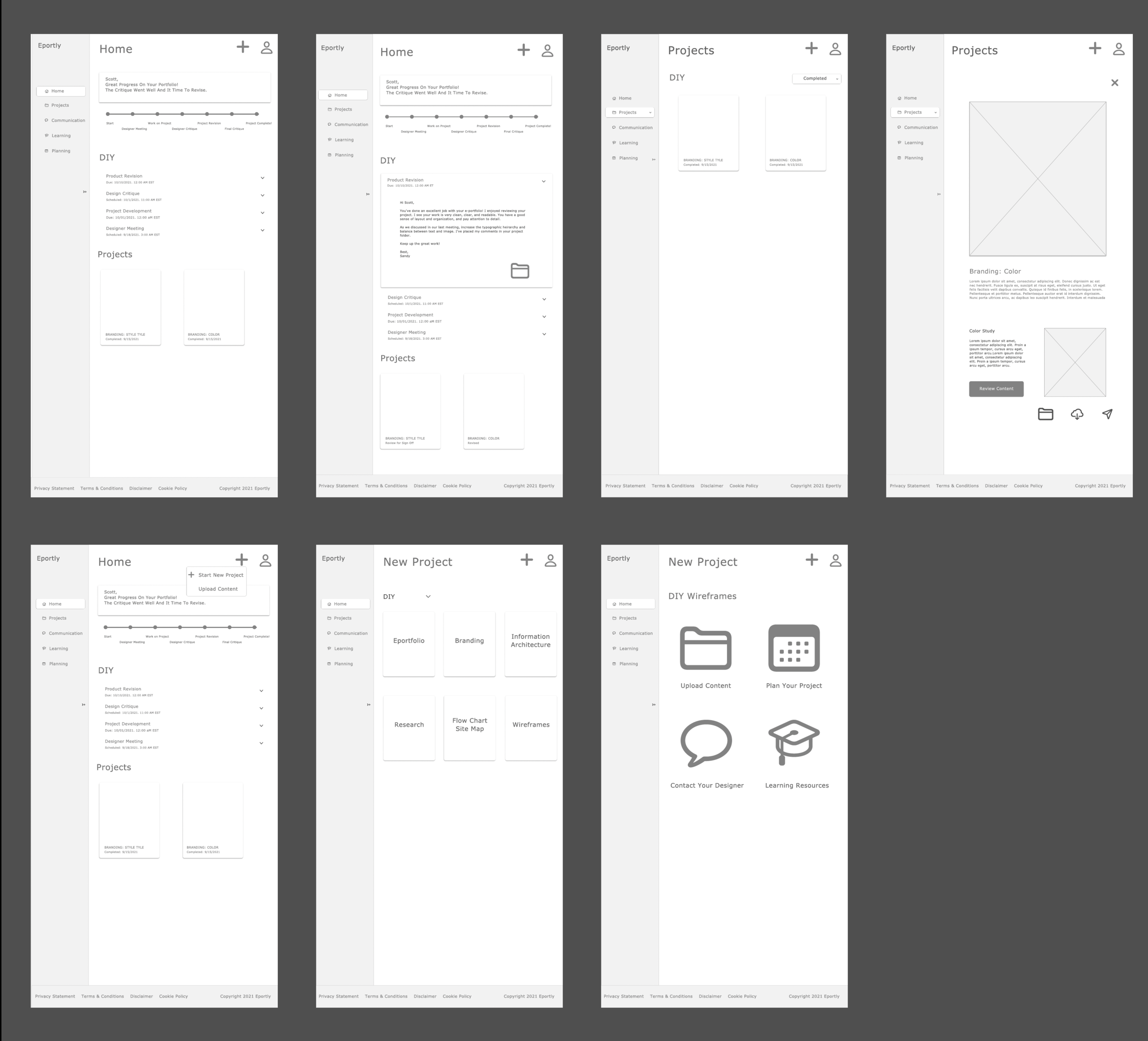
Hifi Wireframes
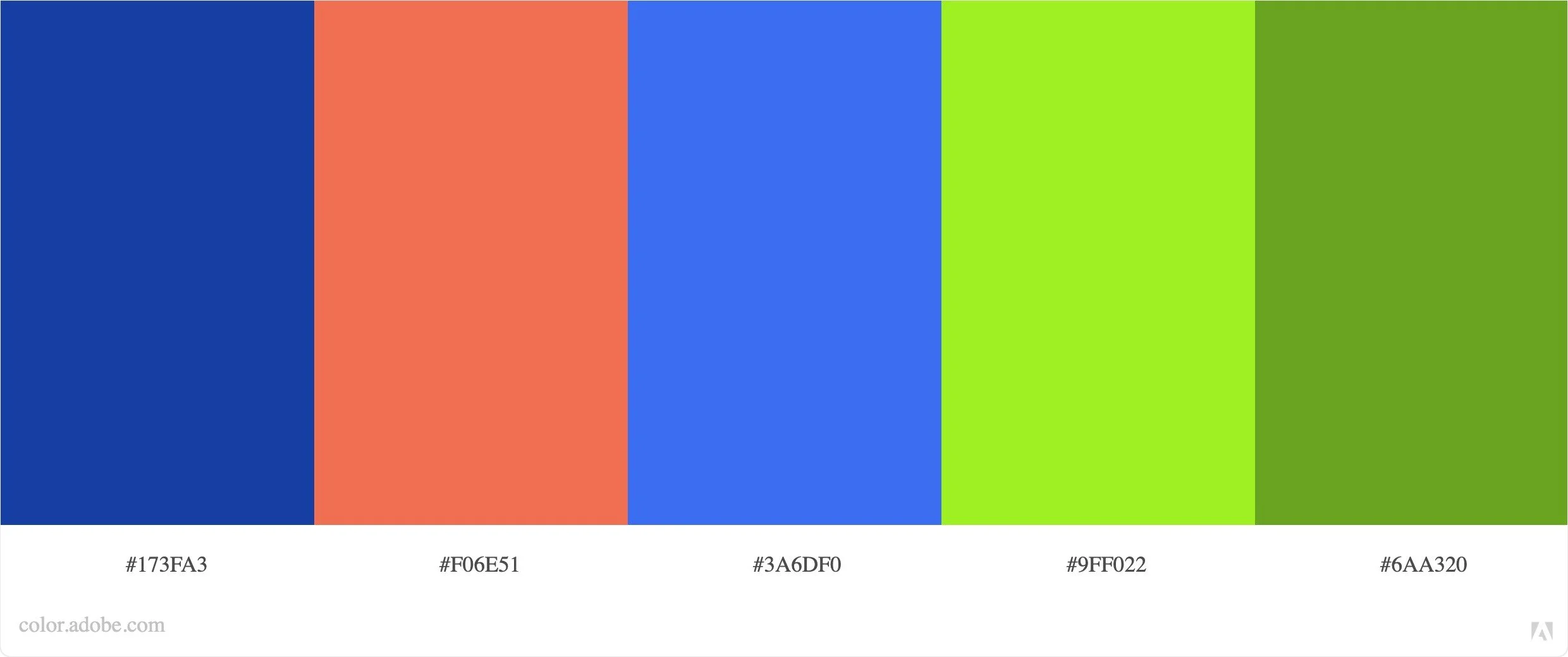
Color Options
Revisions
Component Revisions
Next Steps
Frames; Purchase, Planning, Message, Learning
Color and Components
High Fidelity Prototype
Test, Evaluate
Revise
Artifacts
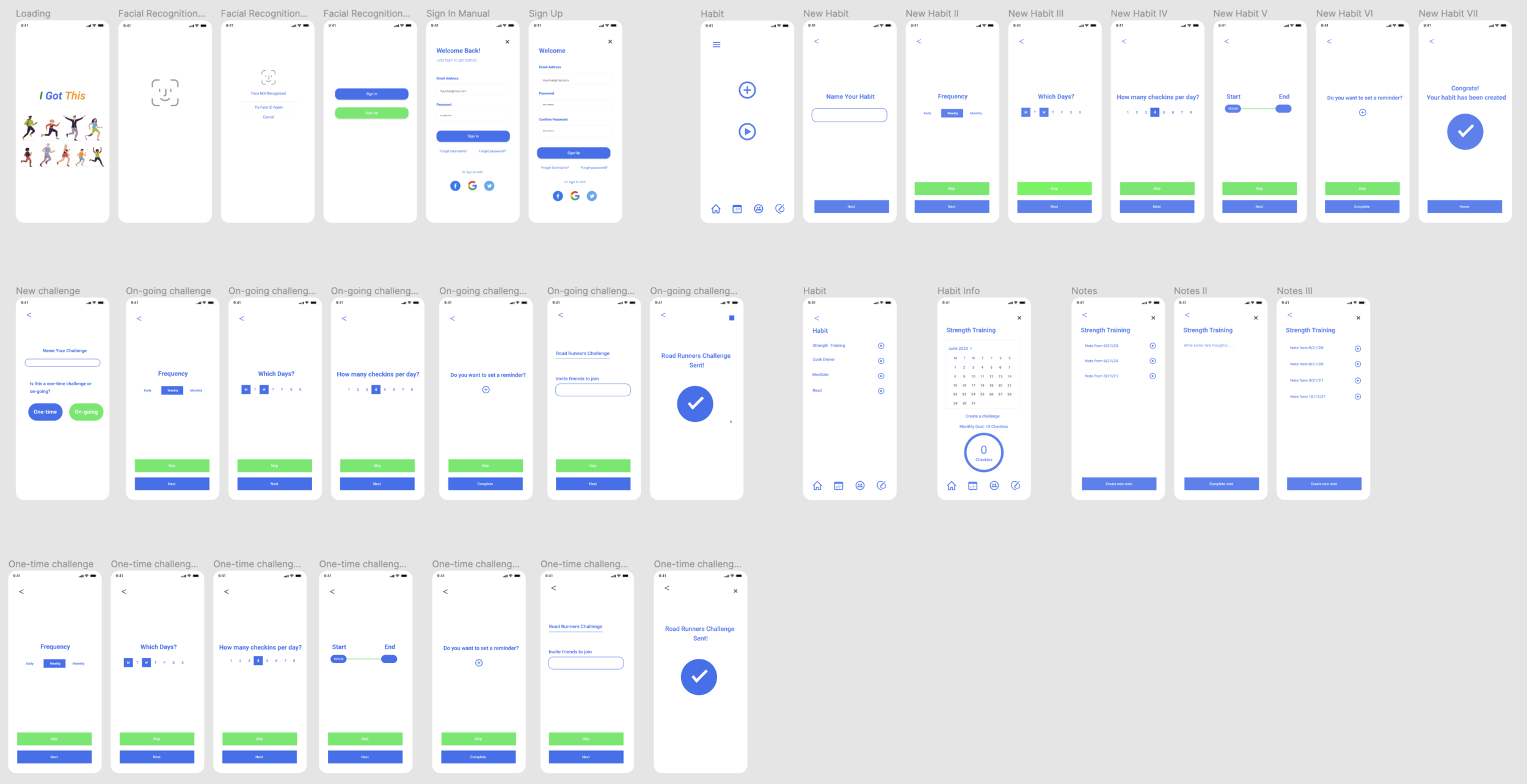
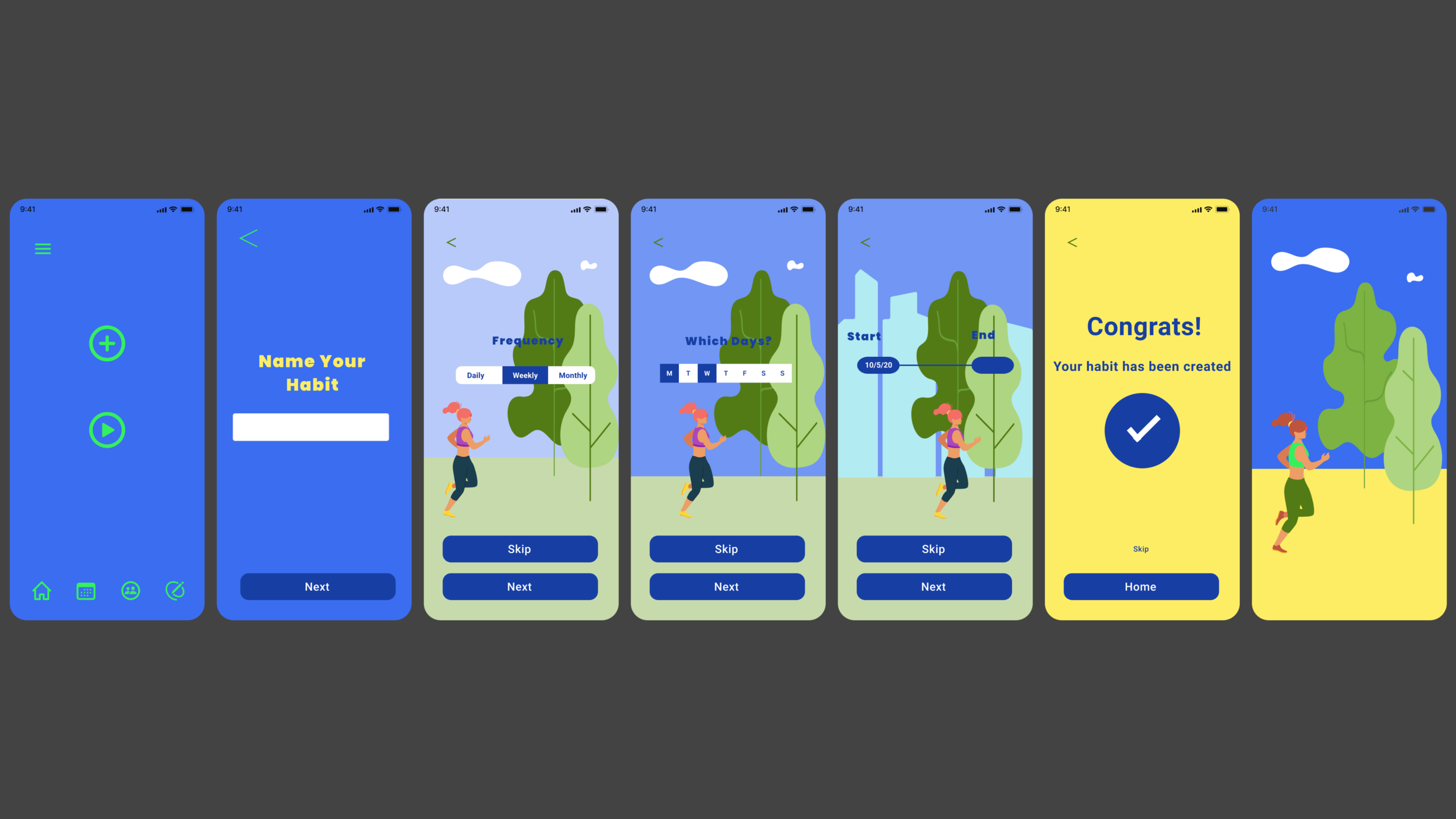
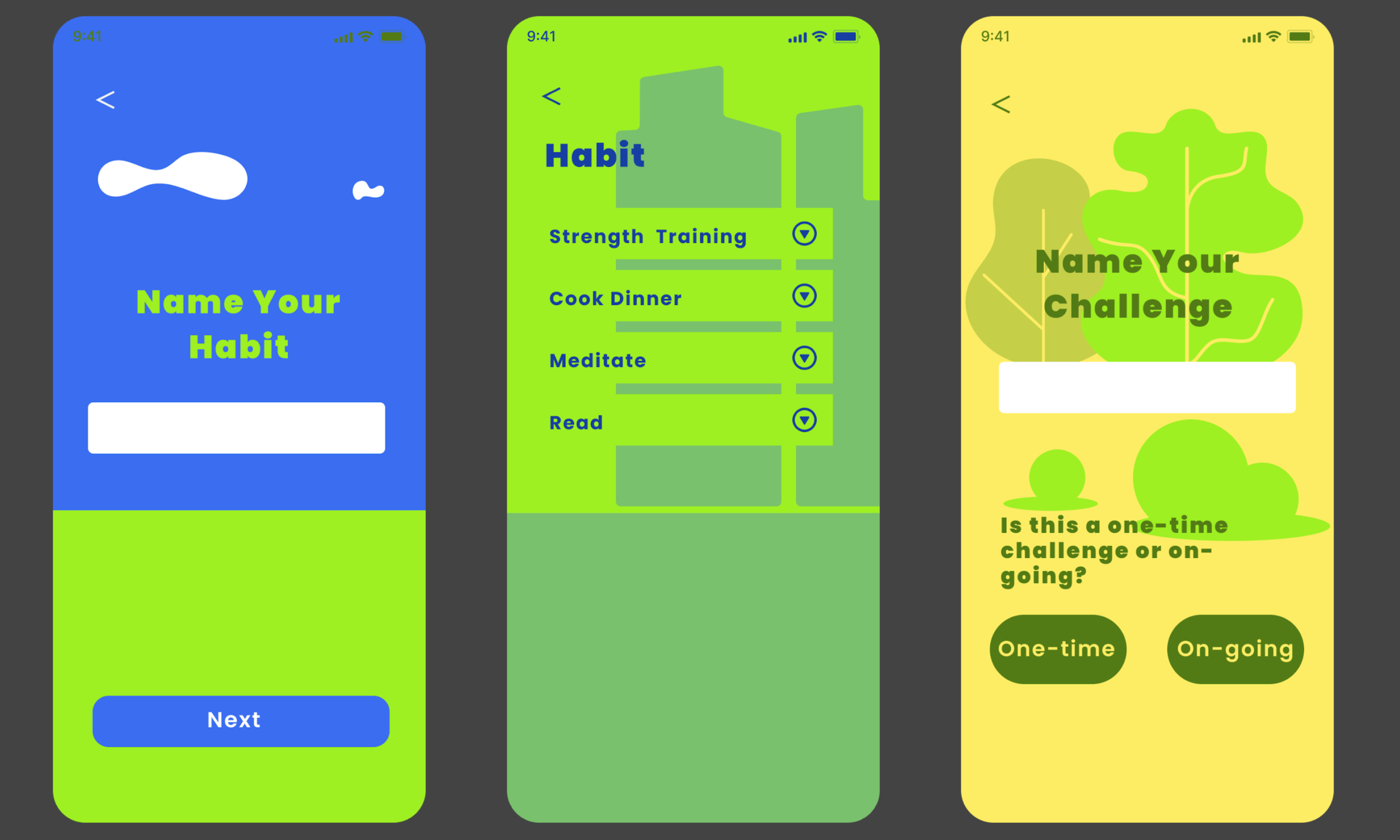
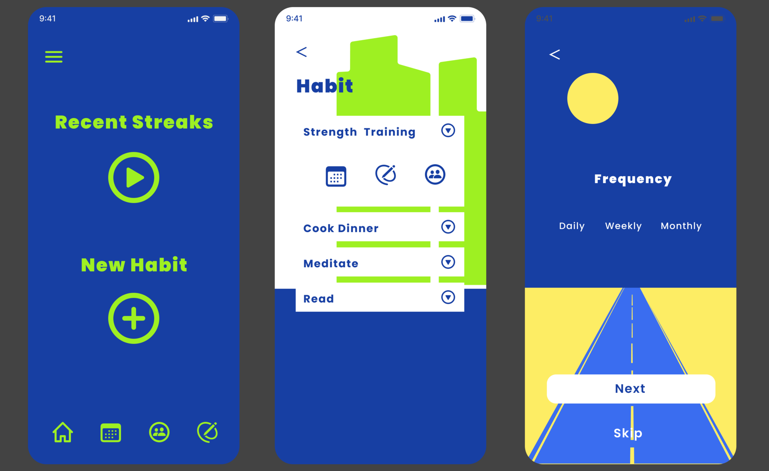
I Got This
Role: Product Design, UX Research, UX Design, Branding, UI
Overview:
I Got This is a habit app built for users to form good habits through community and motivation.
Background
61% of Americans are trying to break unhealthy habits developed during the coronavirus pandemic.
Gen Zers and millennials are most impacted by unhealthy pandemic habits, especially related to work-life balance and substance abuse. 22% of Gen Zers cite poor work-life balance, while 20% of millennials cite alcohol struggles.
Screen time is the most common bad habit that both men and women want to curb.
Questions
Why develop good habits?
What are ways to develop good habits?
Why break bad habits?
What are ways to break bad habits?
Research & Design
Market, Competitor, User
Literary Review and Database
Survey & Interviews
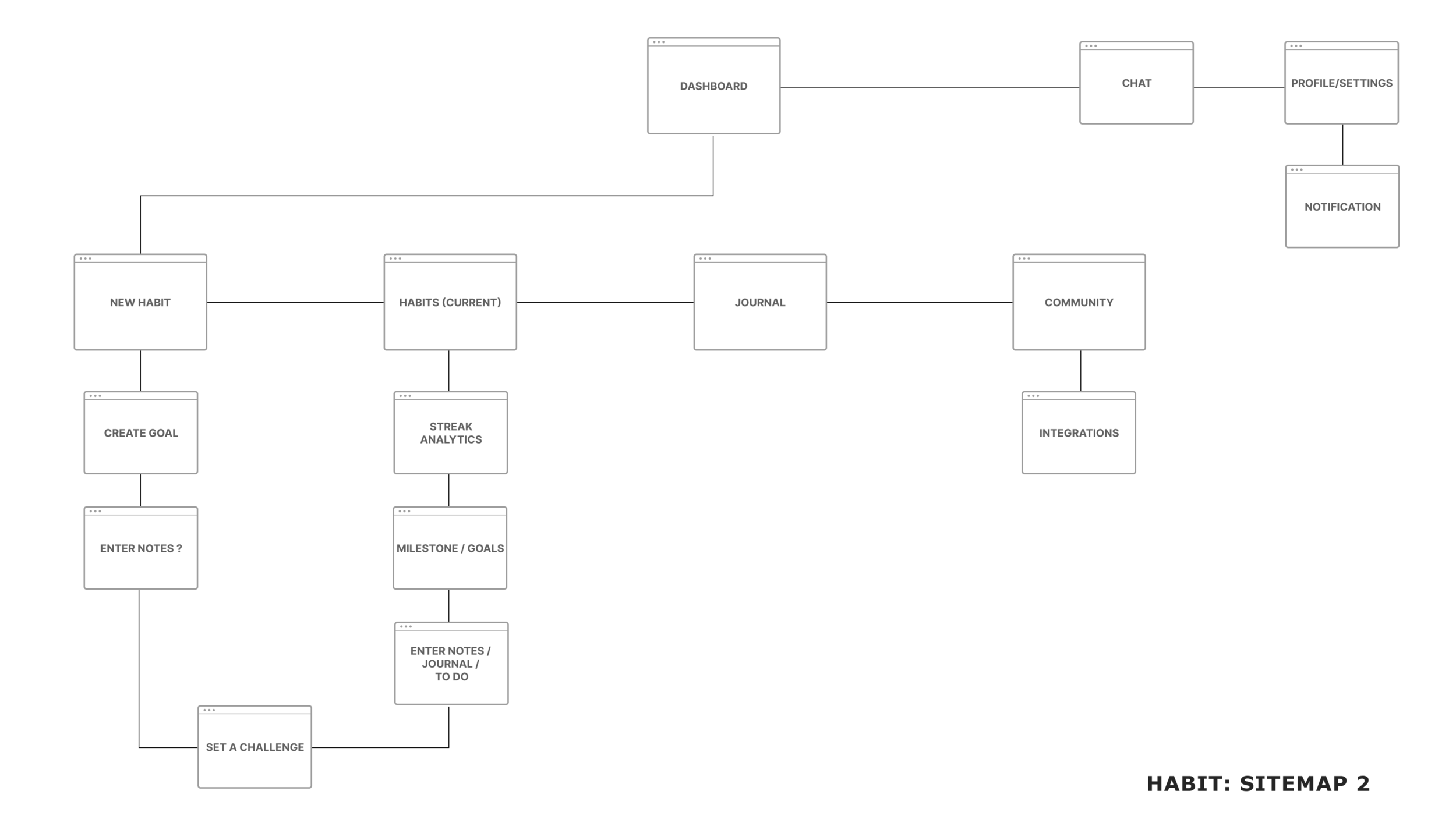
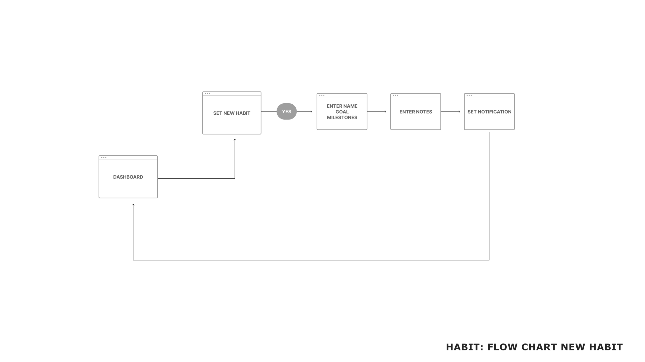
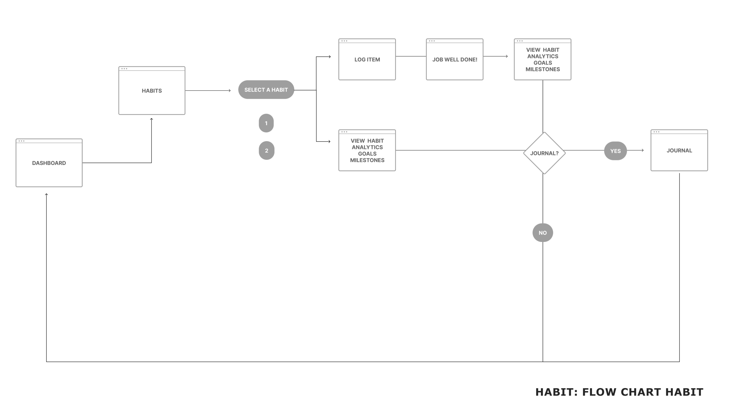
Sitemap
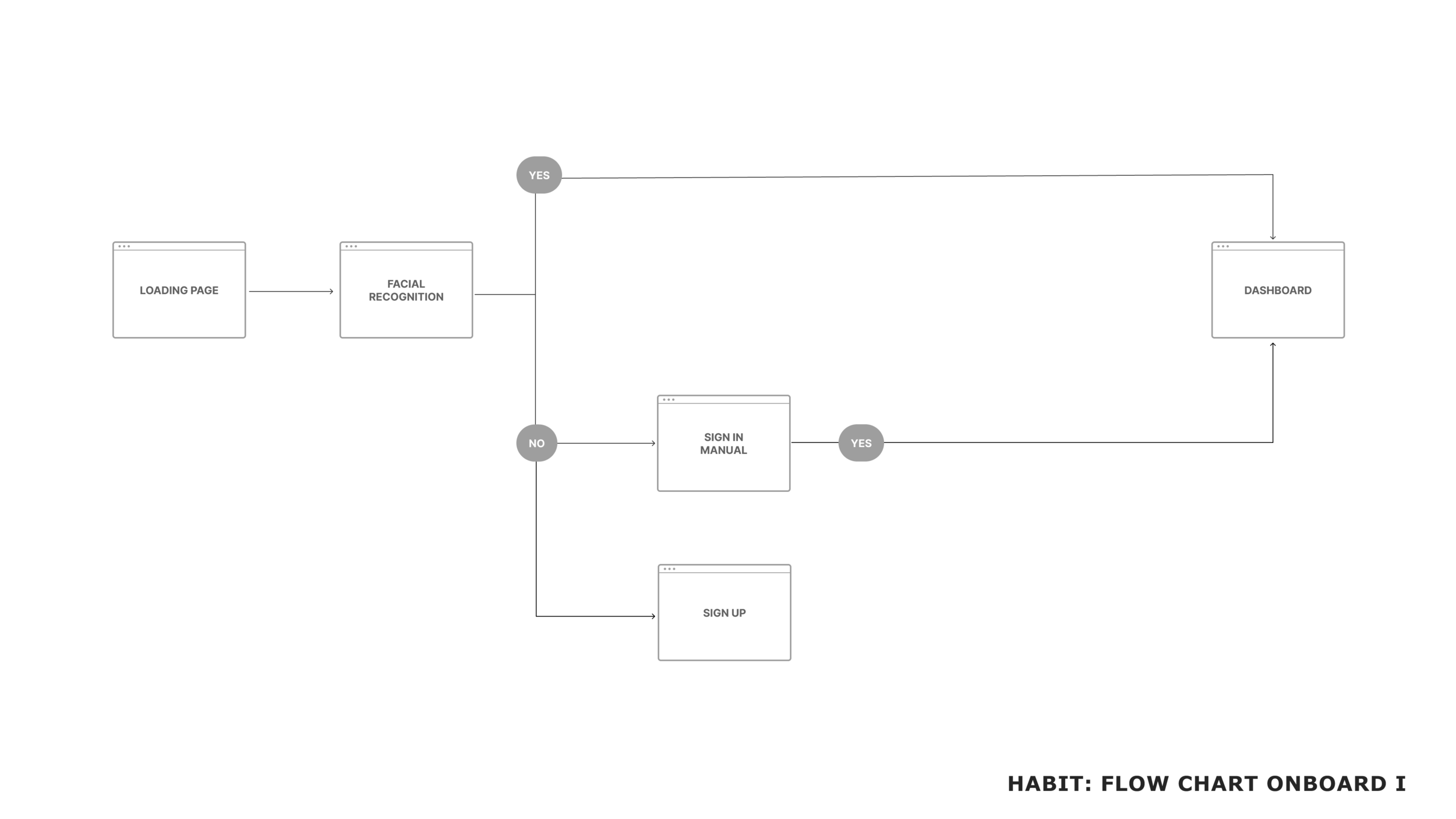
Flow Charts
Wireframes
Survey Results
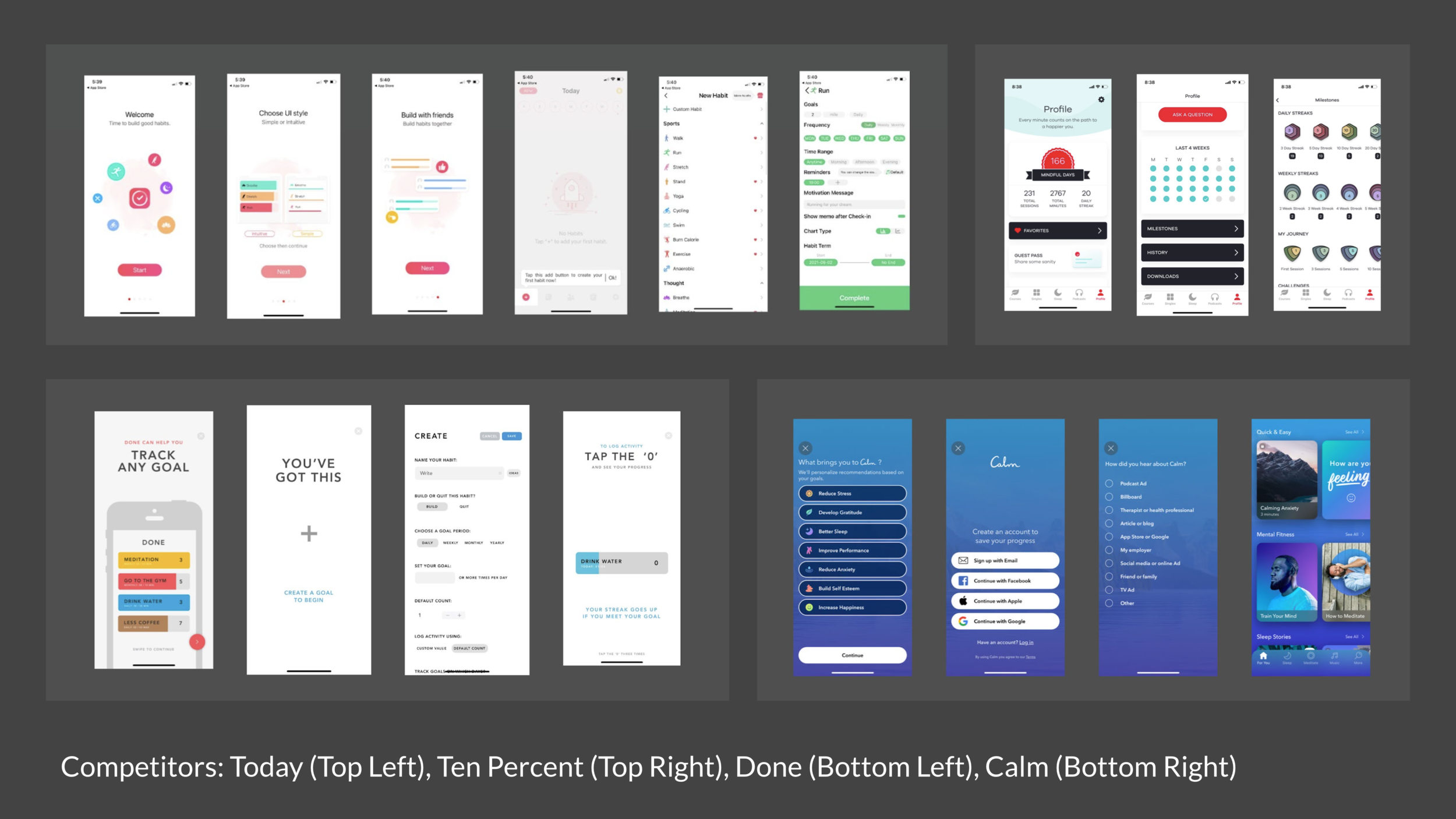
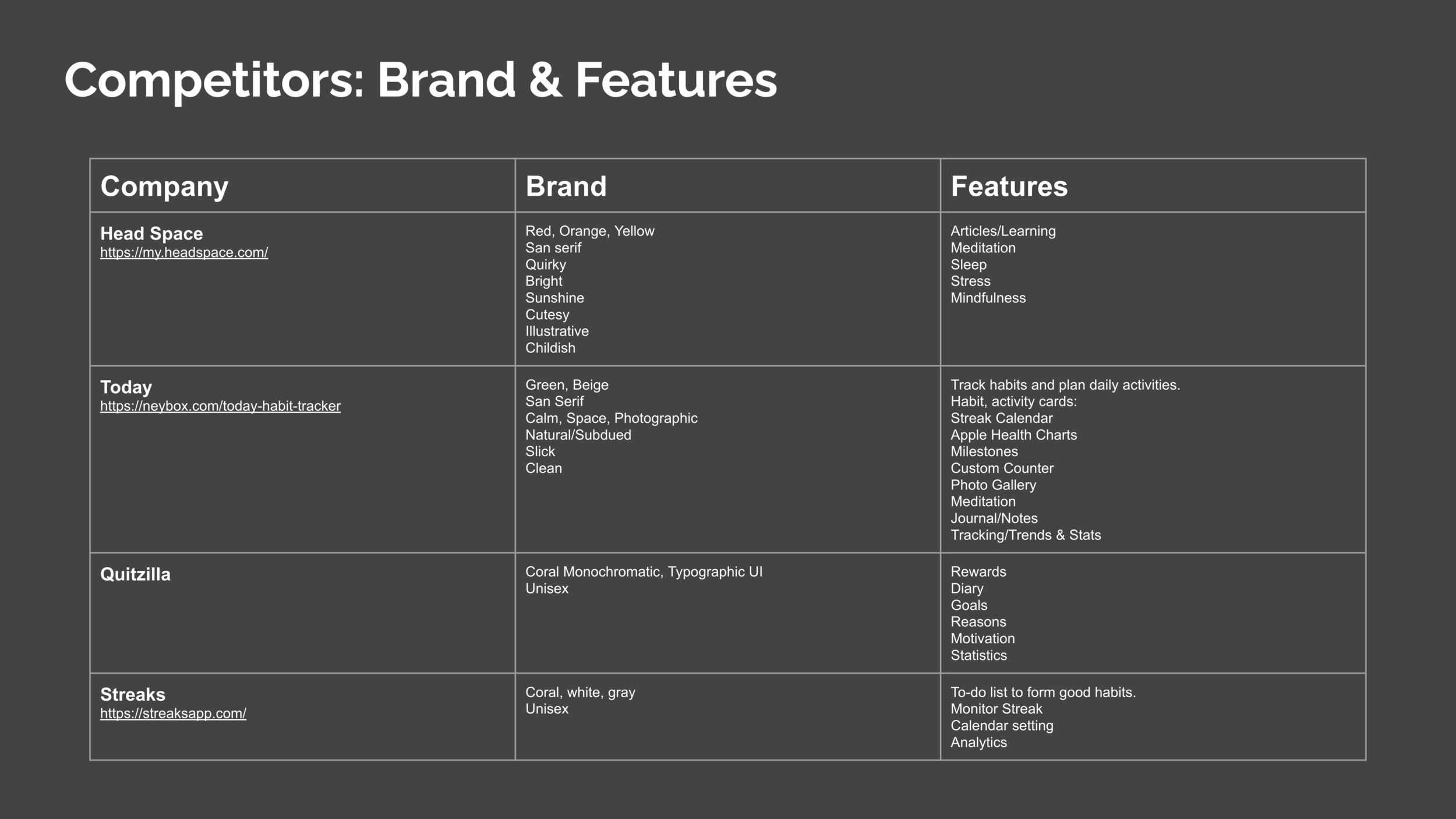
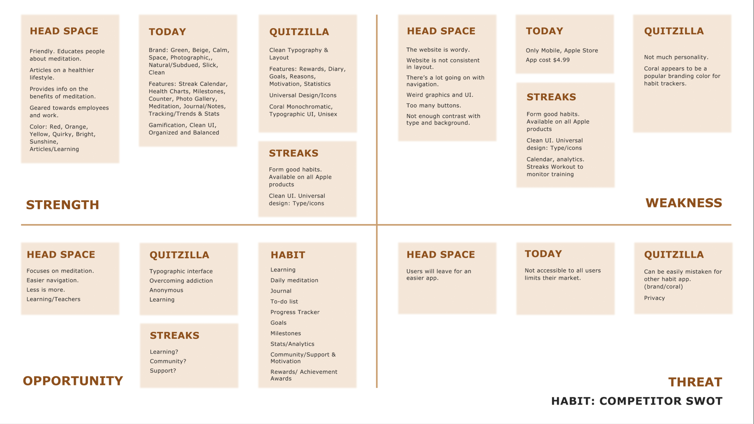
Competitor Analysis
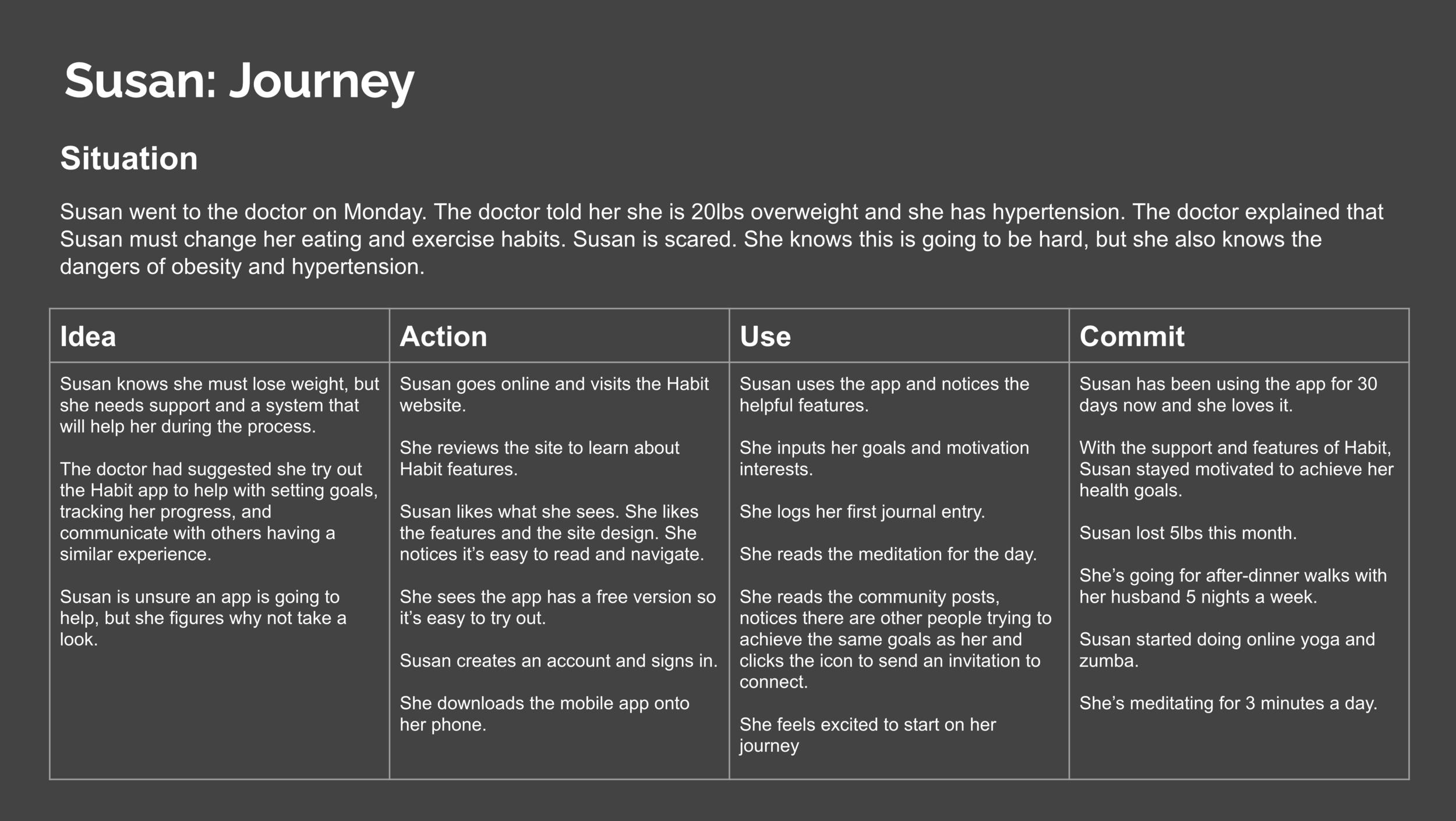
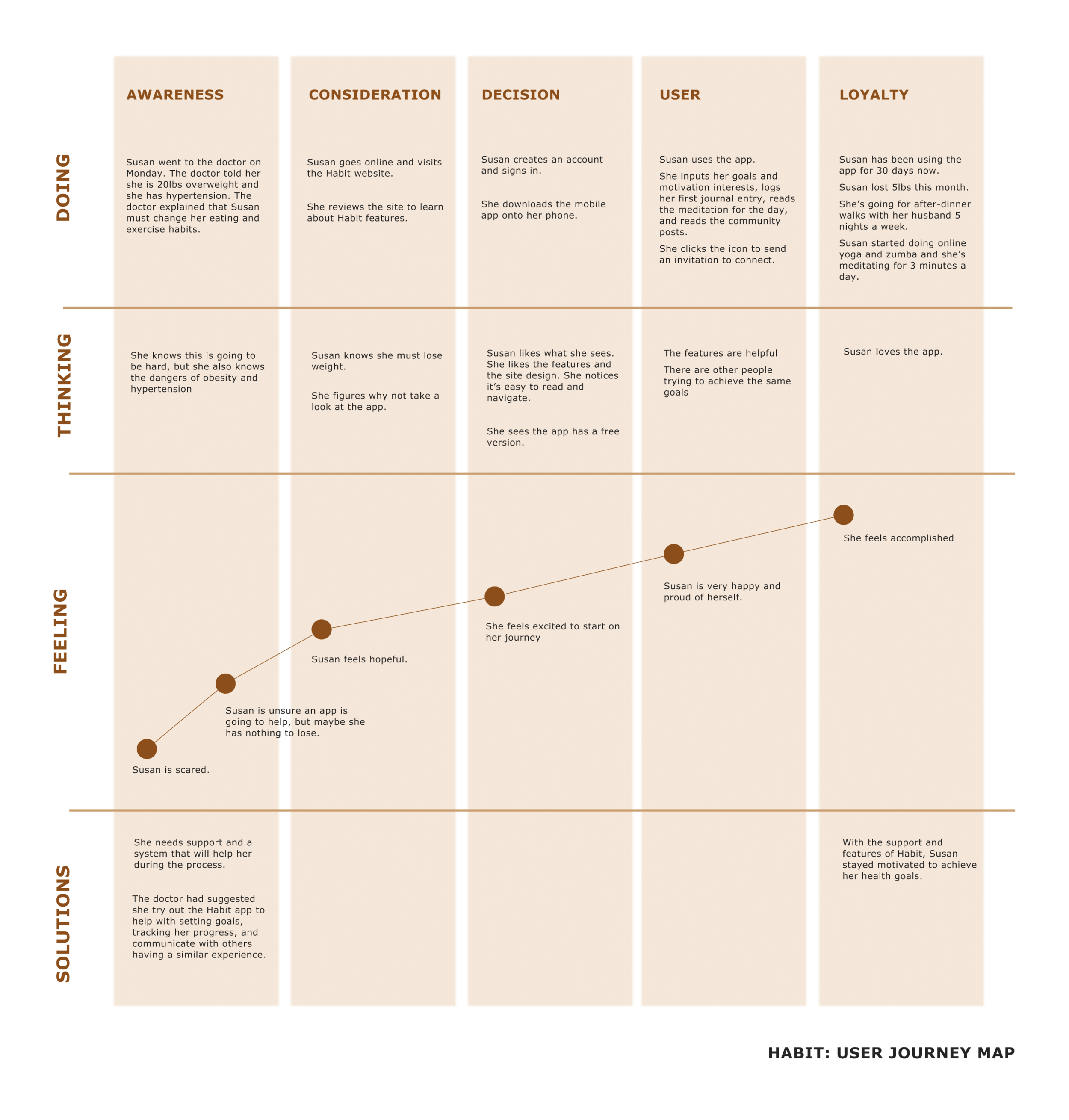
User: Susan
Site Map and Flow Charts
Wireframes
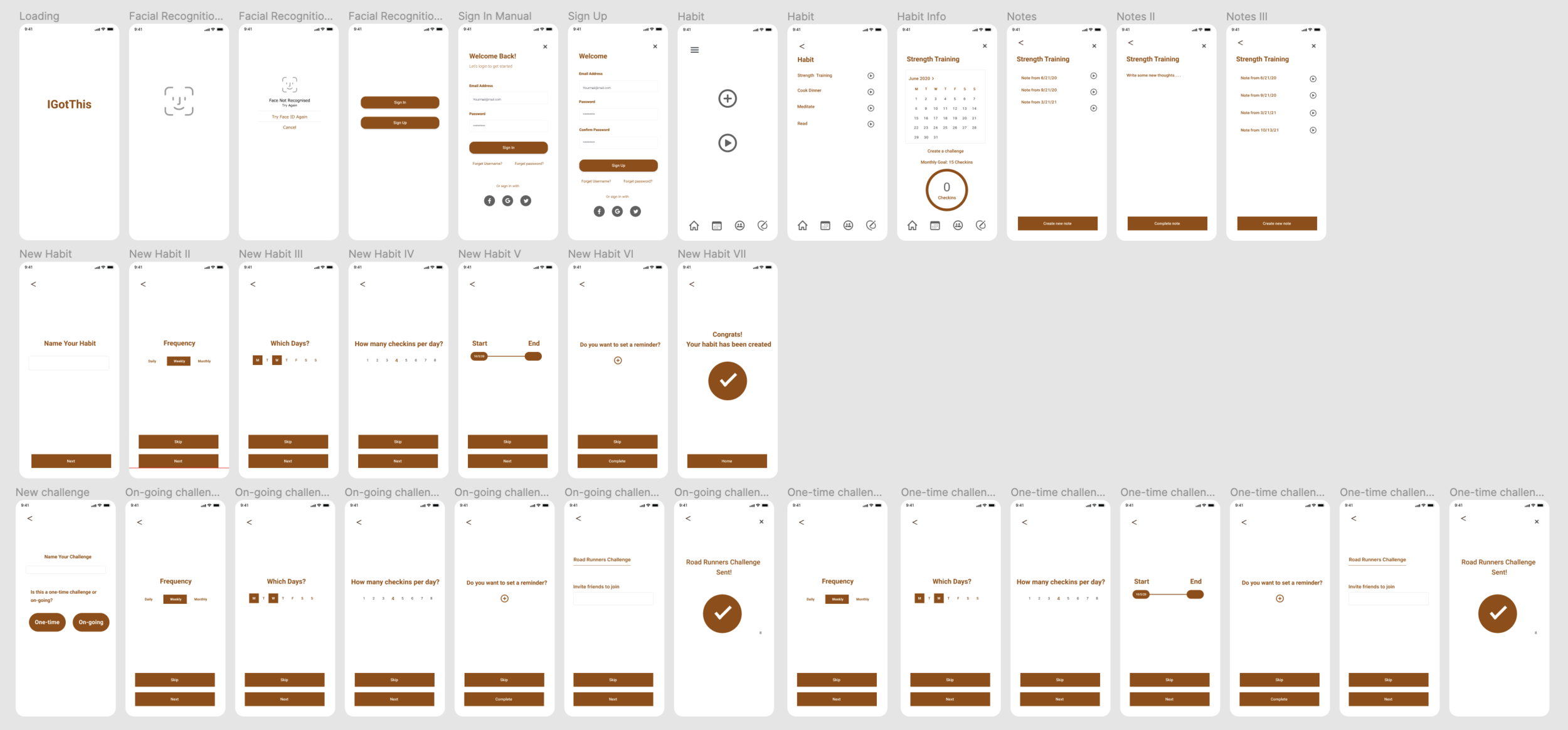
InterActive Lo-Fi Prototype
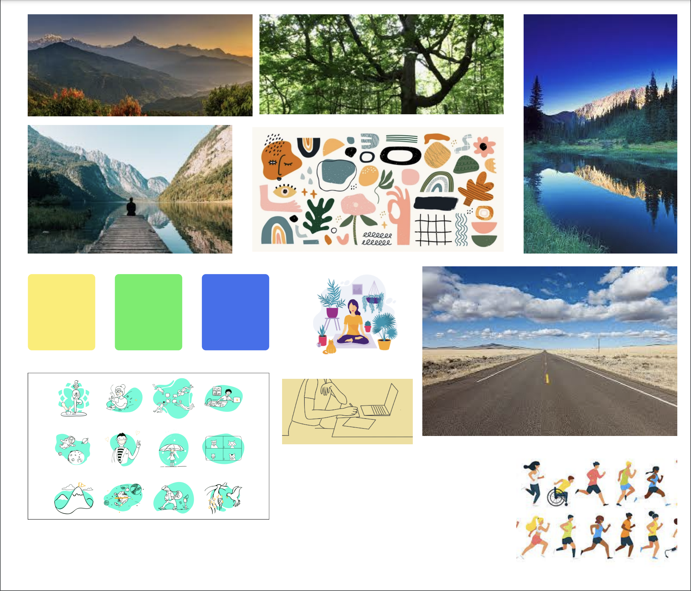
Mood Board & Color
Wireframes Revised with Color
UI Color Study
HiFi Prototype I
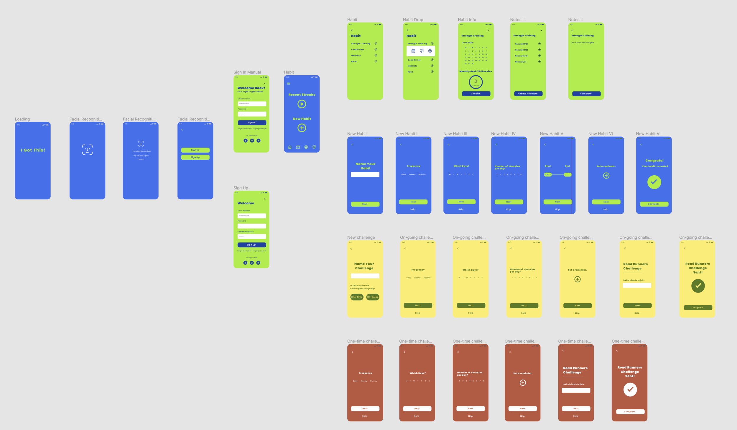
Hi-Fi Prototype III

Pottery Barn
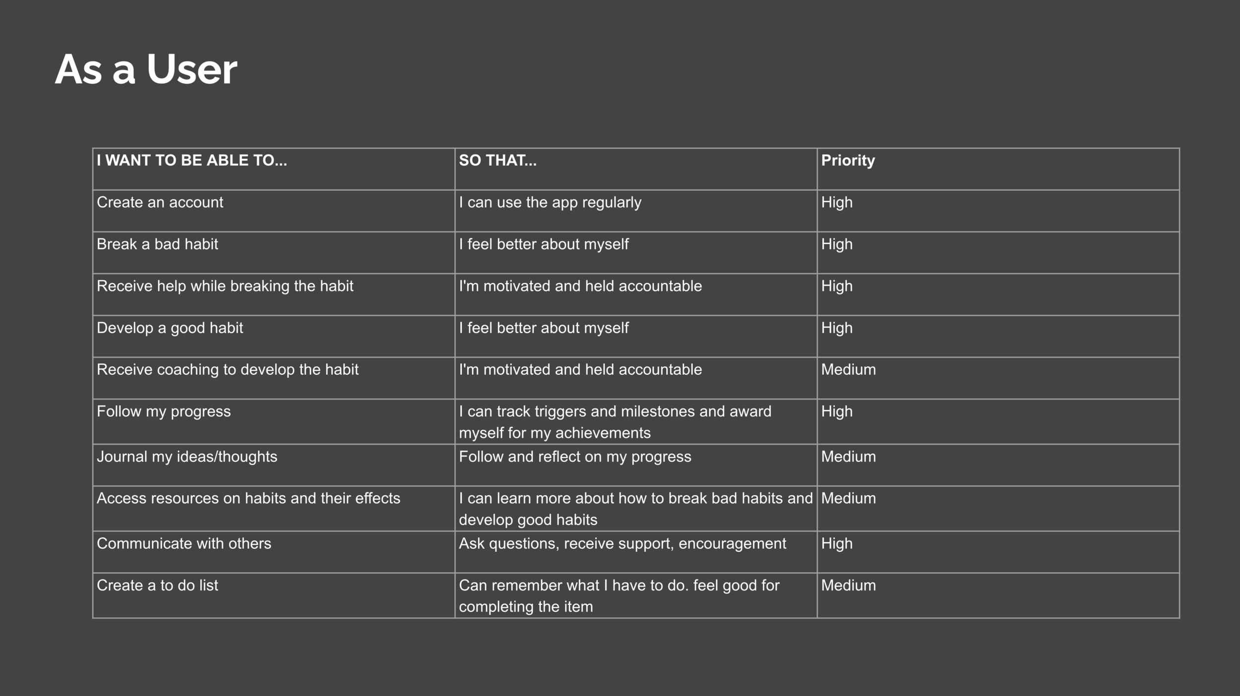
Requirements
Pottery Barn usability research study. The research goals for this study included:
Ensure that users can readily find home furnishings for their living room (e.g., lamp, chair, rug)
Confirm that users understand information about these items to make the best selection for their needs.
Make sure that users can confidently begin the purchase process (i.e., add their selection to cart)
The client wanted to know:
How well the site is doing on the goals listed above
Recommendations for how to improve the experience both in the short term and in the long term.
Script
Greeting/Introduction (1-2 mins)
General Introductions
Expectations (1-2 mins)
Briefly go over the phases of the interview.
Demographics (2 mins)
Name?
Location?
Age range?
Highest level of education?
Profession?
The class associated with?
Single / Partner?
Children?
Cultural/racial demographic
Ability that will affect the viewing and searching process
Experience/Expertise (2 mins)
On a scale of 1-5 where 5 is the highest, what is your technology use/knowledge?
How often do you shop online?
How confident are you with browsing, shopping, or other online shopping-related tasks?
Which device(s) do you usually use for online shopping?
When was the last time you purchased an item?
Participant Activity (10-15 mins)
Send site link to the participant
Have them open the link and share their screen
Ask the participant to select a couch for their living room.
Ask the participant to locate the information they need about the product and that they understand the information.
Ask the participant to begin making their purchase of the product.
Observe the participant and document their behaviors and expressions.
Followup (5 mins)
Have you used this product before?
Have you used a similar product (furniture site)? What site/product?
What stood out to you most when you first entered the site?
Why did you choose the product you did?
What was the easiest part of accessing the information you needed?
What was the hardest part about your process?
Was there anything surprising or unexpected about the site and your activity to locate and purchase the product?
What could be done to improve your search experience?
What did you like/dislike about the way it works?
Wrap Up (2 min)
Thank you.
User: Emily Norton
Emily is a Millennial and falls into the 25-35 age range. She is a Product Manager and lives in Williamsburg, Brooklyn with a roommate. Emily has her Bachelor of Science and considers herself middle/upper income. She identifies as White, European decent, and does not have an impediment that would create a challenge in viewing and using the Pottery Barn website.
Emily has a high level of technology literacy and use and shops online once a week. She is confident with browsing and shopping online. Her last online purchase was the prior weekend (10/2-10/3). Previous to the test, Emily had not been familiar with purchasing a product from the Pottery Barn website but had made purchases from Wayfair and Ikea.
Emily’s Experience
Emily was asked to select a couch she would like to purchase for her living room. She began her search by hovering over “Furniture” and selecting “Sofa & Sectional Collections” (first on the list) from the drop-down menu. She scrolled down the page to find what she wanted. During this time, Emily had a grin on her face and seemed to be interested and focused on what she was viewing.
It appeared that Emily was having a difficult time making a decision to select a couch on the “Sofa & Sectional Collections”. She went back to the home page and typed “couch” in the search bar. On the page, Emily had 419 couches to select from. She opened the filters and checked the boxes to select the features she was looking for; namely, size and square arms. During this time, Emily continued to grin and appear interested and focused on finding what she wanted.
Emily selected a couch from the York square collection but decided to go back and continue her search by using the filter list. Emily finalized her decision; a couch from the Big Sur collection and moved on to select the fabric she wanted for the couch.
Selecting the fabric appeared to be a challenge and Emily clicked on several choices before making a decision. When asked about this during the follow-up, Emily stated that she was confused by the organization of the fabric choices and found it difficult to understand the organizations and differences in the fabric styles. The information regarding the fabric style was provided when clicking the fabric selection, yet the information about the fabric was limited and the text was too small and hard to read. Emily did not use the fabric selection filter.
After Emily selected the fabric, she was ready to check out. Emily had no problem with this process and was able to check out fast and with ease.
Follow-Up Questions
Q. I noticed that when you first began, you chose to hover over “Furniture” and select “Sofa & Sectional Collections”. Why did you choose to make this your first step?
“Sofa & Sectional Collections” was the first thing Emily saw on the list and she thought it was going to take her to a page of couches. She did not realize that she’d be taken to a page that showed the various Pottery Barn couch collections. After scrolling down the page and viewing the different collections, she realized that she wanted to type the word “couch” into the search bar instead to find what she was looking for.
Q. Why did you choose the product you did?
Emily wanted a couch that was the right size for her living room. She wanted a couch with wide square arms so that her cat can lay on the arm. When searching for a couch, Emily checked “square arm” in the filter but had a difficult time finding a couch with a square arm wide enough.
Q. What was the hardest part about your process?
Selecting the fabric was difficult. Emily was confused by the organization. At first, she looked at the amount of time that an order will take based on the fabric. She saw that one group would take 12 weeks to deliver and decided to go to the other group of fabrics, assuming the delivery date would be faster. She realized that the second group would also take 12 weeks and became confused about the differences in the fabrics.
The information about the fabric was limited and the text was small and difficult to read. She could order a swatch, but it did not say how long it’d take the swatch to arrive. She was concerned that if the couch would take 12 weeks to deliver, she didn’t want to have to wait longer for a swatch to arrive and then place the order.
Q. What could be done to improve your search experience?
The filter can include other features to help find what a person is looking for. The site has a “small spaces” selection, but what does “small spaces” mean? It would have been helpful to be able to choose “wide arm”.
Reorganize the fabric section so it is easier to select the fabric you’re looking for. The needs to be more information about the fabric and the text needs to be larger and easier to see and read.
Key Takeaways: Goals
1. Ensure that users can readily find home furnishings for their living room.
This was achieved after a long search starting at “Sofa & Sectional Collections”, then going back home, typing “couch” in the search bar, and using the filter to locate the couch Emily was looking for.
2. Confirm that users understand information about these items to make the best selection for their needs.
Emily was able to obtain the information she needed to find the couch she was looking for that best suited her needs, yet she struggled when trying to select the fabric because; 1. The extensive list of fabrics that were not properly organized. 2. Not noticing the “filters” for the fabric. 3. Not be provided with enough information about the fabric. 4. The information provided on the fabric was written in text size that was too small.
3. Make sure that users can confidently begin the purchase process (i.e., add their selection to cart)
There was no problem adding the couch to her cart and making the purchase. This was done in minimal time.
Opportunities for Improvement
Additional filters should be added to simplify the couch selection.
Need for better fabric organization to make the fabric selecting process easier.
The fabric filter button needs to be more obvious to the user.
Provide more information about the fabric and increase the type for easier readability.
Need for shorter delivery time. 12 weeks is too long.

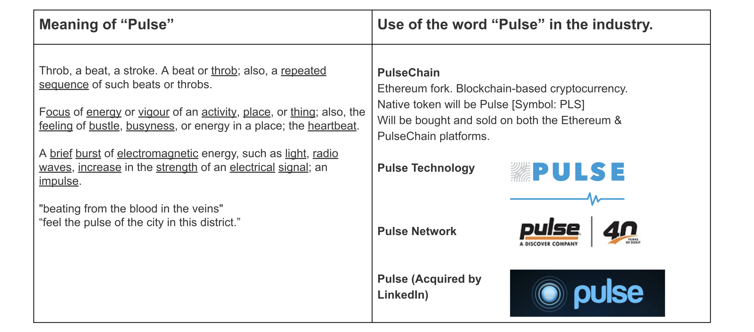
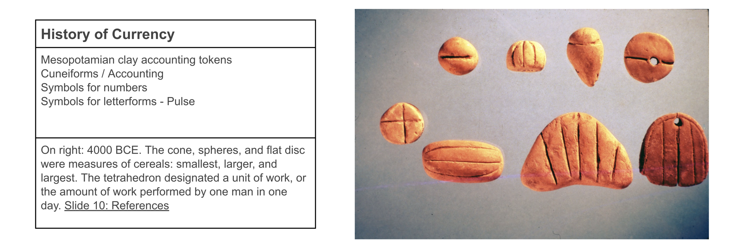
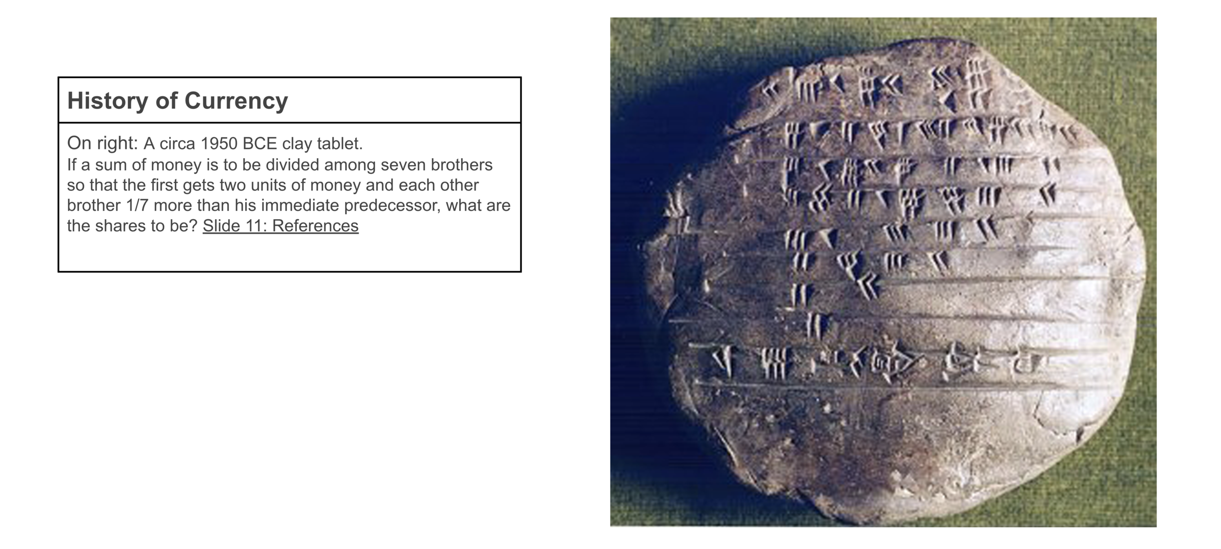
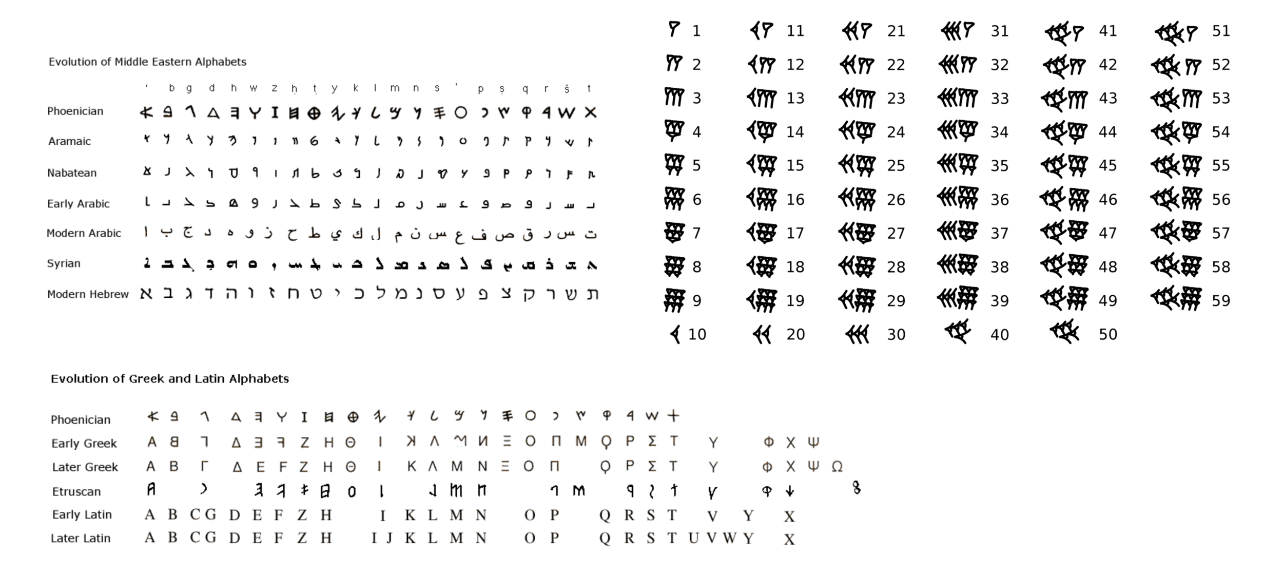
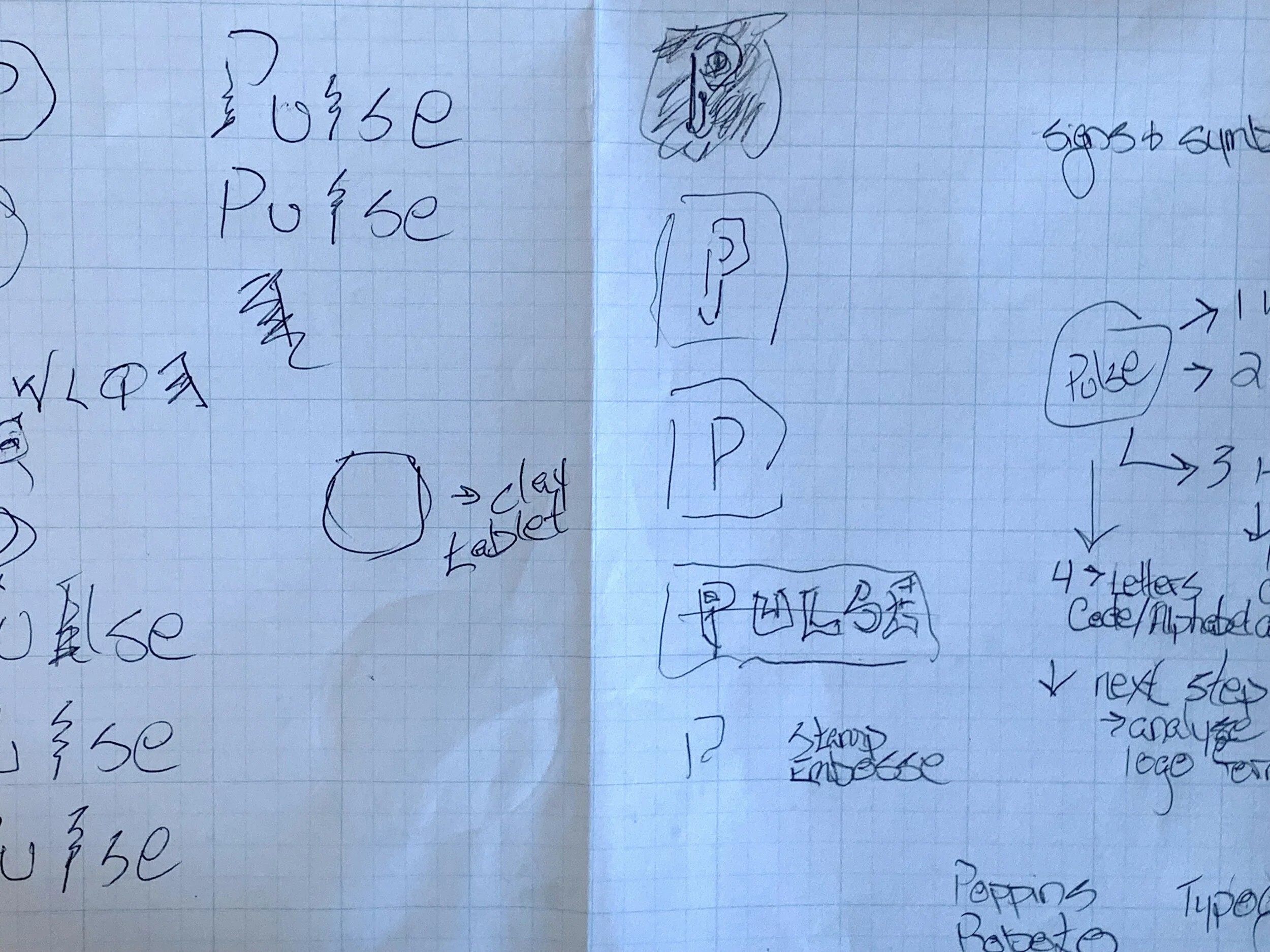
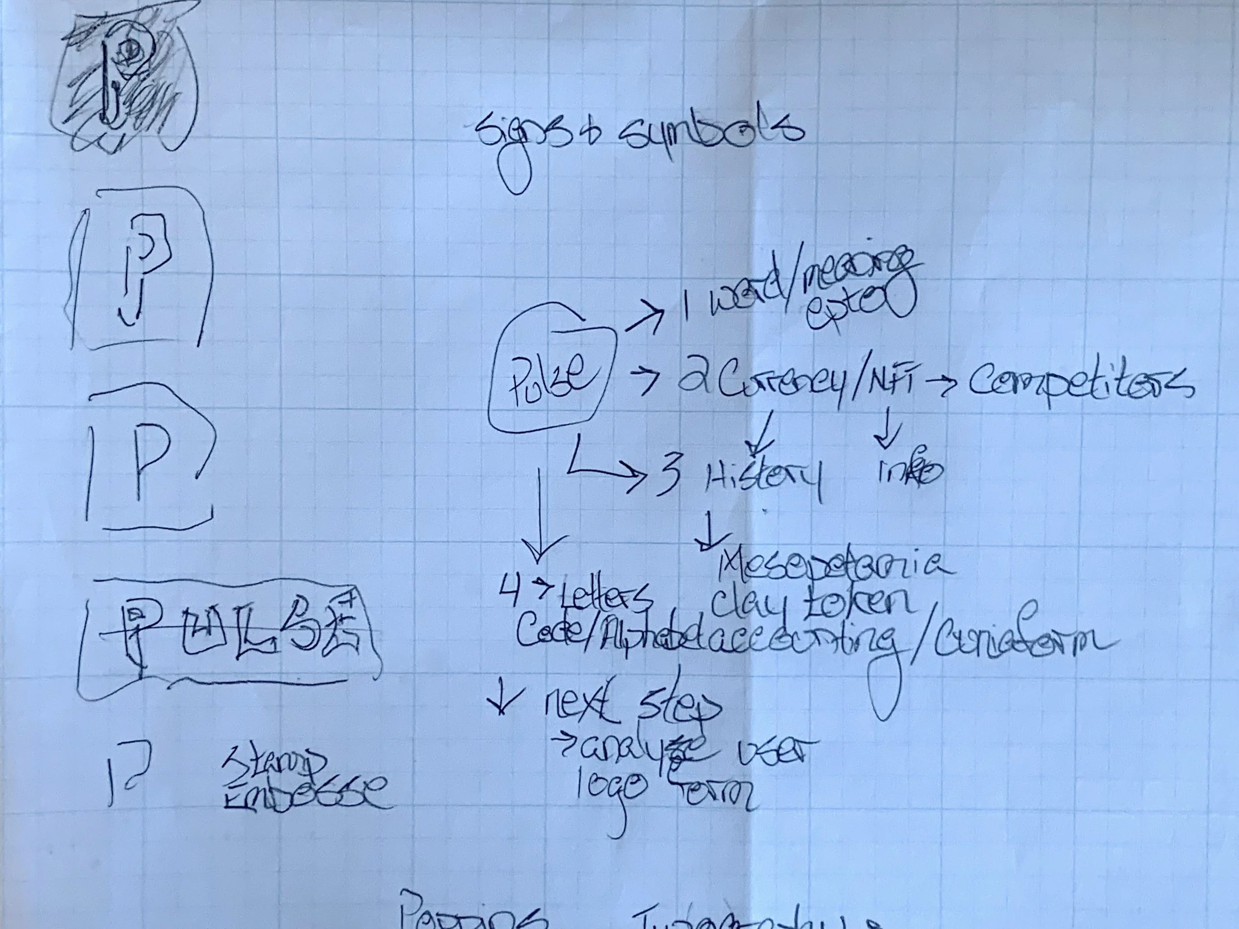
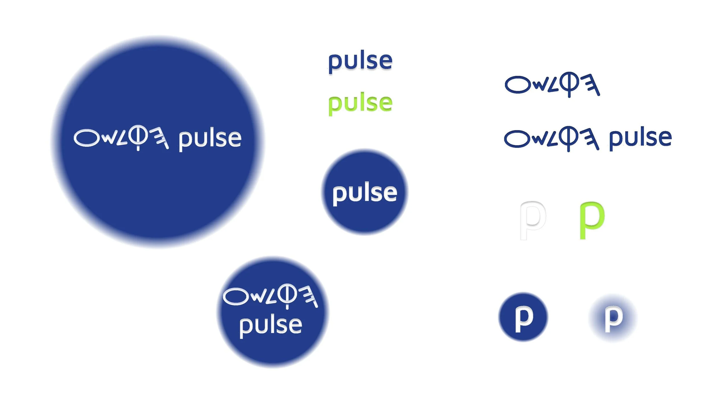
Pulse
Duration: 3-5 days
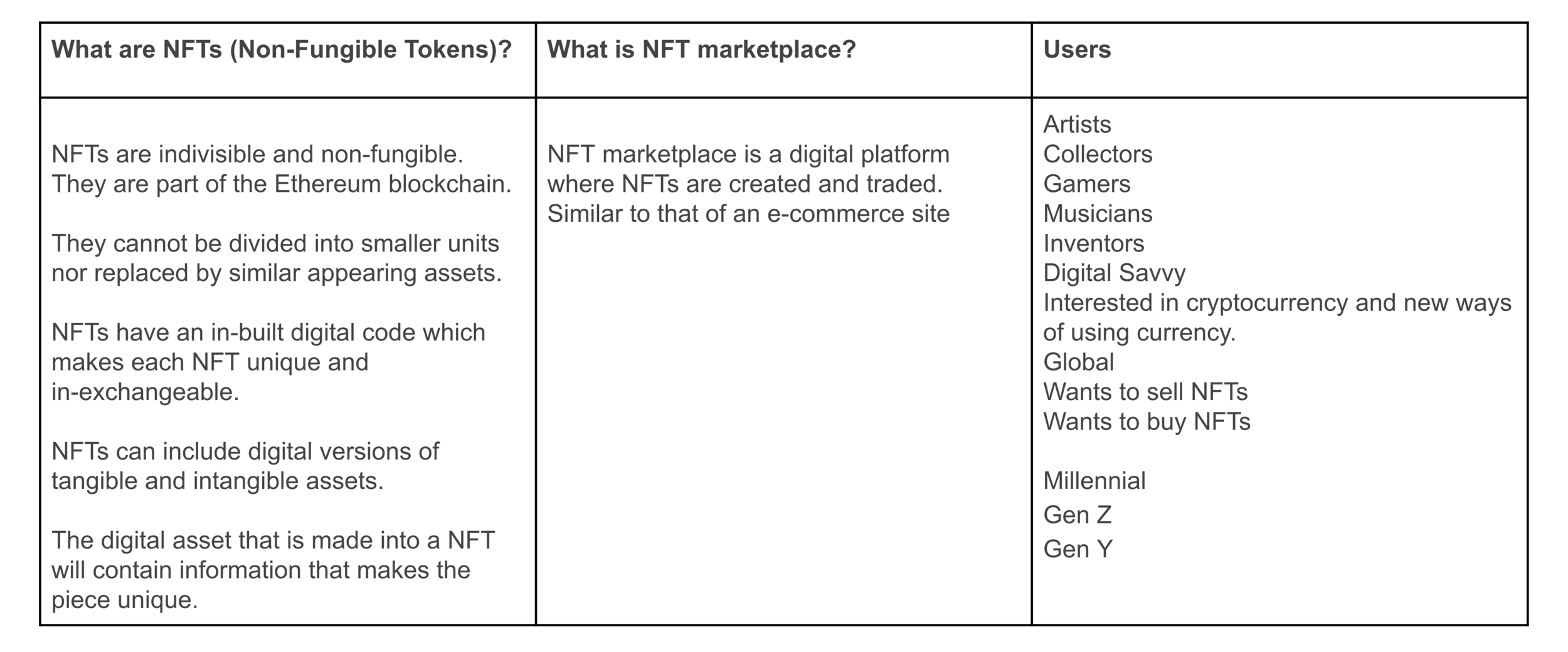
Brief: Design the Brand Identity for Pulse, an NFT marketplace.
Pulse is a digital financial app offering banking features, digital assets, and NFTs.
Features
Spending Account
Branded Debit Cards
Savings Account
Investing Account
Parental Controls
Peer-to-Peer Payments
Strategic Integrations
Digital Collectibles
NFTs
NFTs
Service to help individuals set up NFT.
Produce and manage NFT launch from start to finish.
Full-service team handles technical and creative aspects.
Create new designs or work to convert existing assets to rare digital assets.
NFTs
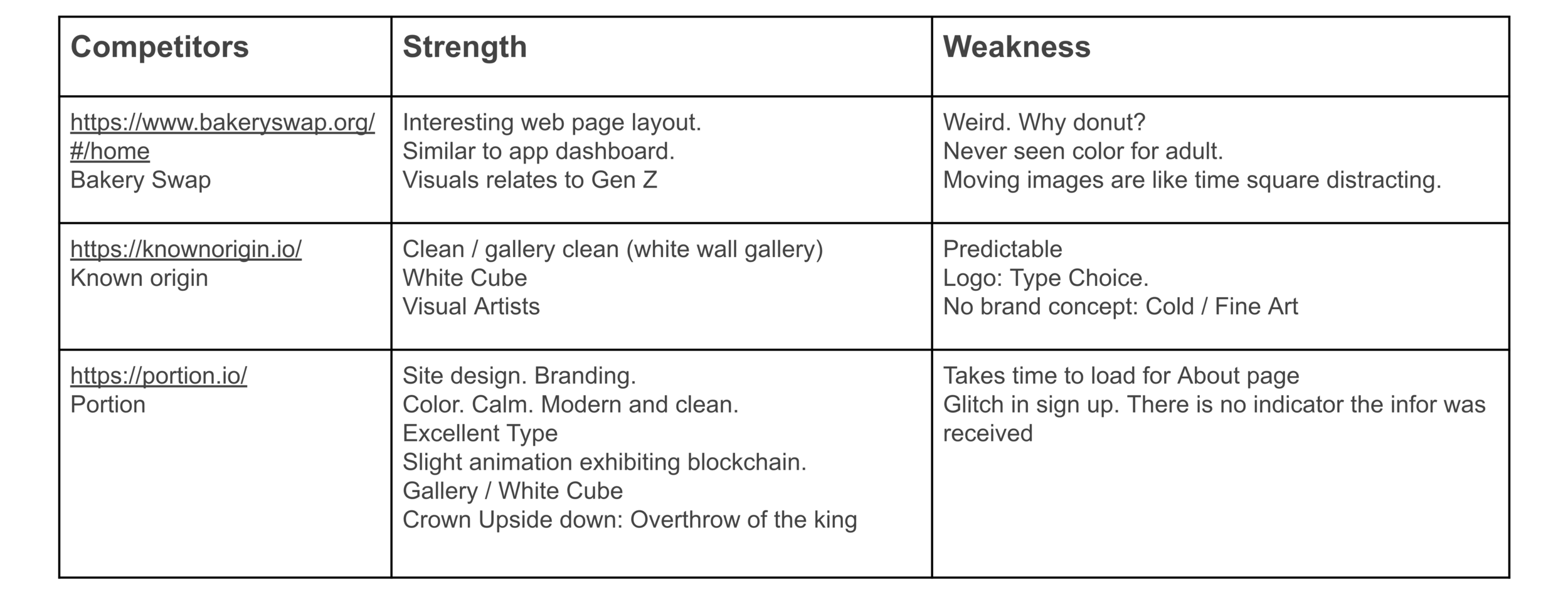
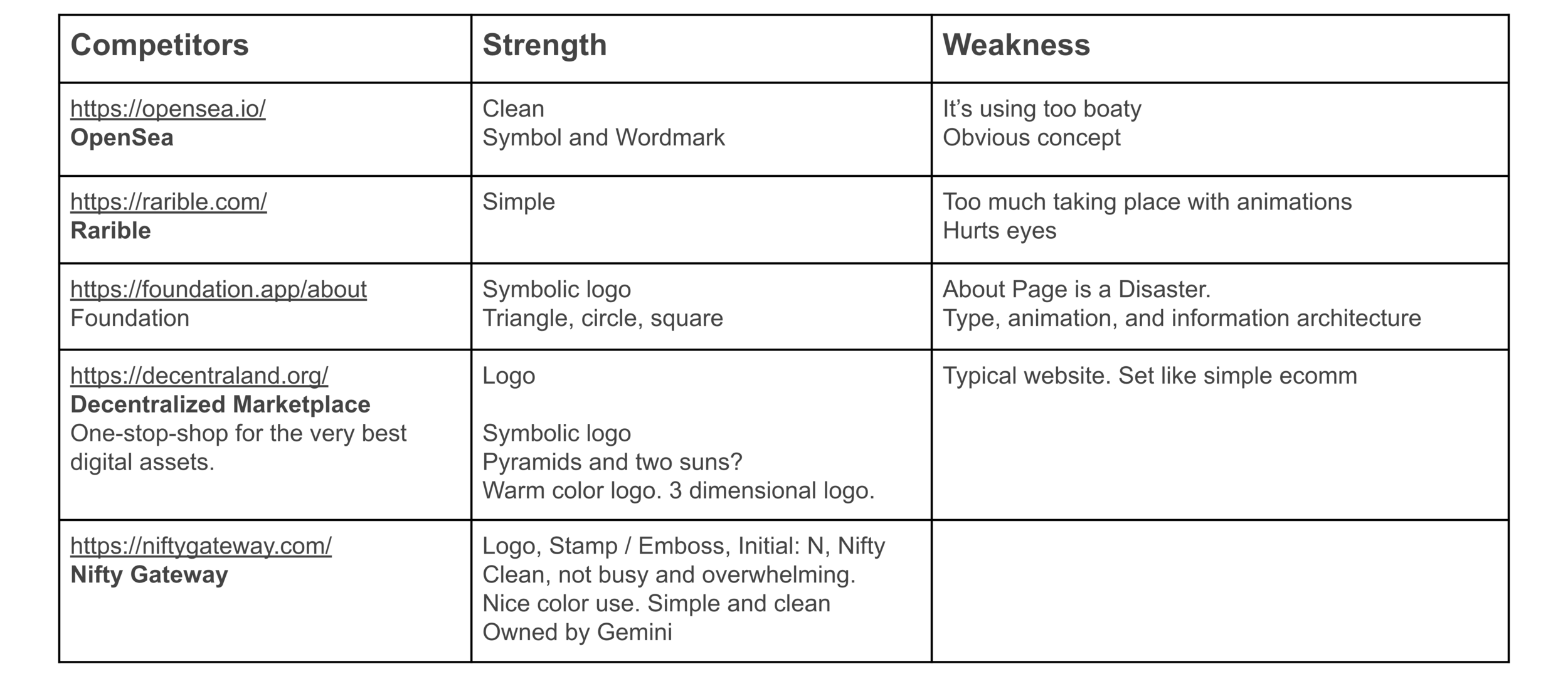
Competitors
Ideas
Sketches
Color & Type
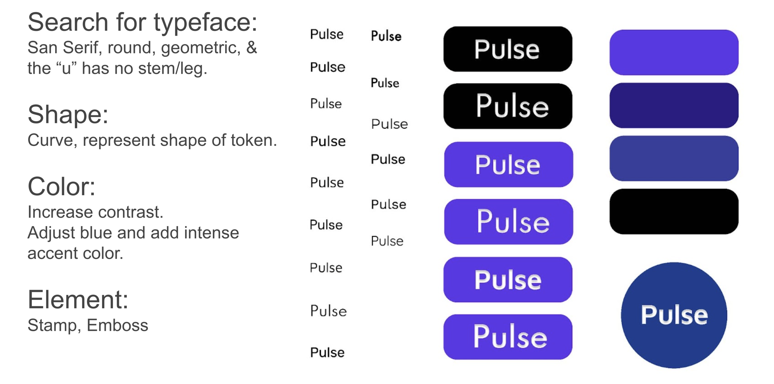
Logo Variations
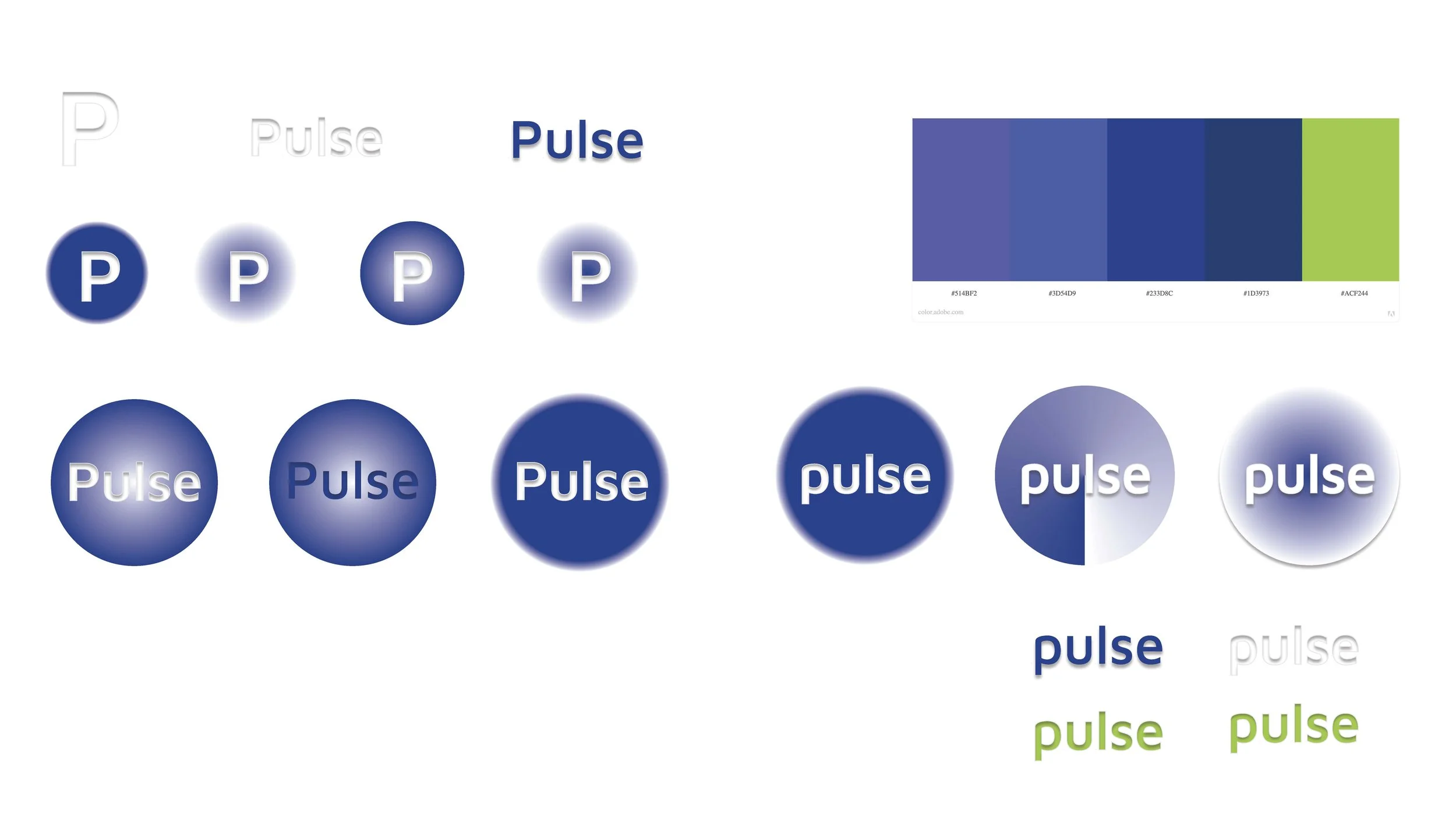
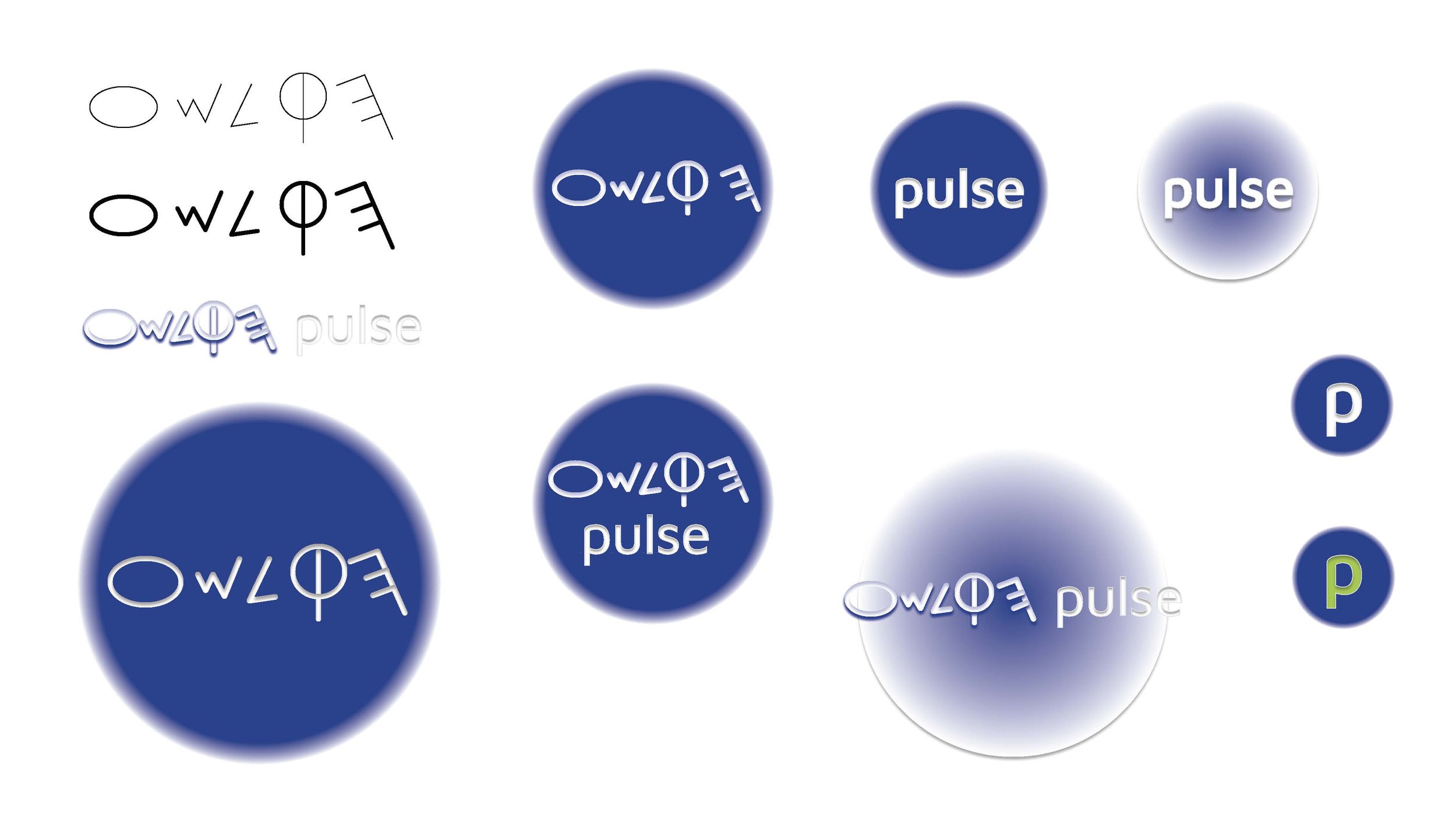
Selected Choices
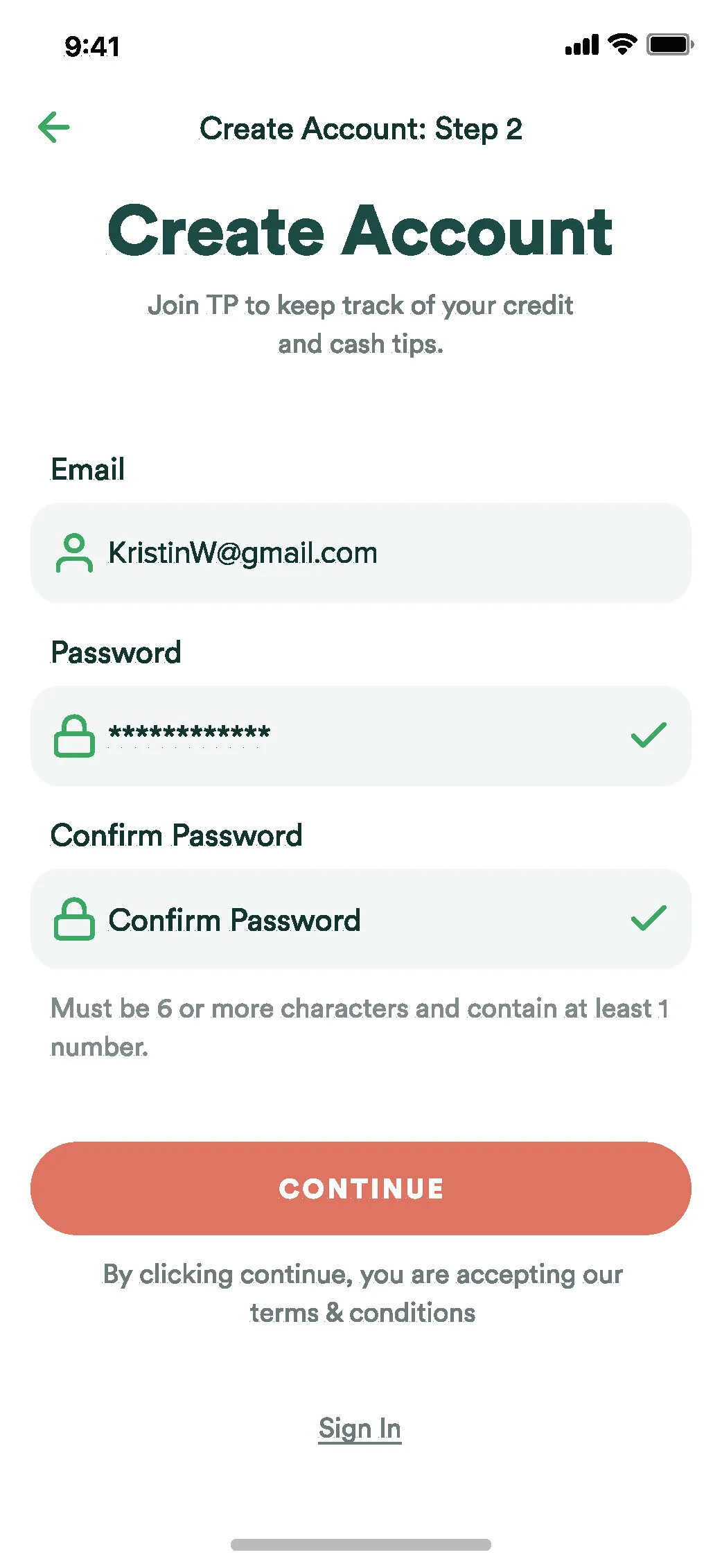
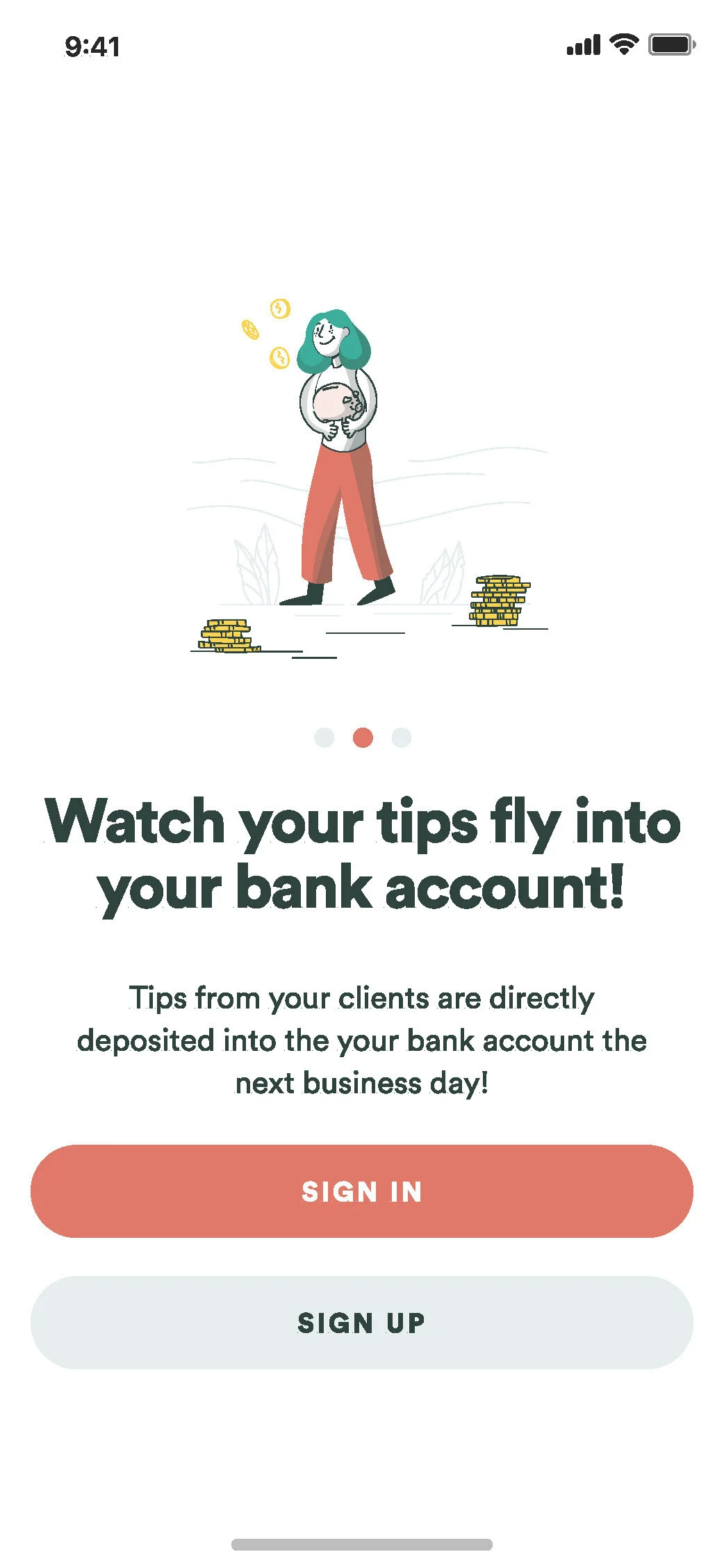
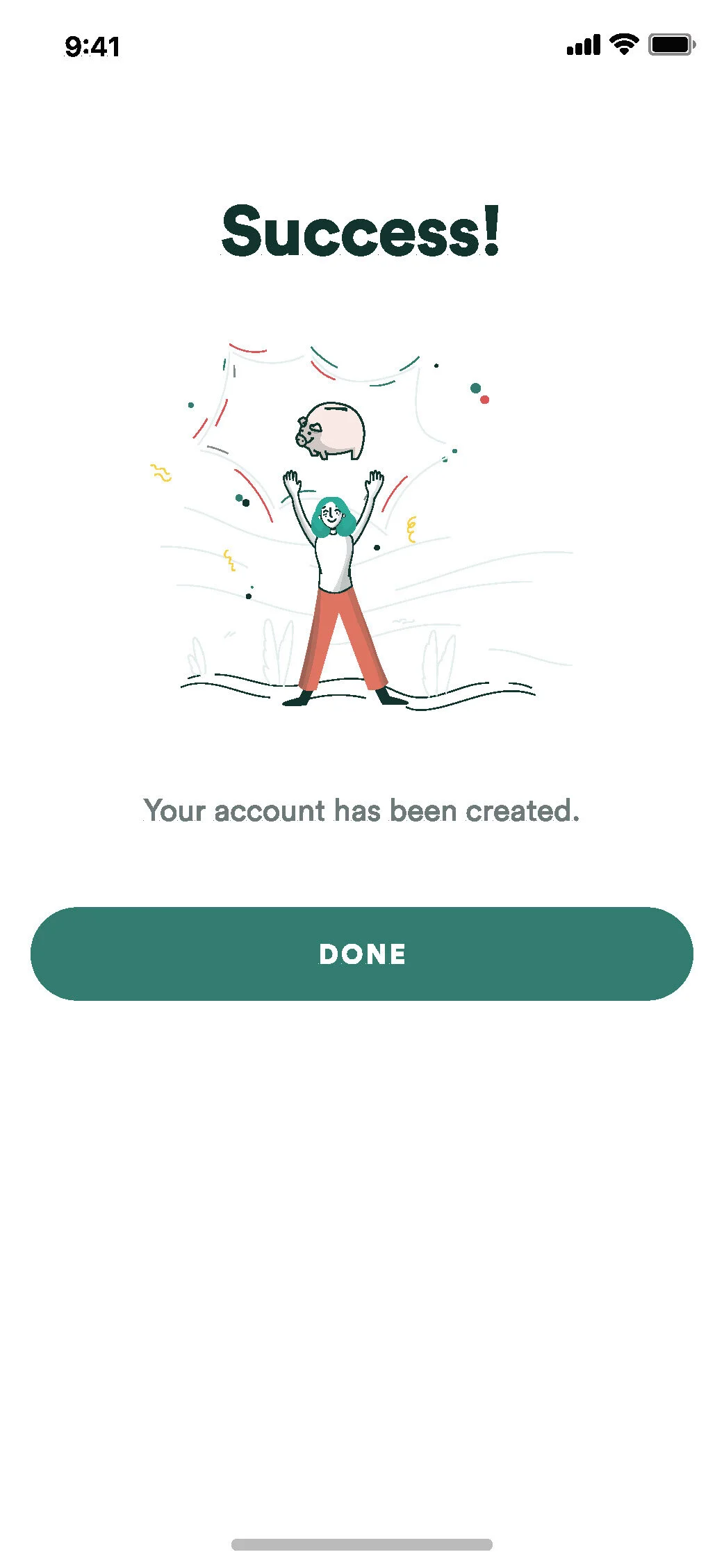
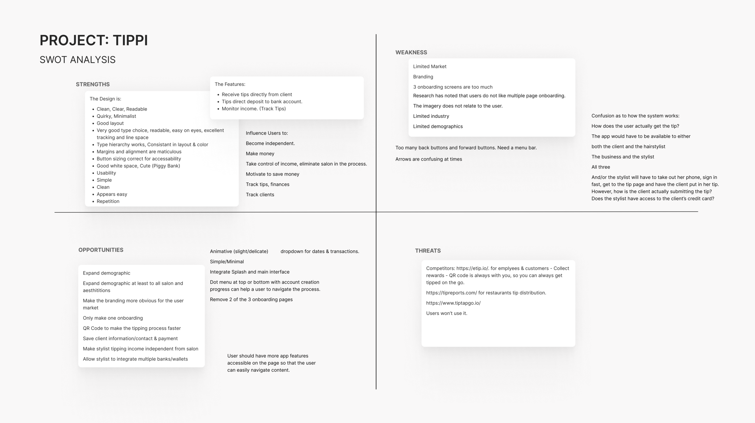
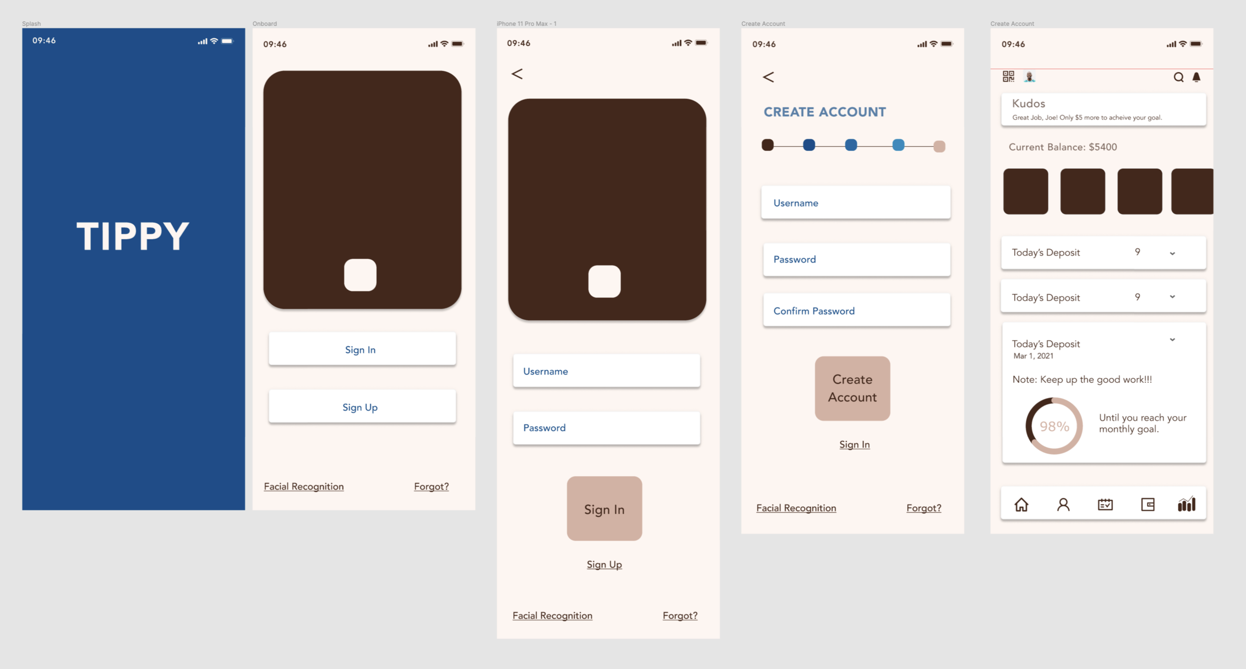
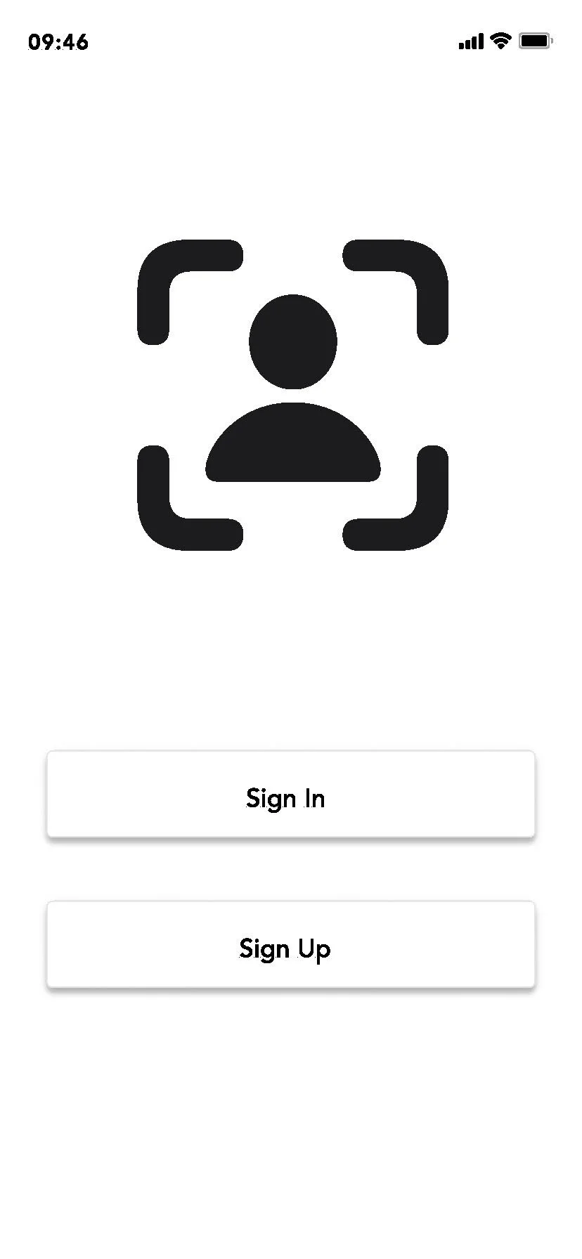
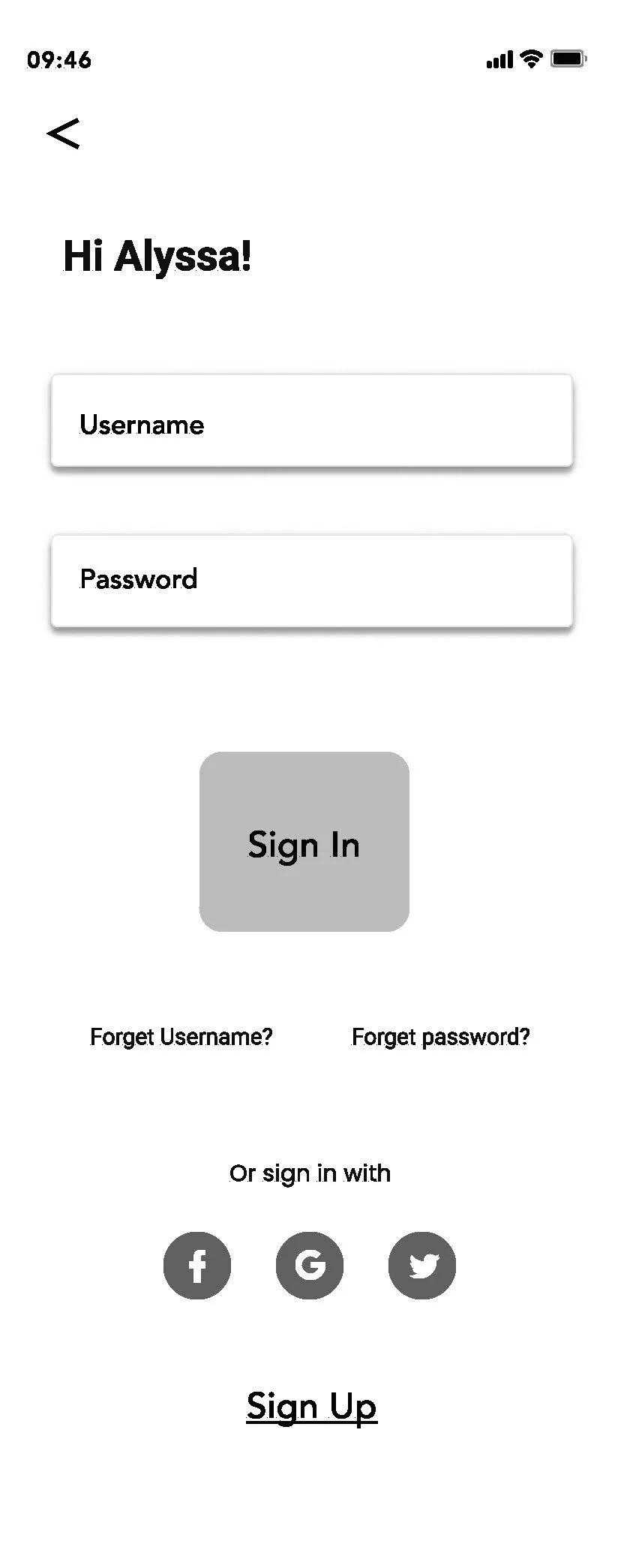
Tippi
Evaluation & Mockup
UX Research & Design: Shayna T. Blum
Sprint: 3-5-hours
Questions
Why would hairstylists want to use this app?
How does the money go in? Does the hairstylist give her phone/iPad to the client?
Does the client have the app?
Is the app connected to the main /computer register?
SWOT
Strength
Layout
Organization
Repetition
Weakness
Product brand does not relate to hair stylist.
App focuses on the banking function, not on the user.
App is not diverse or unisex
Opportunities
Expand demographic.
Expand demographic at least to all salon and Aestheticians.
Make the branding more obvious for the user market.
Threat
Research has noted that users do not like multiple page onboarding.
The imagery does not relate to the user.
Limited industry
Limited demographics
User
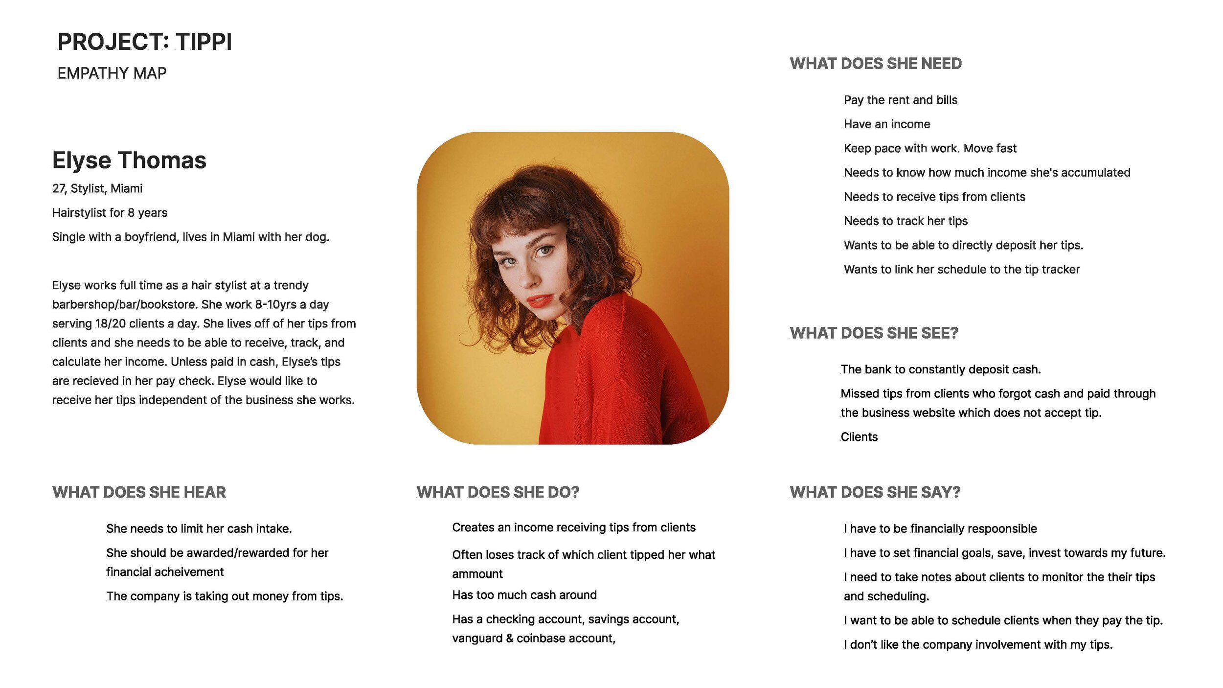
Interview Notes
“I’d like an app that will let me receive tips directly from the client, not through the salon.”
“I want to be able to reschedule clients from the app.”
“I work long hours and see up to 20 clients a day, The app needs to be easy, simple, and fast.”
“I think the brand should be vintage. The colors should be blue, red, and white to reflect the barber pole.”
User NeedS
As a hairstylist Elise wants to
Wants to receive tips.
Wants to track her tips.
Wants to receive tips.
Wants to directly deposit her tips.
Wants to limit cash tipping.
Wants to link her schedule to the tracker.
Wants to be able to set goals.
Wants to be awarded/rewarded for her financial achievement.
Wants to take notes about the client.
Wants to withdraw from the app.
Wants to integrate with other apps.
Wants to access the info with ease.
Wants to enter deposits very fast.
Wants to monitor her progress with clients.
So that she can
Pay the rent.
Knows how much income she's accumulated.
Have an income.
Not have to go to the bank.
So that she can decrease missed tips from clients who forgot the cash.
She can monitor/analyze relationships between client, time, and tip.
Motivate herself to achieve the goal.
Feel good about her hard work.
So that she can prioritize clients.
Keep pace with work. Move fast.
Keep pace with work. Move fast.
Analyze the relationship.
be independent and not rely on the salon.
Increase the probability of their return.
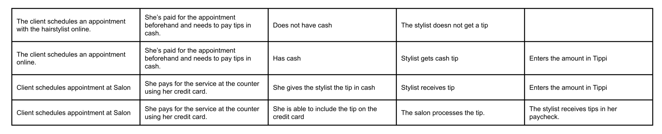
Journey Map
Situations the User Wants to Avoid
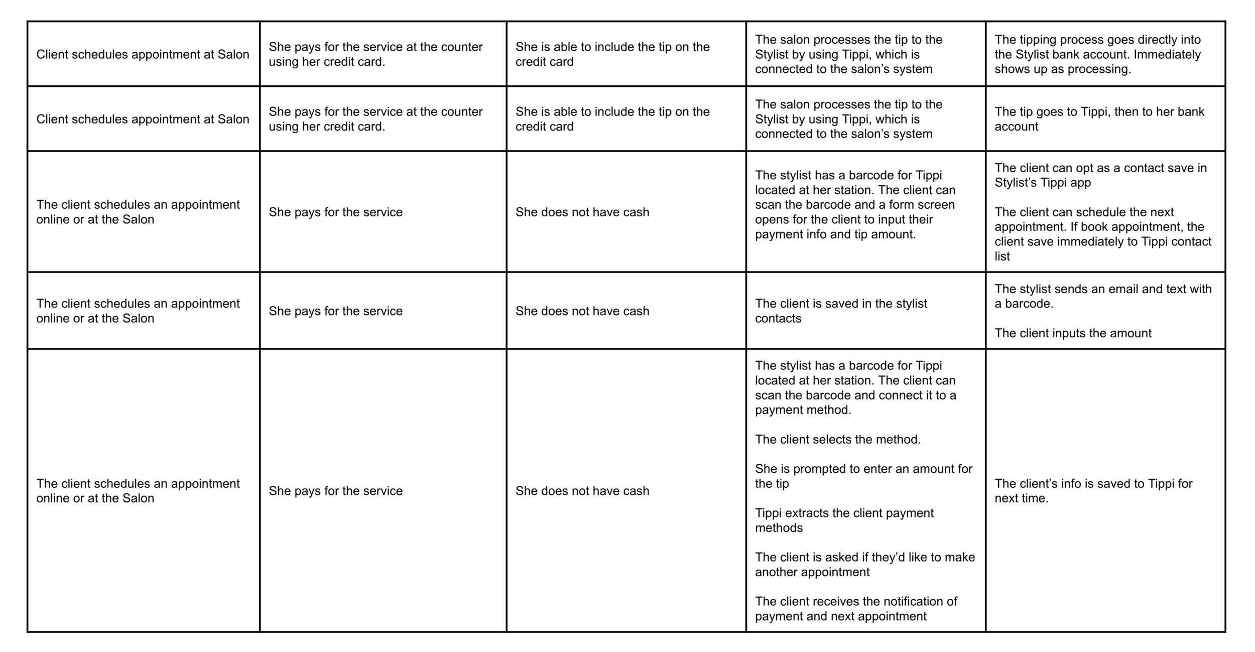
Journey Map
Situations That Work For the User
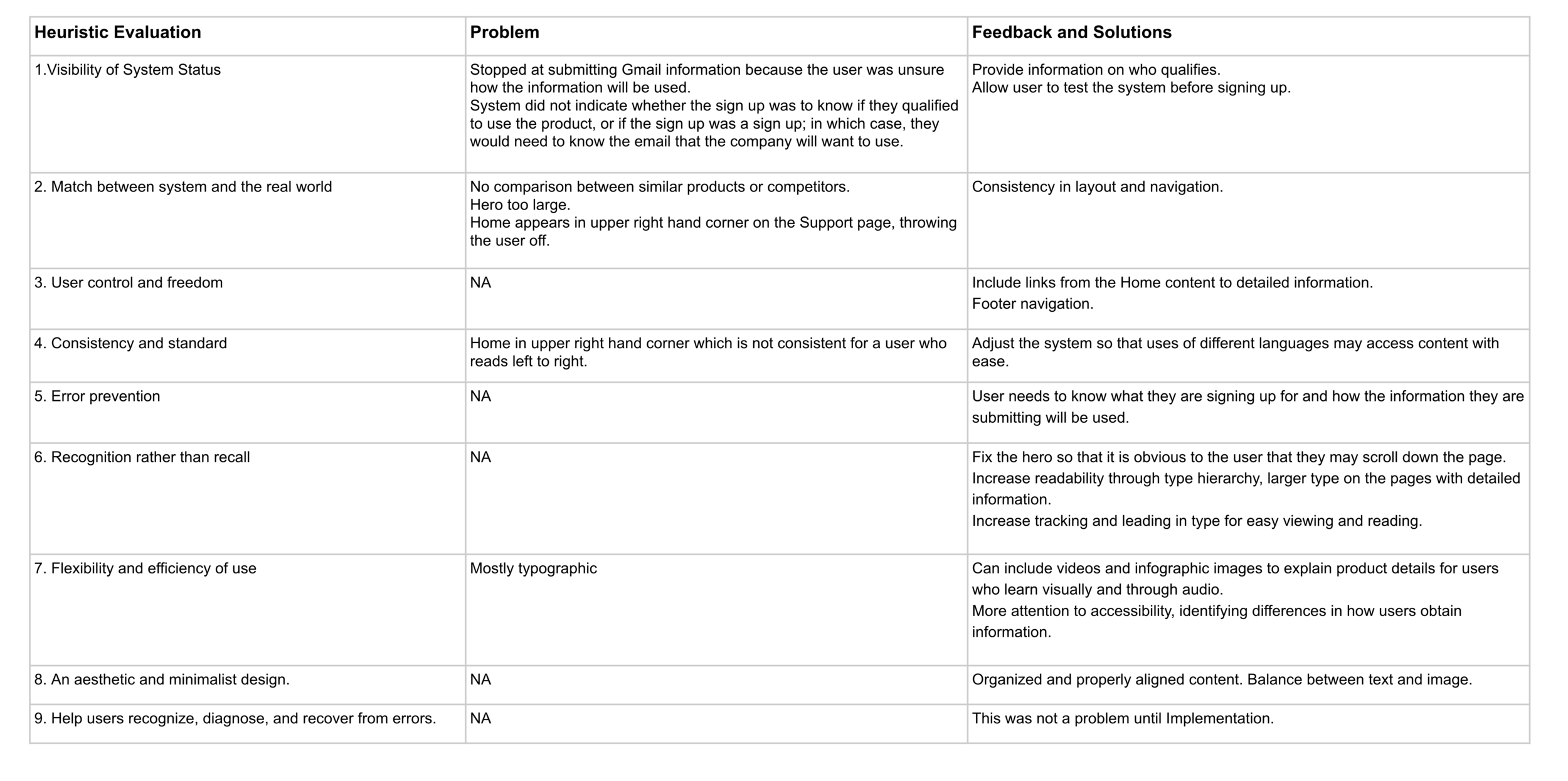
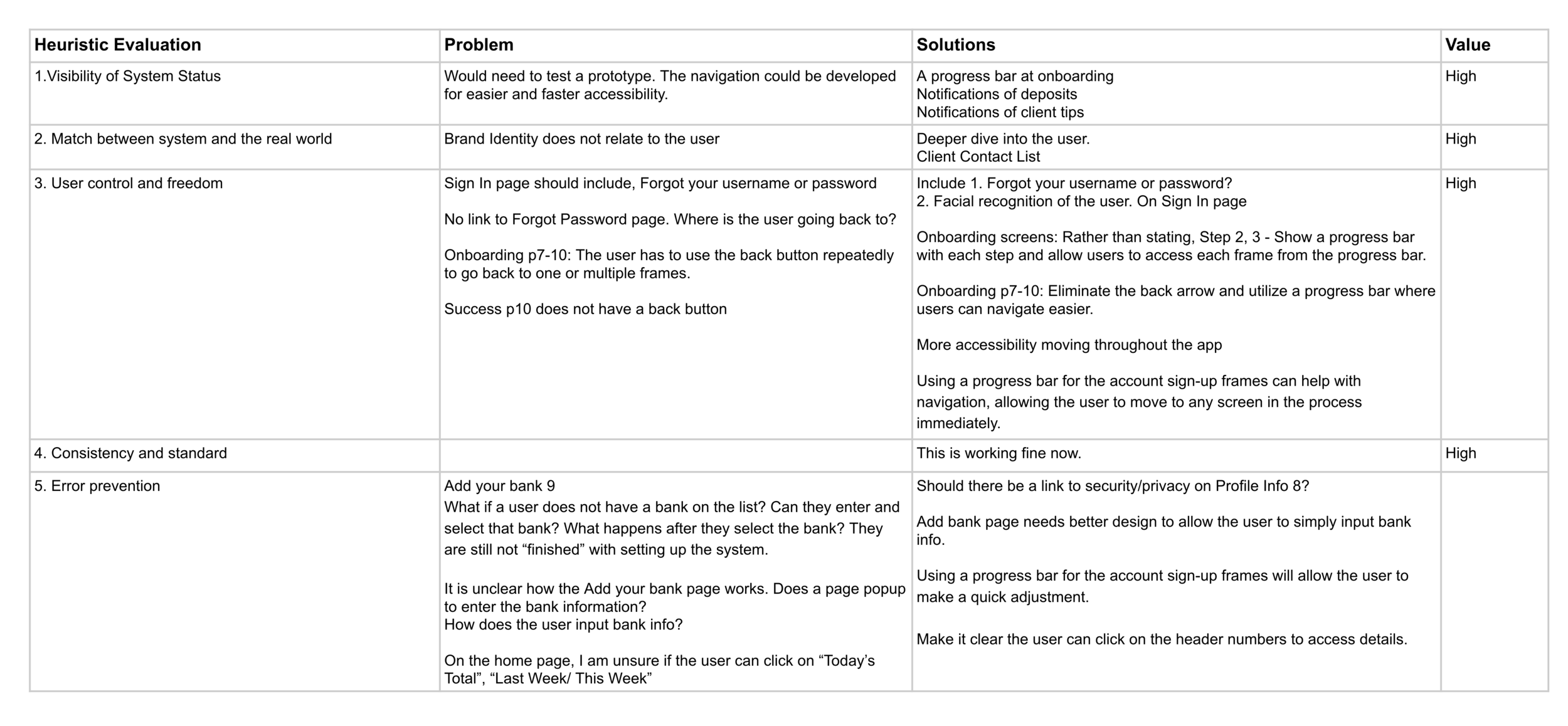
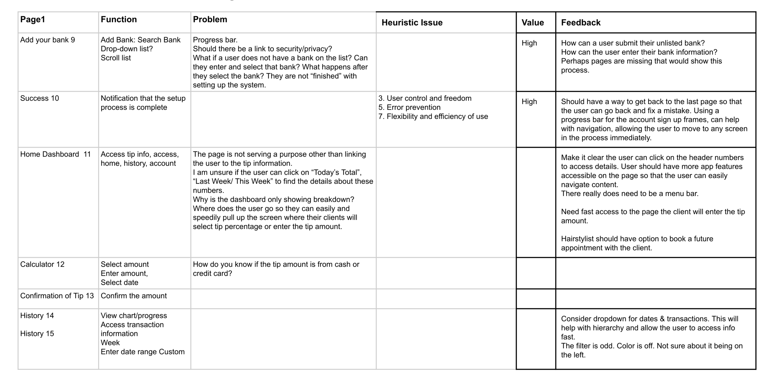
Heuristic Evaluation
Complete Product
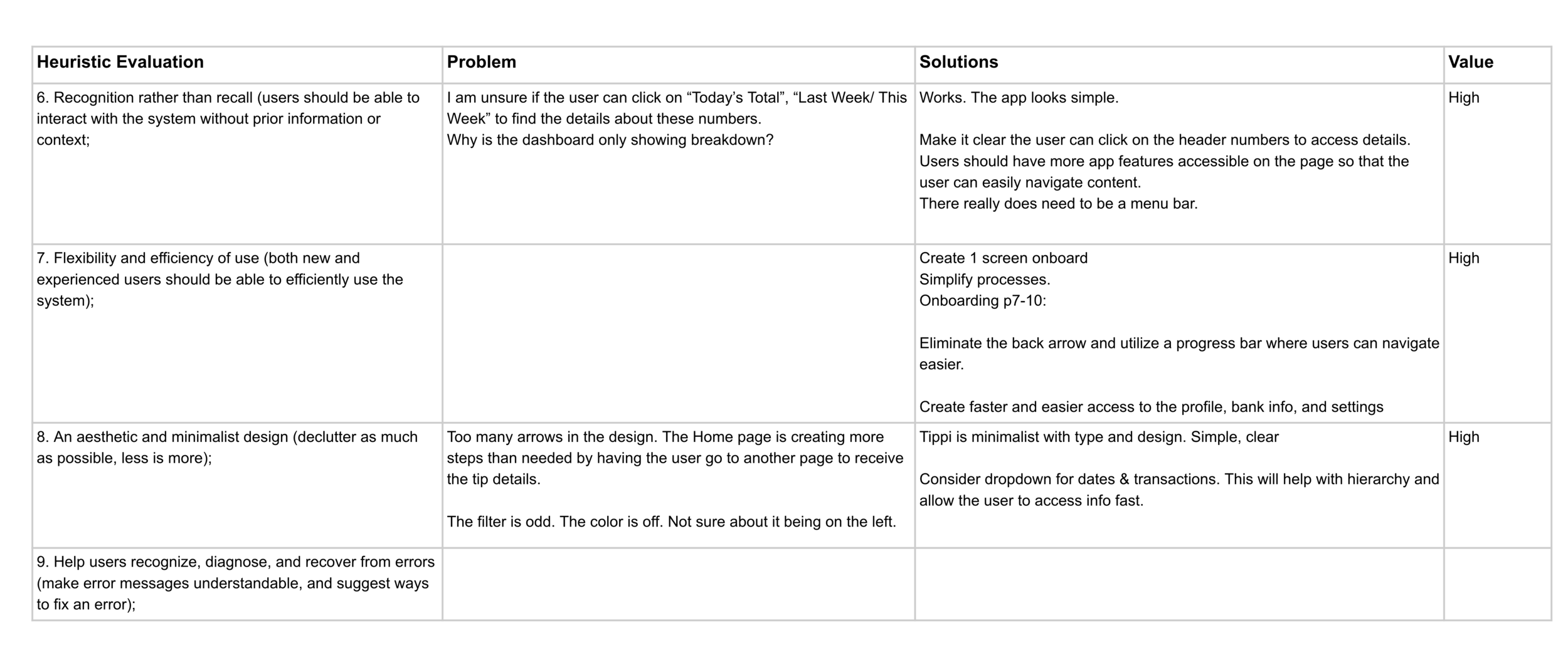
Heuristic Evaluation
Individual Frames

Sketch
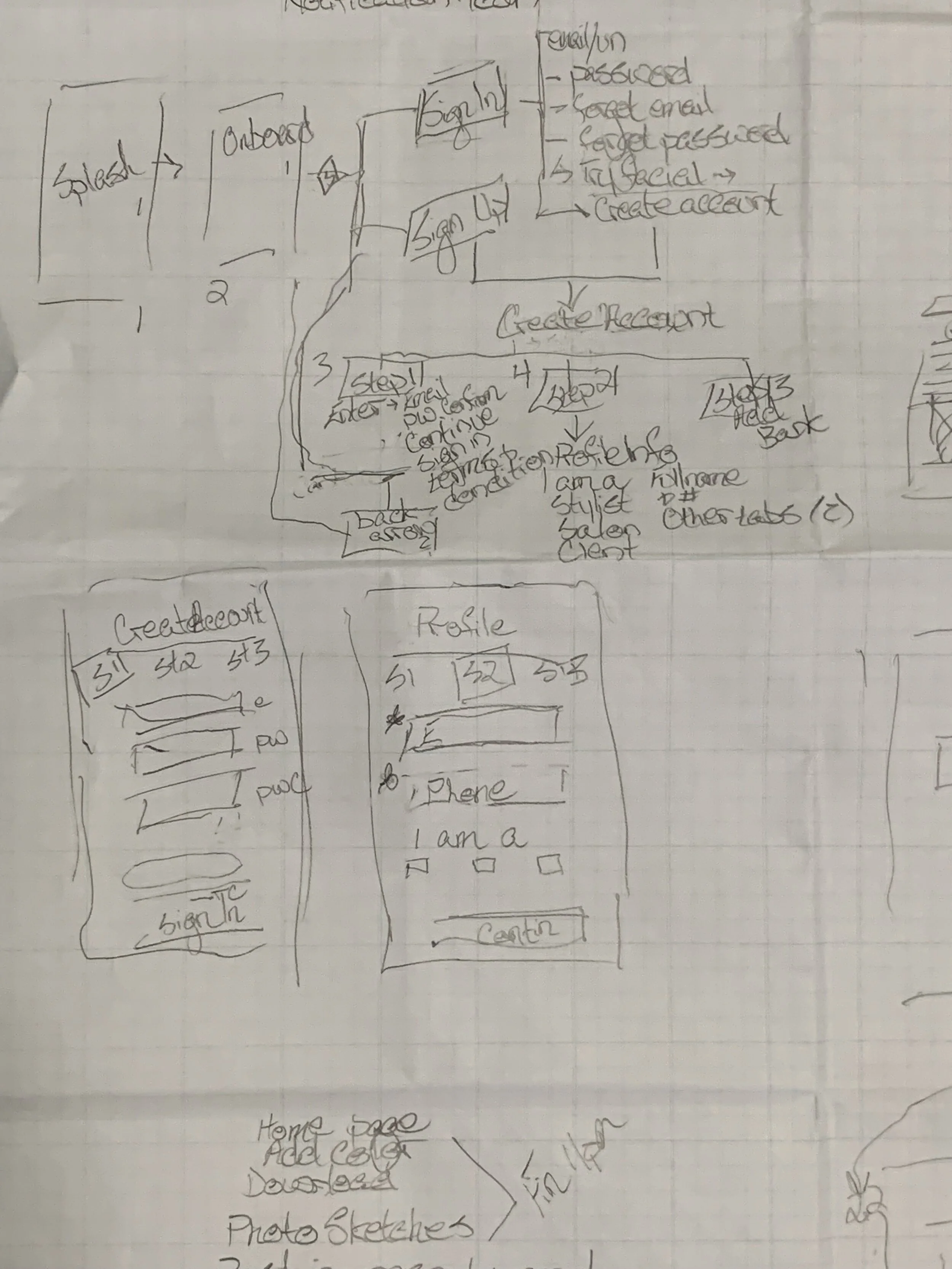
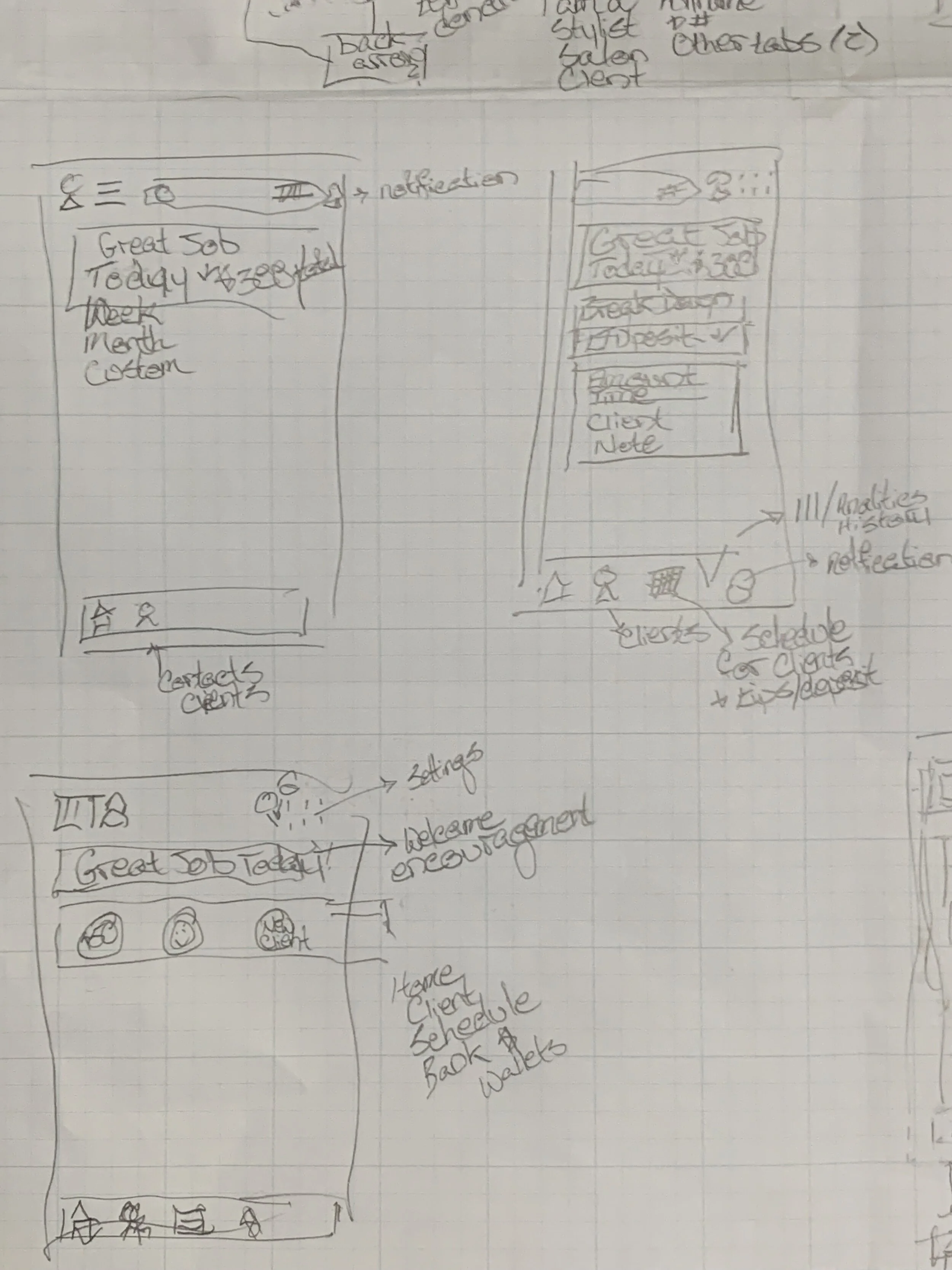
Digital Sketch
Wireframe


Color Options

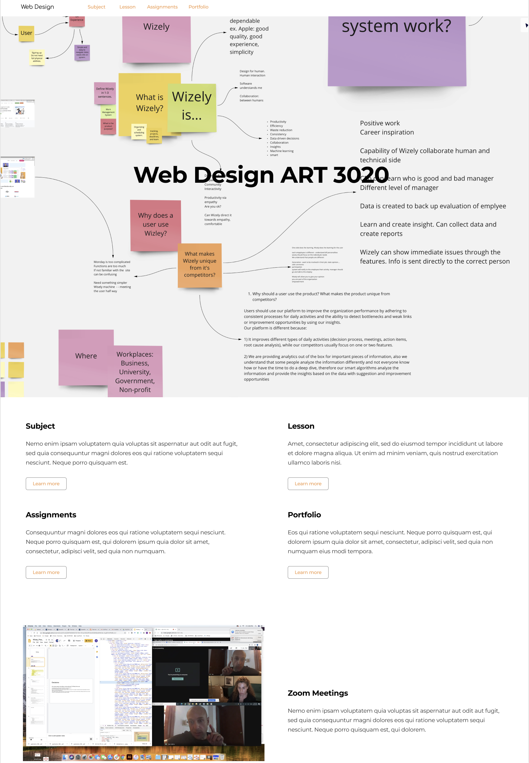
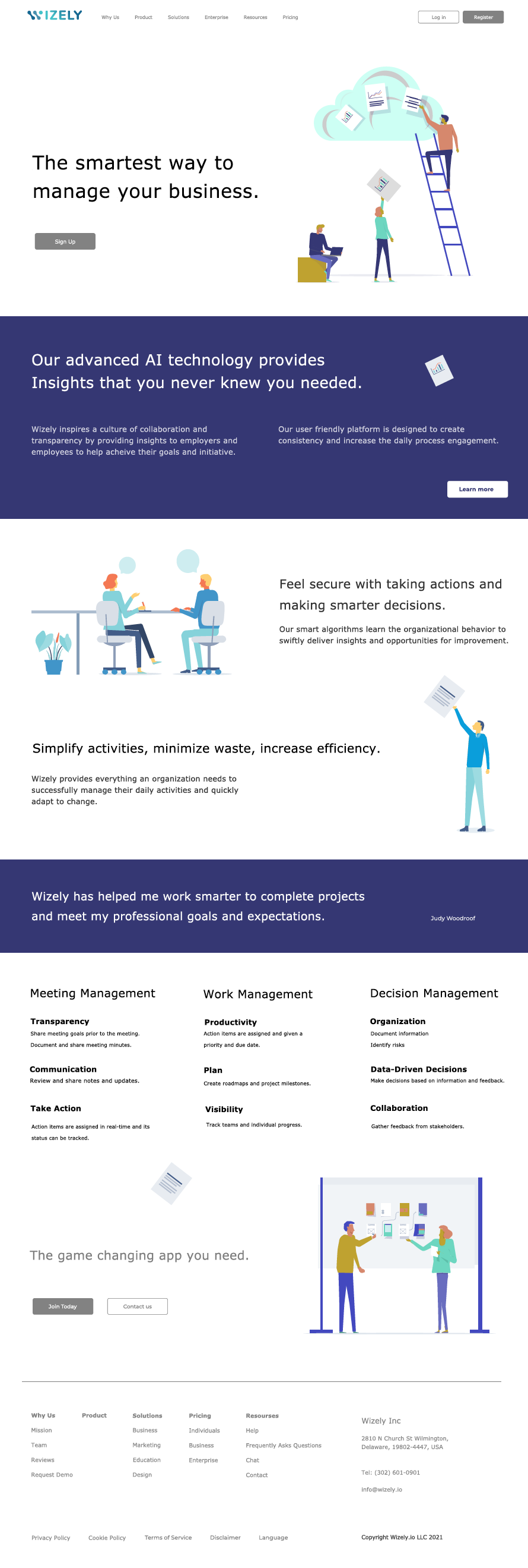
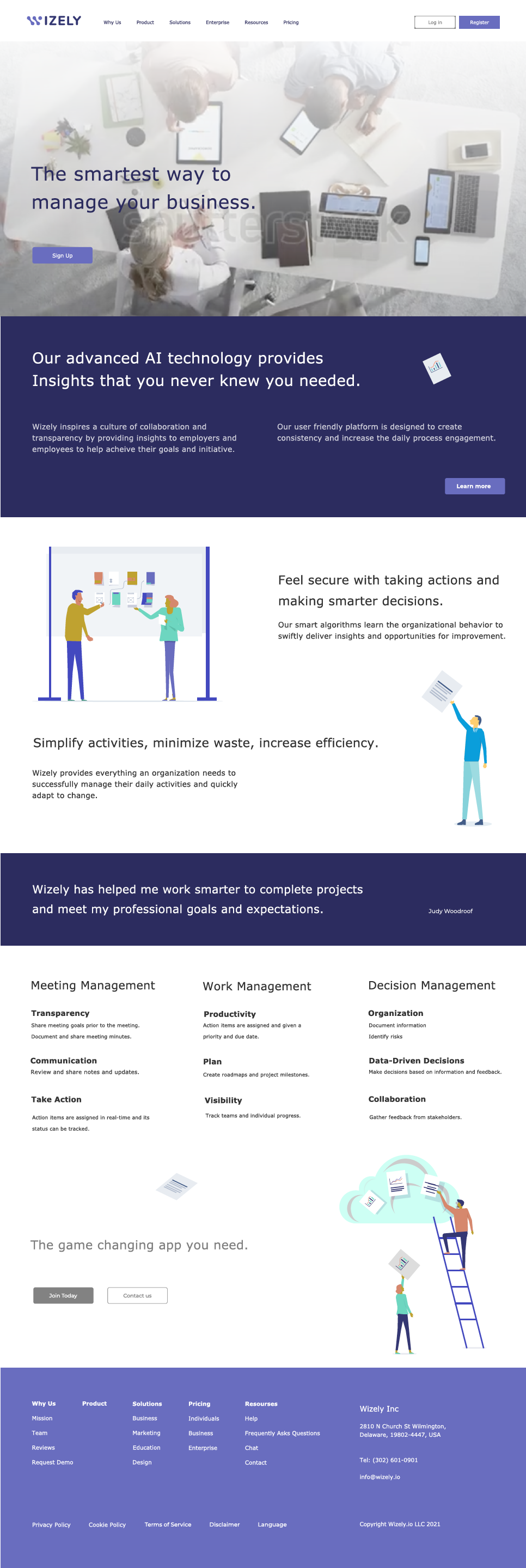
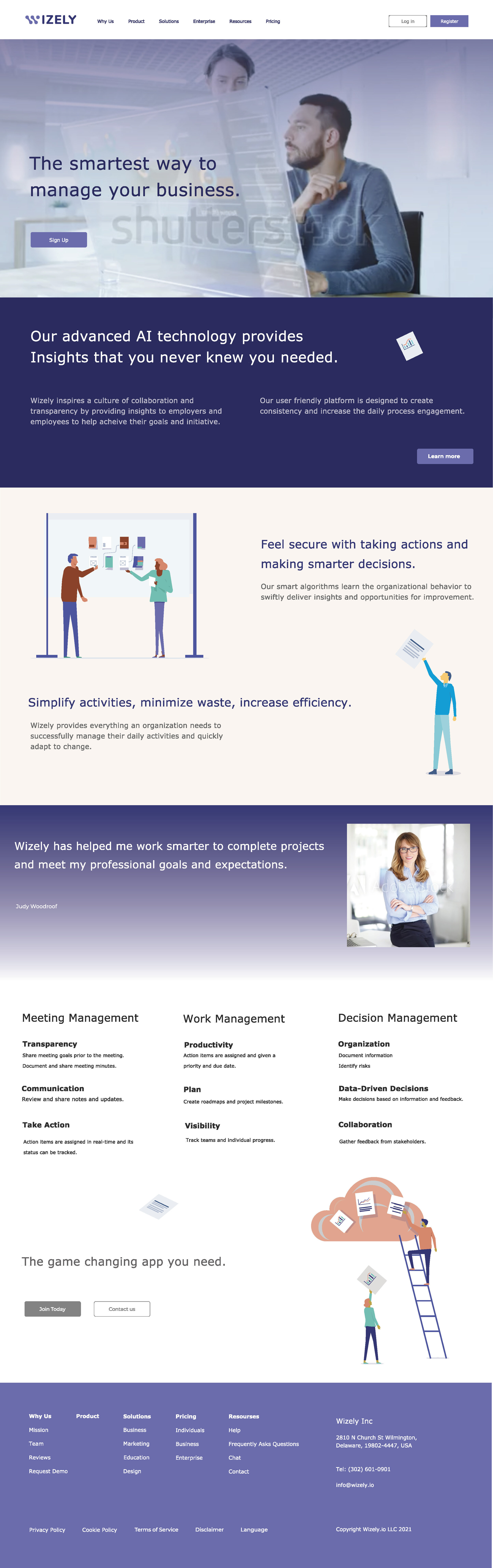
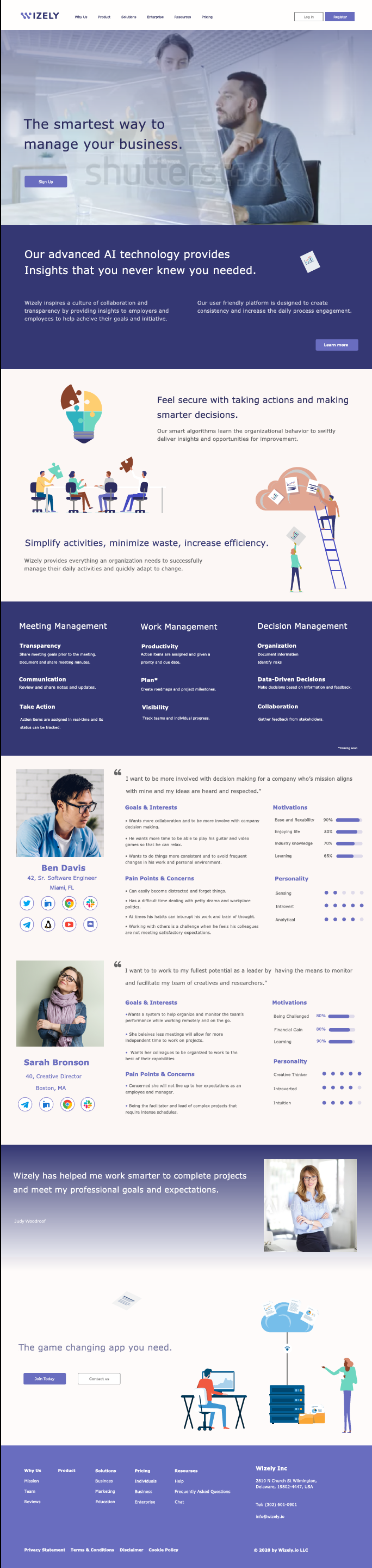
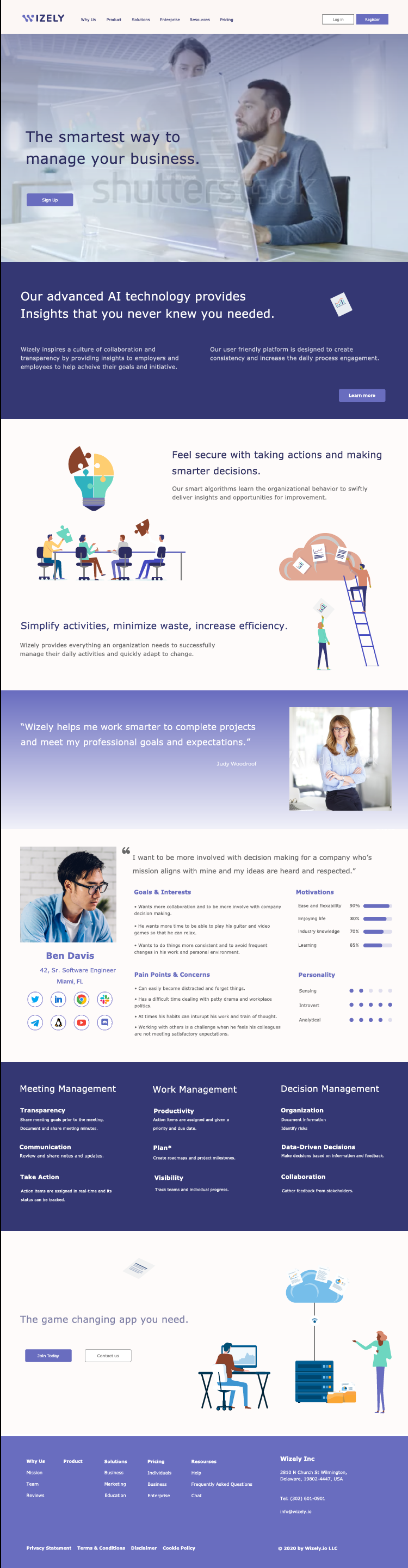
Wizely.io Sitemap
Wizely.io Work Management System (WMS)
Wizely.io is a work management software that uses a funneling process to increase a business, organization, and individual’s productivity and efficiency. Wizely.io is reliable in reducing waste through data-driven decisions; promoting consistency and collaborative insights.
Scope of Project
Site Map of Wizely.io website
Home Page: Wireframe & Prototype
Selected Project Deliverables


Project: Virtuhouse
Market & UX Research
Duration: 3 Weeks
Overview:
Virtuhouse is a real estate service helping users to relocate by viewing properties virtually. The research examined the market competitors and users; young professionals, recent graduates, and university students.
Research Methods
Mixed-Method:
Literary Review (Google Scholar, News Articles)
Competitor Websites
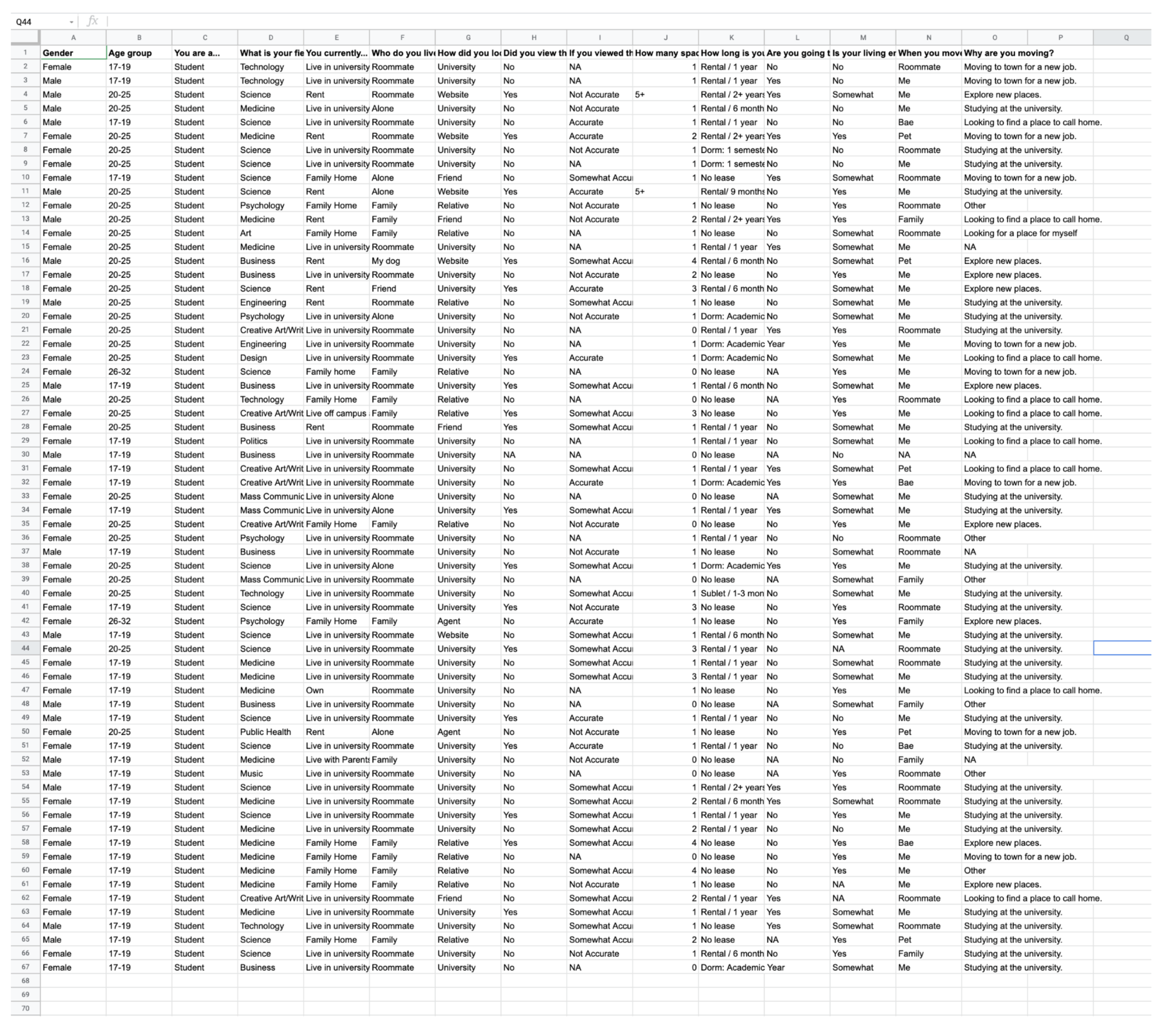
Survey & Interviews (Formal & Informal)
Census Bureau, Data.gov, Kaggle.com
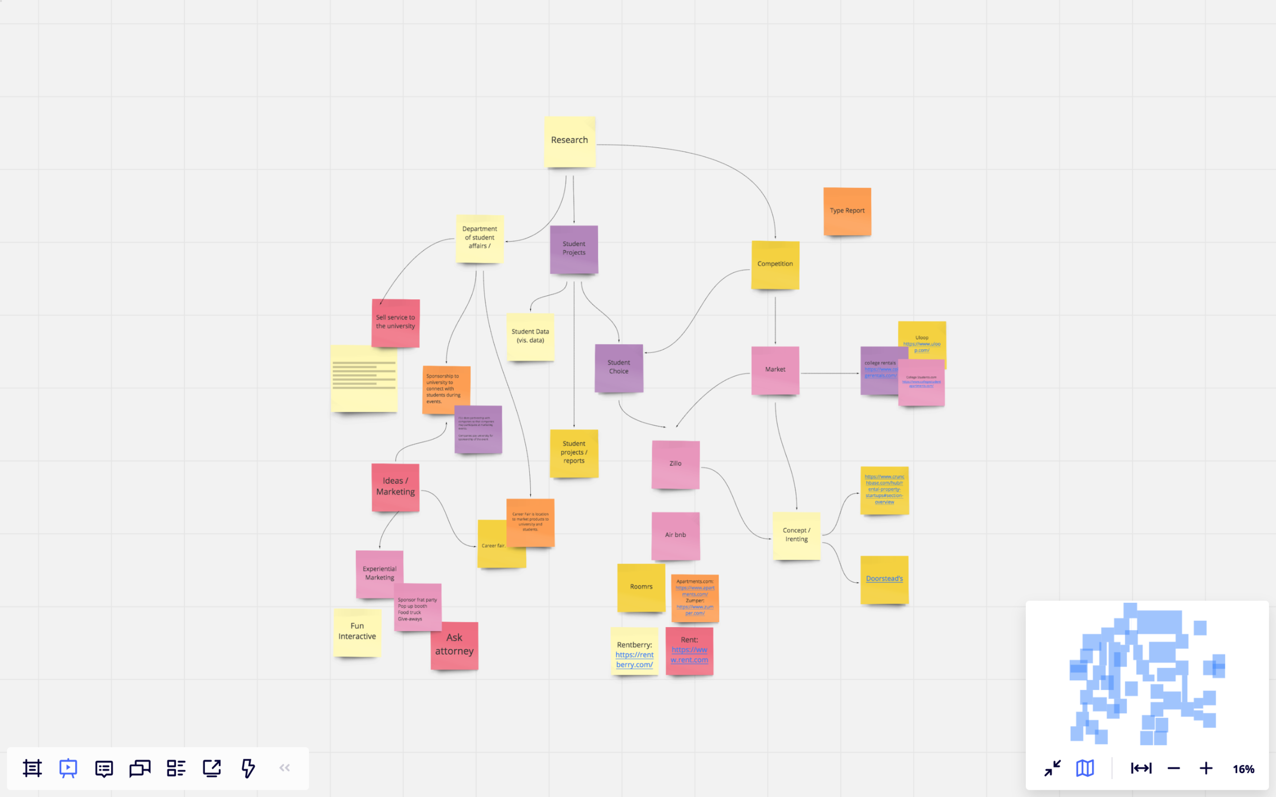
Project Brainstorm & Organization
User #1
Undergraduate Student
Freshman and Sophomores (17-19 yrs)
Junior and Seniors (19-21 yrs.)
What are Undergraduate Student Needs?
Proximity to Campus
Affordability (Roommates)
Proximity to Amenities
Access to Public Transportation
Safety
Private Space
Laundry
Neighbors
Cleanliness
User #1 Location
Why college towns?
87% of students live off campus.
Owning a property near a university and accepting student renters mean reduced vacancies and competitive rents.
Renting to University Students
High Demand:
Many universities and colleges do not offer students four years of housing.
Higher Rents:
Constant demand for housing.
Third Party Payment:
Common for a student attending college to have their rent paid by someone else. Often, parents are the ones who are paying the rent, and they will serve as co-signers on the lease
Word of Mouth Fills Vacancies:
Students may view certain rental properties as very desirable.
Satisfied With Less:
Most college students are not looking for the most high-end finishes.
College Town
Ithaca, NY
State College, PA
Bloomington, IN
Lawrence, KS
Blacksburg, VA
College Station-Bryan, TX
Columbia, MO
Champaign-Urbana, IL
Ann Arbor, MI
Gainesville, FL
Major University
Cornell University
Penn State
Indiana University
University of Kansas
Virginia Tech
Texas A&M
University of Missouri
University of Illinois
University of Michigan
University of Florida
Enrollment
33,451
47,823
44,564
29,512
45,150
60,137
41,057
51,660
76,448
58,453
Population
104,606
158,728
164,233
116,559
181,555
242,884
172,703
237,199
356,823
273,365
Percent
32.0%
30.1%
27.1%
25.3%
24.9%
24.8%
23.8%
21.8%
21.4%
21.38%
User # 1 Survey
User #1 Market Competitors
Roomrs: This product is similar to Virtuhouse in marketing to students and young professionals. The product is an online rental platform focusing on rentals and rental assistance for university students and young professionals. They offer short-term, flexible leases, individual and roommate rentals, and community.
College Student Apartments: has search tools that help college students find the perfect apartments, houses, roommates, and sublets. With the proprietary Smarter Housing Search, you can find student housing based on the closest distance to campus, best price, and preferred amenities.
Uloop: student marketplace for your college.
College Rentals https://www.collegerentals.com/
Academic Housing https://www.academichousingrentals.com/
Handshake: https://joinhandshake.com/
User #2
Young ProfessionaL
Millennials, Gen Z
What are the users’ needs?
Easy access to center-city jobs
Competitive rental prices
Trendy areas
Social amenities
Business center
Short Term or Long term
Flexibility
Roommates or Single
Key Points
Often second rental experience
Student loan debt requires young professionals to rent rather than buy.
Consistent moving at the end of 6 months or one-year lease.
Prefer temporary lease: “millennials love the idea of being able to pick up and go when their lease is up.”
User #2 Location: Atlanta, GA
Statistics: Atlanta, GA Census 2018
Population estimate 2018, 498,044
Owner-occupied housing, 2014-2018, 43.4%
The median value of owner-occupied, 261,400
Median gross rent 2014-2018, $1,099
High school graduates, 90.3%
Bachelors or higher, 49.9%
Civilian labor force, 65.1%
Median household income, $55,279
Per capita income, $43,468
Each year, millennials move to Atlanta to join its major industries: agribusiness, energy, film, aerospace, and more. The cost of living in Atlanta is reasonable with rentals averaging $1500.
2020
Population, 498,044
Ranks 10th economically in the nation with a GDP of $276 billion. The Atlanta metropolitan area is home to 5.6 million, making it the 9th largest in the United States. In 2018 the annual growth rate was 1.28%. In 2020 it was found that the median age in Atlanta is 33.2 years and within that the median age for males is 32.9 years and females 33.6 years.
According to the most recent ACS, the racial composition of Atlanta was:
Black or African American: 51.85%
White: 40.27%
Asian: 4.16%
Two or more races: 2.41%
Other race: 1.05%
Native American: 0.24%
Native Hawaiian or Pacific Islander: 0.03%
User #2 Market Competitors
Rentberry: An online rental marketplace bringing landlords and tenants together, eliminating the need for real estate agents in the rental niche. This alone has not only sped up the process for both landlords and renters, but also minimized costs and maximized profit for both groups. Landlords and renters can negotiate the rental rate directly, reaching a mutually acceptable rate.
Bungalow: An aesthetically pleasing and user-friendly site, uniquely focused on rentals and roommate location. Like Roomrs, Bungalow provides rental advice and community. https://bungalow.com/
Zillo: identifies rentals as a large market opportunity since renters move more often than homeowners and property owners have to spend money on advertising and lease concessions.The network includes Zillow products; Trulia, Hotpads, MyNewPlace, AOL Real Estate, and MSN Real Estate. Industry also listed Zillo as a leader, as well as Apartments.com and Zumper.

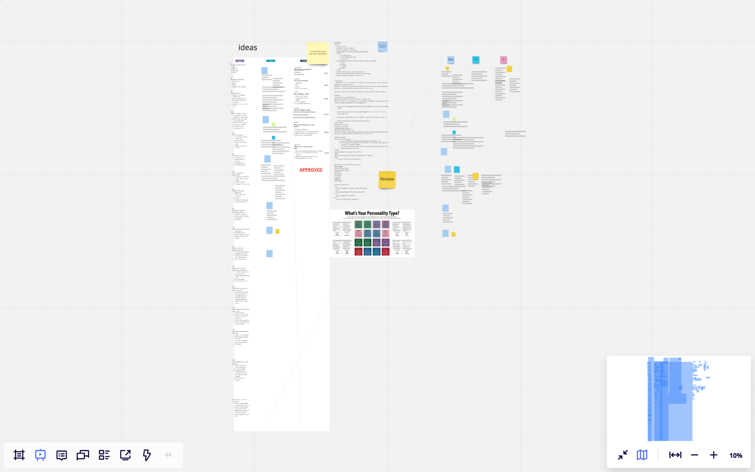
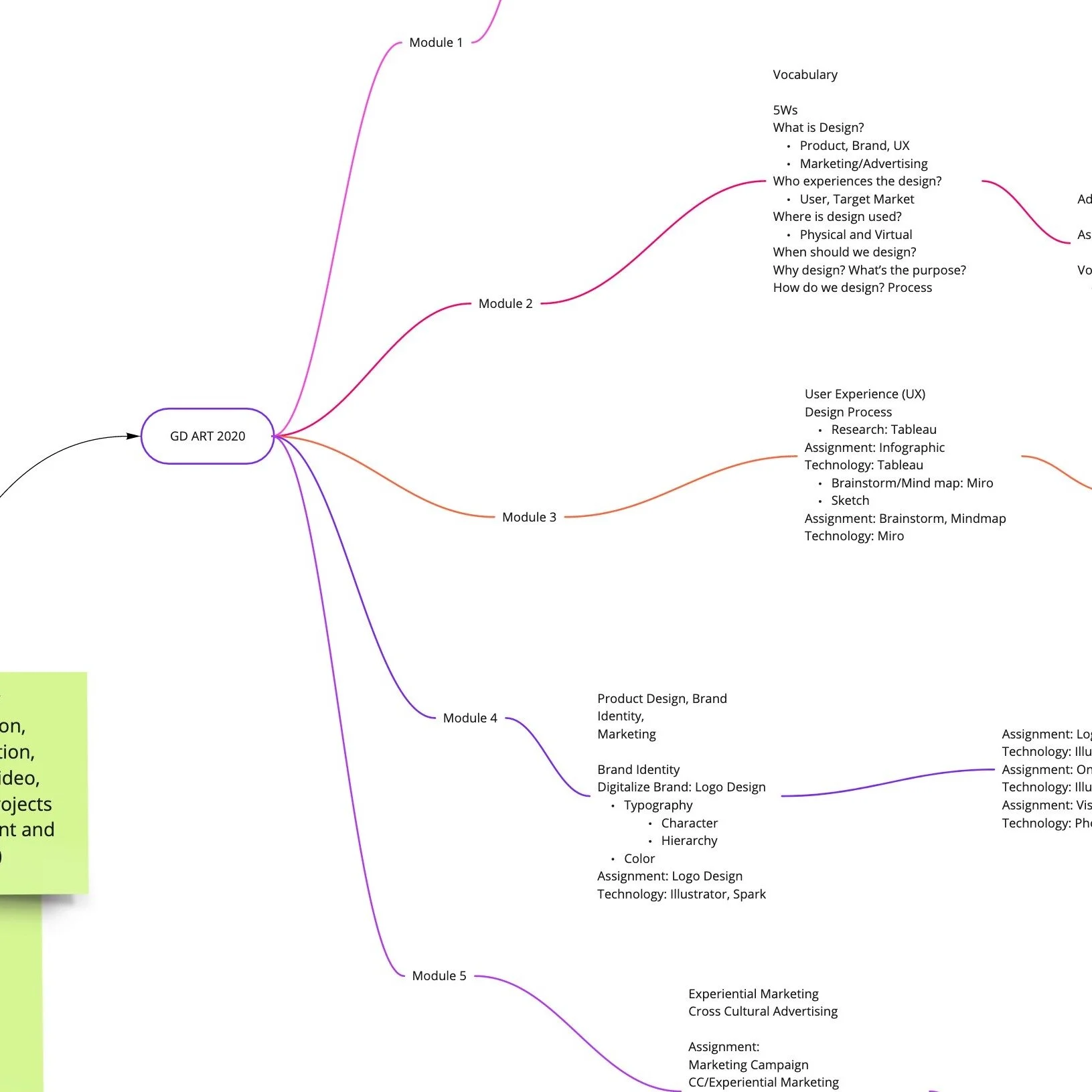
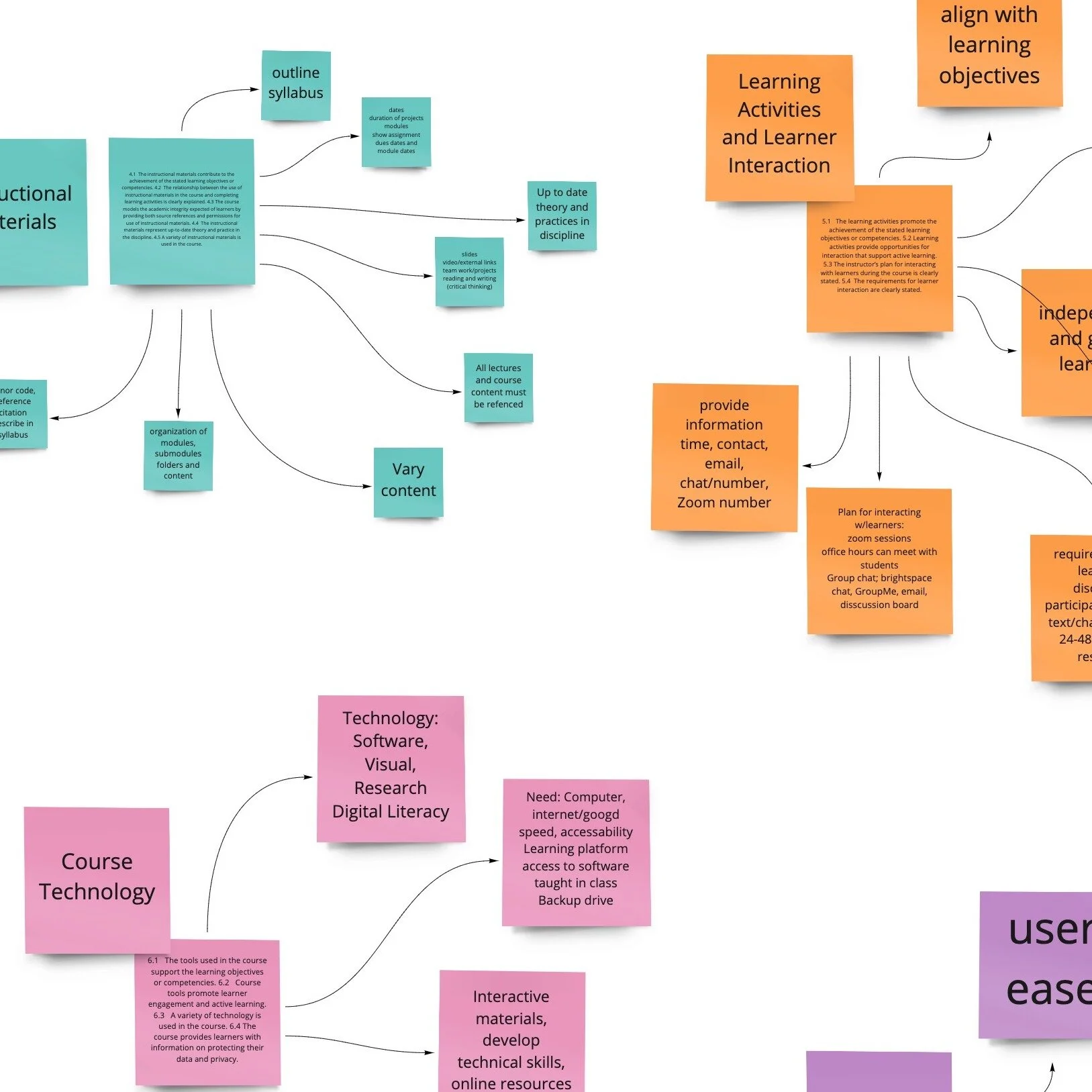
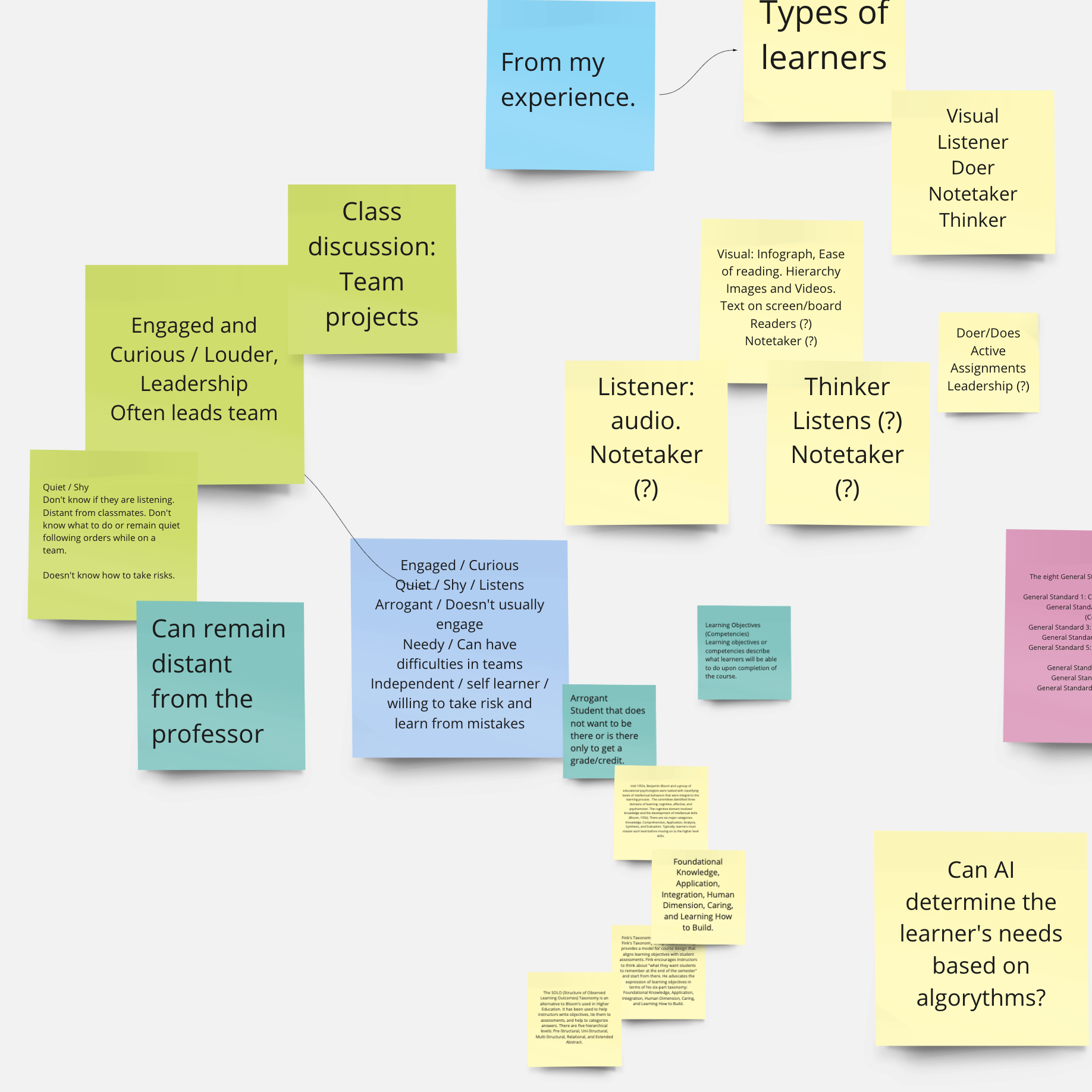
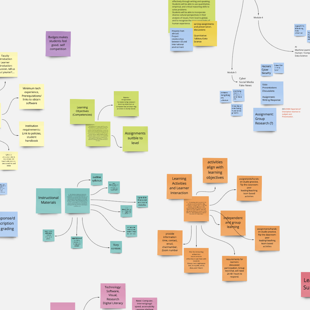
Brainstorm for Course Revision
Course Revision Brainstorm
XCOR 3010 Design & Technology in Global Culture
Brainstorming and mind mapping is a free-associative process where individuals and teams record ideas through a conscious and subconscious process. Introduced initially through the work of Sigmund Freud, the free-associative process is often understood as a "stream of consciousness," where the mind is capable of thinking freely to form ideas.
As an essential tool for creatives, the free-associative brainstorming and mind mapping process allows thoughts to flow by connecting words or phrases. The visual outcome of a brainstorming session is a chart-like structure of lines and concept nodes linking two or more thoughts: "semantic units," or units of meaning."
The brainstorming process was used in the initial stages of revising the XCOR 3020 Design & Technology in Global Culture course for online learning.
Selected Dashboard Images

Project Shield
Scenario
The client has had their website (Project Shield https://projectshield.withgoogle.com/landing) up for some time but is not getting the conversion metrics that they had hoped for. There are two types of users that come to the website (Developers + Non-technical visitors). While the site is currently tailored for developers, research has shown that non-technical visitors are tasked with vetting out products like these and the team feels like the site may not be serving this user group in the most ideal way.
Business Requirements
The website should arm non-technical visitors with the ability to answer fundamental questions such as:
What is Project Shield?
What will this software do for me?
How can this improve protection on my site?
Where do I start to get this implemented?
Answer the following questions:
Does the information on the website meet the needs of the non-technical visitor?
Do they understand how it works?
What expectations do they have after they request access?
Moderator Script
Greeting/Introduction/Expectations (1-2 mins)
Demographics (2 mins)
Name?
Location?
Level of education?
Profession?
What economic class do you identify as belonging?
Do you have a disability that will affect the viewing and searching process?
Experience/Expertise (2 mins)
On a scale of 1-5, what is your level of tech knowledge?
How often do you use technology?
Which device(s) do you usually use?
Participant Activity (5-6mins)
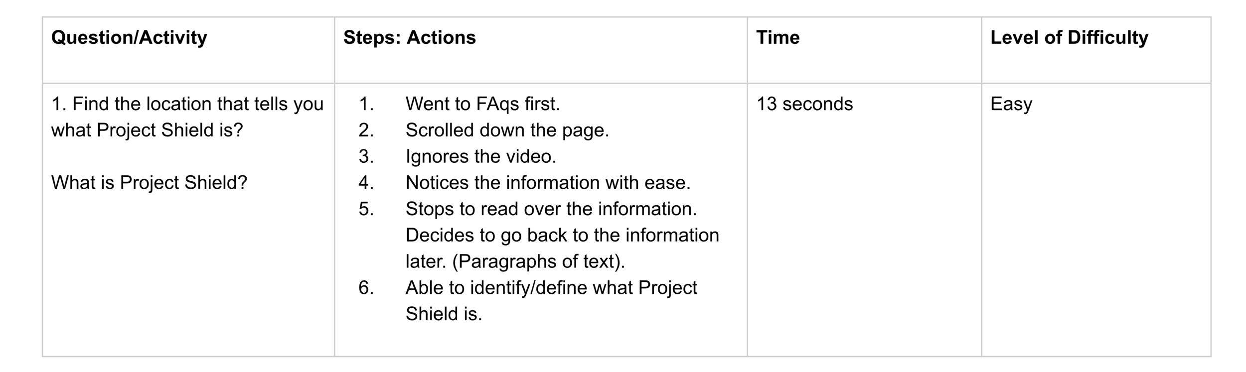
Find the location that tells you what Project Shield is.
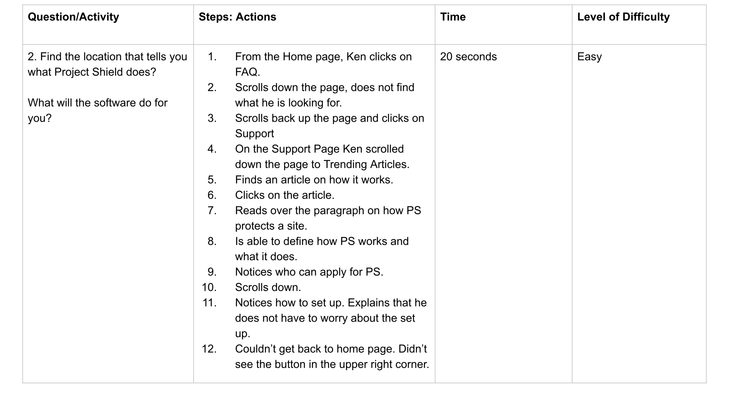
Find the location that tells you what Project Shield does.
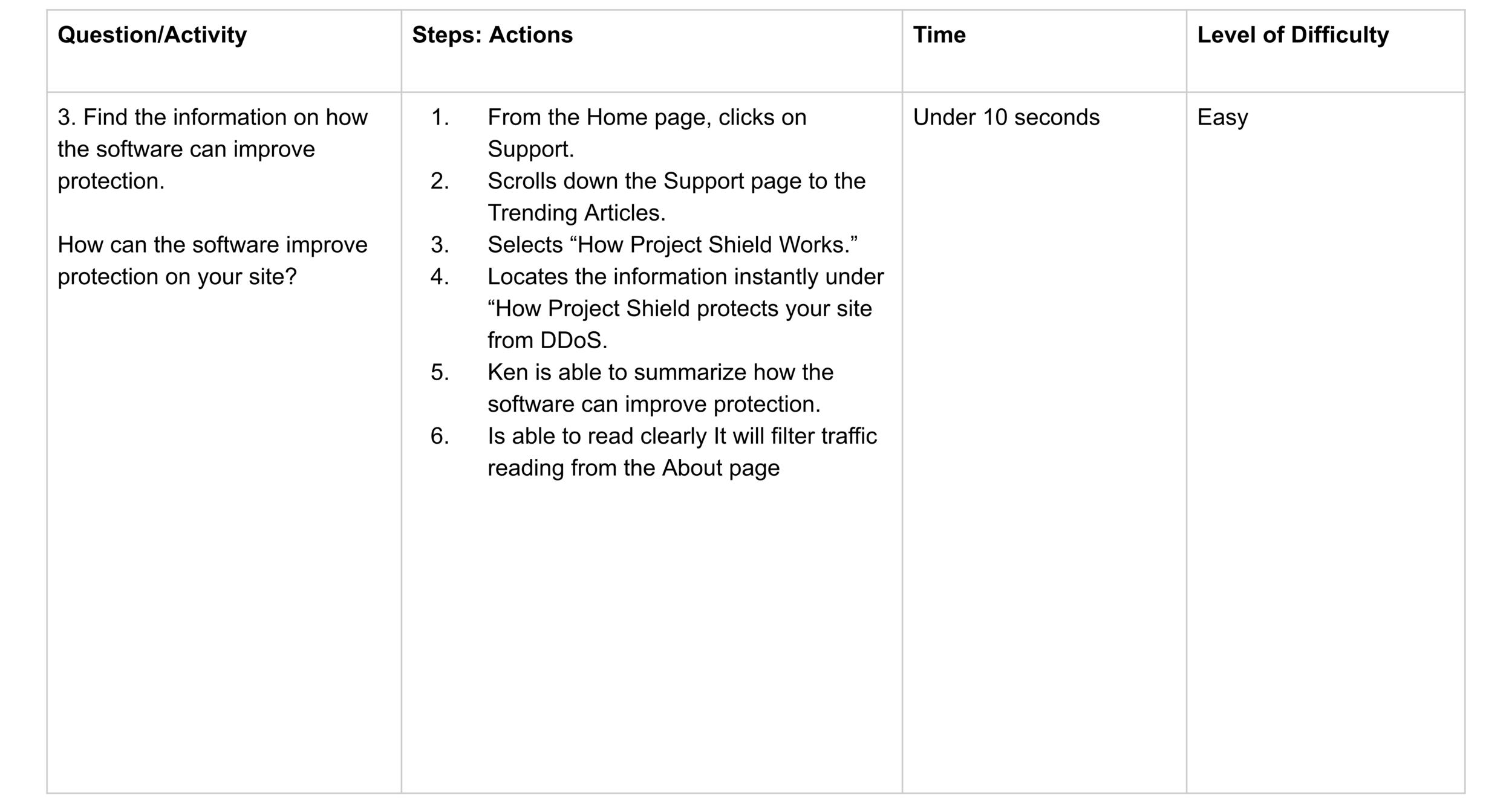
Find the information on how the software can improve protection.
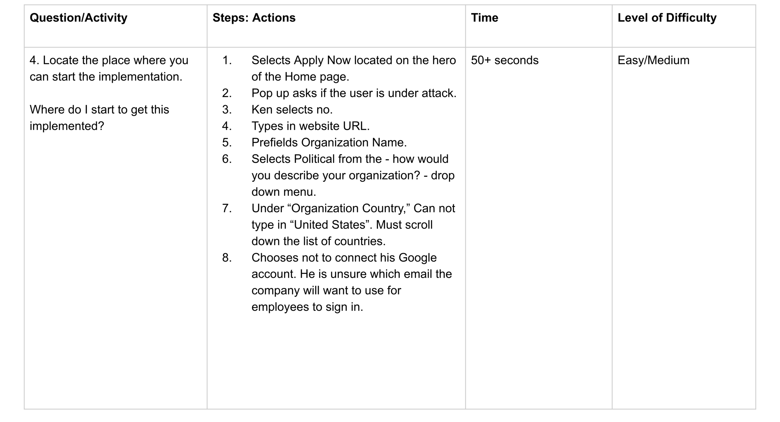
Locate the place where you can start the implementation.
Followup (2 mins)
Have you used this product before?
Have you used a similar product?
What stood out to you when you first entered the site?
What was the easiest part of accessing the information you needed?
What was the hardest part about your process?
What could be done to improve your search experience?
User
Name: John Colman
Location: Charlotte, North Carolina
Education: Masters in Journalism
Profession: Political Journalism
Identifies as middle class.
No special ability that will affect site viewing and use.
Average tech literacy.
Uses technology daily.
Devices: laptops & tablets
Lower than average cyber security use/knowledge.
Non-technical individual
Is searching for a DDoS system for his company.
The company will make the final decision on which product to choose.
The user is testing the product to locate the information he needs to bring back to his team.
User Test & Interview
Follow-Up Questions
Q. Having gone through the site, do you feel you understand what the product does and how it works?
Yes. The support page provided enough information to let the user know how the software will help against a DDoS attack.
Q. When you went to apply for the service, did this make sense to you?
Not really, because I got stuck. I was surprised when it asked me for my Gmail account.
I’d like to know more about if I qualify. At the bottom of the Home page, there is a list of who is eligible to use the product, but I’d like to know more. I think I am eligible because of what I do, but I’d like to know about the steps for applying. This looks to be (a site) for someone who is applying; not a site for someone who is looking for more information on why/how to apply.
Q. I noticed that when you began your search, you went directly to the FAQ. What was the reason you chose this as your first step, rather than scroll down the page?
I did not know that you could scroll. I did not see anything that would indicate this. I did not see a scroll bar. The hero fit the whole screen. I thought (the edge of the hero) was the end of the screen. I thought it was a splash page and did not know I could scroll down.
Strengths
Easy to locate: What the product is. What the product does. How the product will help improve protection.
Offering the FAQs and Support pages.
Readability level high: Enough content/text on the Home page. Not too wordy. Little snippets of information. Simple.
FAQs and Support have the right topic. Not too much reading.
Good use of typography and typographic hierarchy.
Good contrast between background and type.
Layout and alignment are organized
FAQs page lists detailed information using type hierarchy, making it easy for the user to skim the content and locate the info they are seeking.
Weakness
Discovers a user can scroll down the home page by accident.
Signing up/Implementation was confusing and concerning when asking for Google information.
Did not provide useful information on who qualified for the product.
Hero too large. The user did not know you can scroll down the Home page to receive information.
Unable to type in country during sign up. Must scroll down the list to select the country name.
Change in site layout on the Support page. The Home button moved to the upper right corner which made it confusing for the user to go Home.
Opportunities
More information on who qualifies to use the product.
Information on competitor comparison.
What makes Project Shield unique and different from their competitors?
Tutorials. Listed table of comparison.
Include a 1-2 minute video summarizing the product.
Expand information from the home page.
Consistent layout of navigation.
Threats
User wanted to do further research into competitors.
They will leave the site and review competitor sites
Possibly will not go back to Project Shield.
Does not want to submit Gmail account without knowing if they qualify.
The user paused to find the Home button from the Support page.